Jolie Laide Pt.2
AGP603
From: Third year (Final Project) studies at Brighton University
This projects foundations are based on the topic Jolie-Laide, ‘ugly beautiful’, I applied this definition and general concept throughout the project and I wanted the influence to be visible in my final outcome/s. I manipulated the topic to create either a beautiful, in form or function, outcome/s.
The idea in which I used in the project ‘should come from our external and complex environment: nature, society and its human interactions’.* You should ‘embrace the complexity of (the topic) and deliver insight into it and show both its beauty and its shortcomings’.*
My stance in this project was a visualiser/ educator and ‘ghost designer’ - one that works with information or topic without full, prior or current, knowledge surrounding the subject area. I wanted to work collaboratively within that area, as said in the [*] Conditional Design Manifesto written by Luna Maurer, Edo Paulus, Jonathan Puckey and Roel Wouters;
‘The initiation of designing can happen from a single individual, a community action, or a collaborative undertaking.’
I let the information I found through this collaboration drive the project forward. In the first part of this project I used the term, Jolie Laide, to inform the research which led to the manipulation of natural patterns and motifs created by the growth of bacteria which informed an artistic outcome. I chose again to follow this area of study and I reflected upon this statement and had it evidenced in my work; ‘The function of scientific drawing is admittedly an essentially practical one: to inform, to explain and to instruct. But that does not prevent it from measuring up to aesthetic criteria.’ The Artist in the Service of Science - Walter Herdeg.


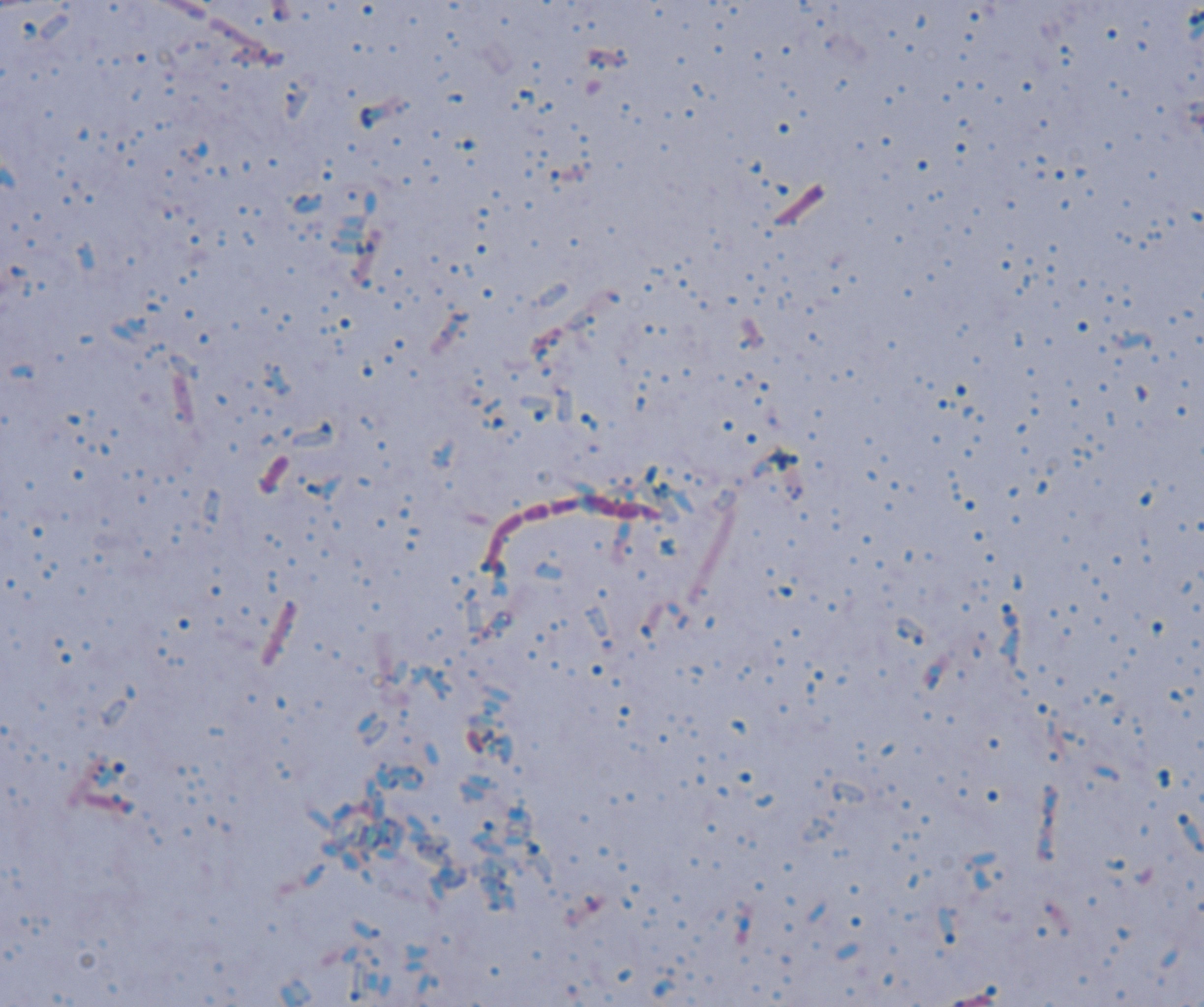


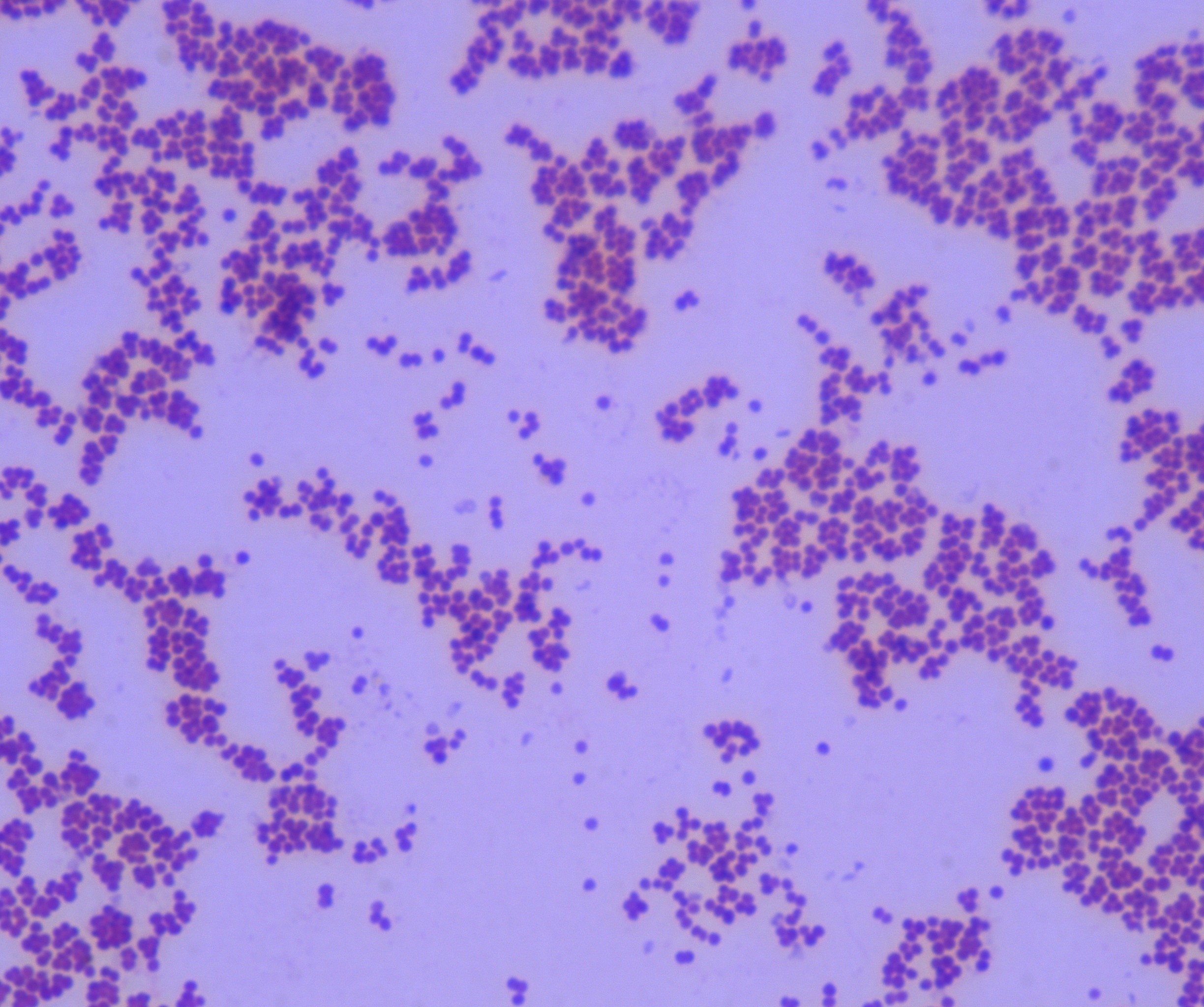
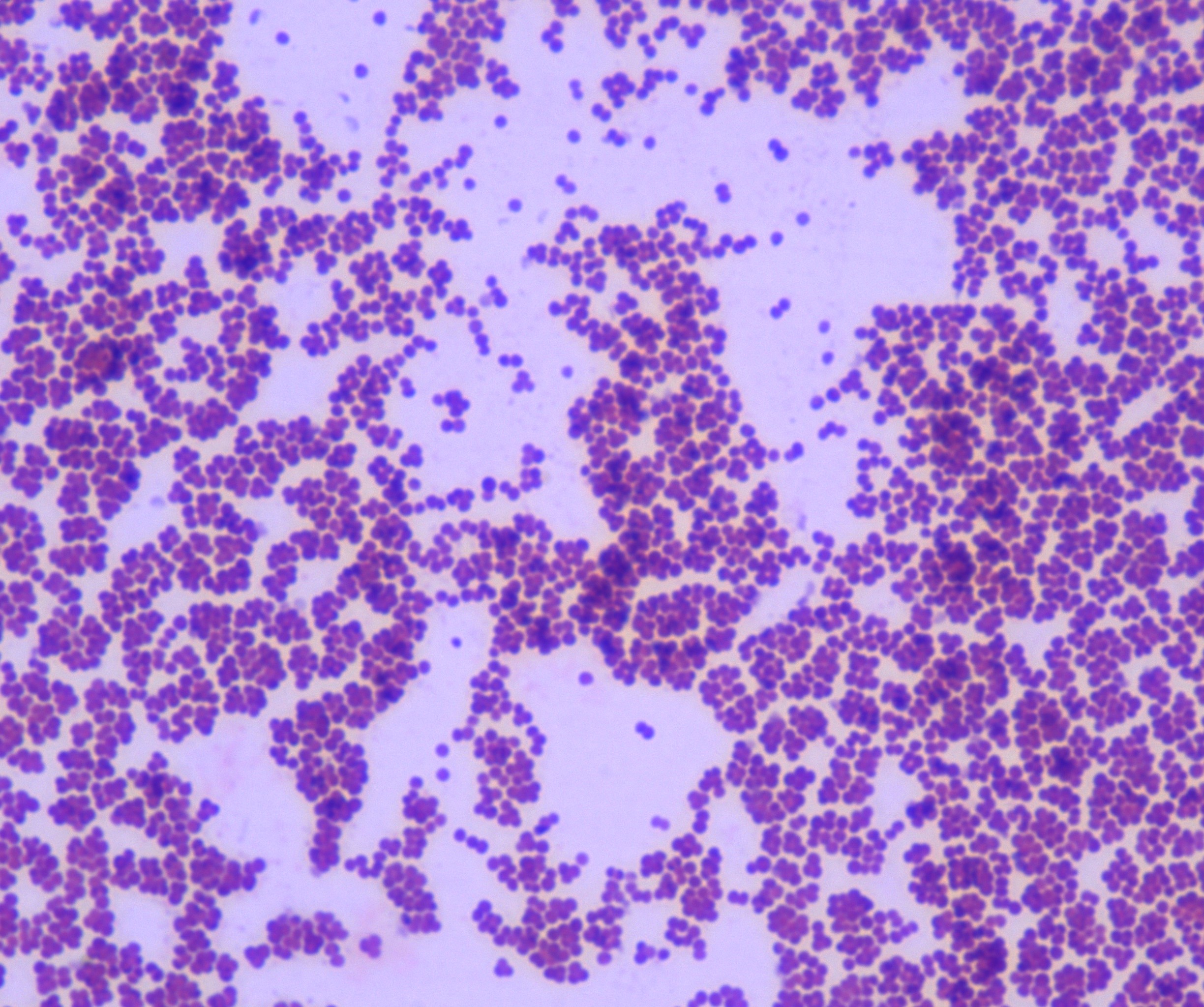
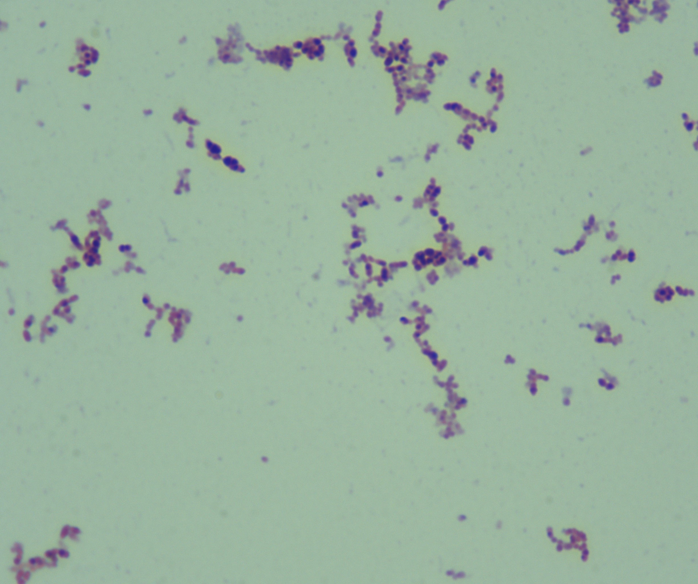


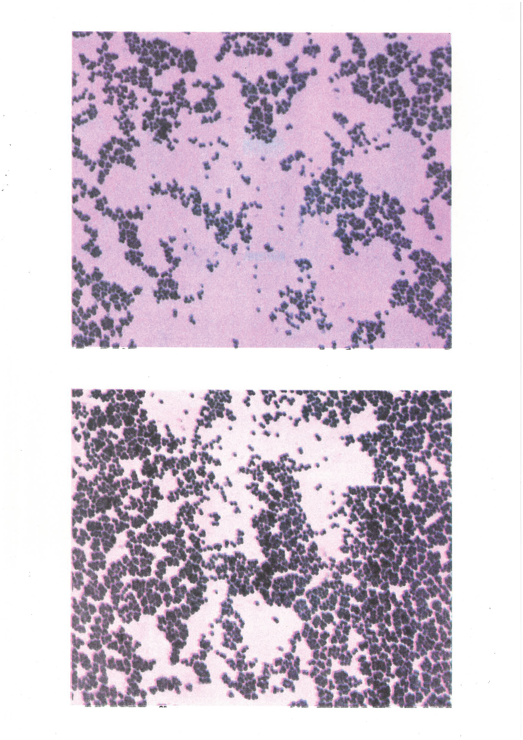
I used high-powered microscopes to open windows into invisible realms so that I could capture the beauty of bacteria and viruses on a cellular level.
I worked collaboratively with a Brighton University student to inform my design work. Elif Erdem is a student studying Pharmacy MPharm, she undertakes research projects alongside researchers, who are leading the development of innovative biomedical products and pioneering new approaches to regenerative medicine and the treatment of cancer, asthma, diabetes and other chronic diseases. We will be collaborating on both of our level 6 final year projects.
I plan to educate my intended audience on hand dryers and their spread of bacteria and germs through compromised air particles spreading. - based on Erdem’s practical work in the labs and dissertation using a collection of animations.
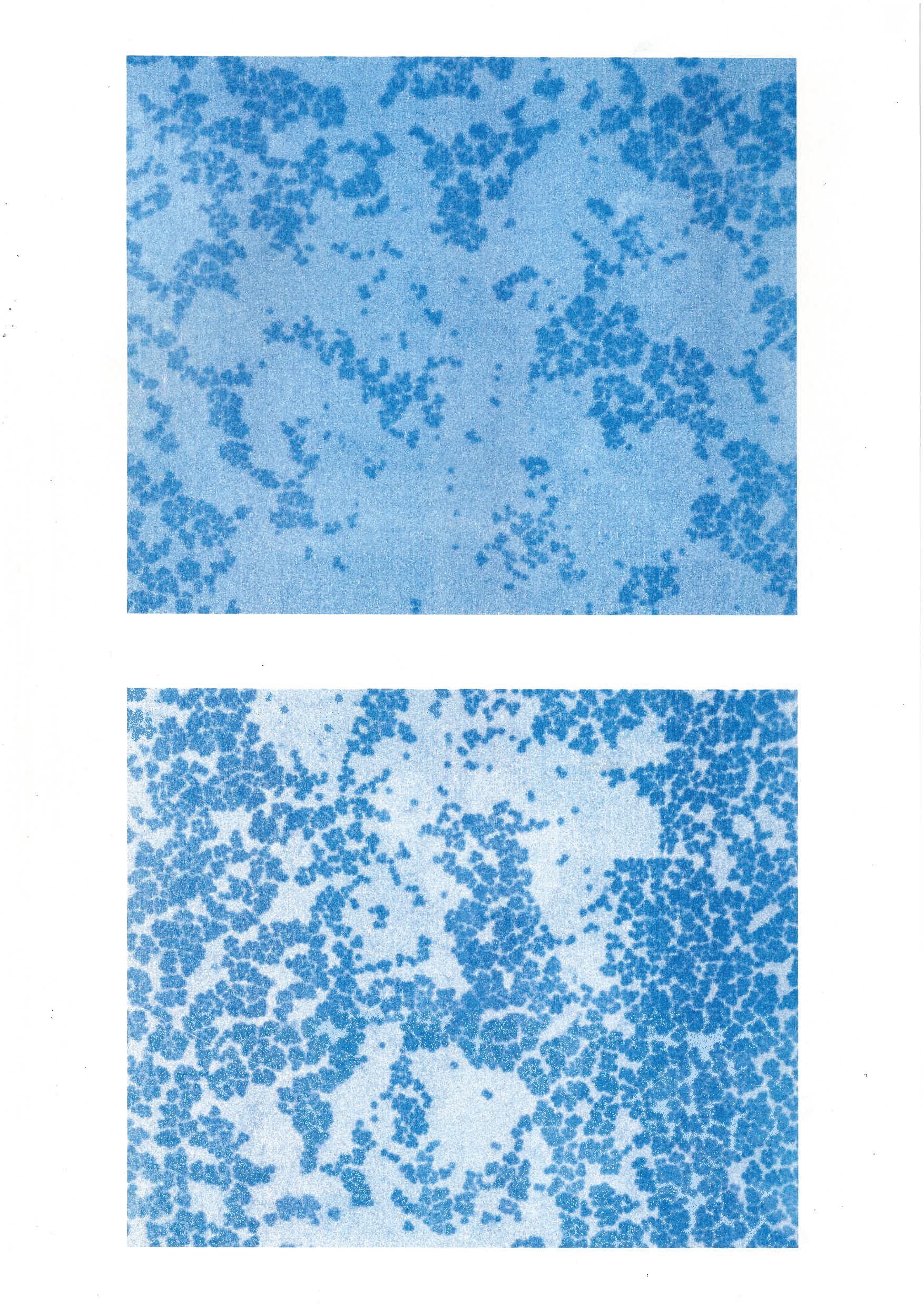
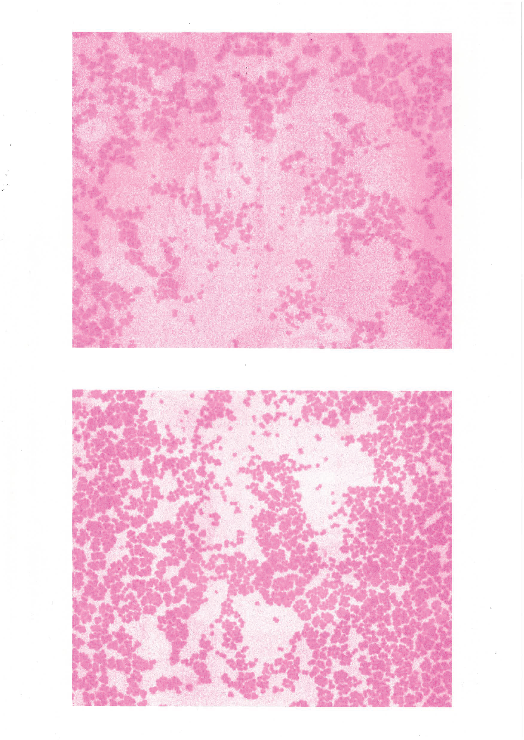
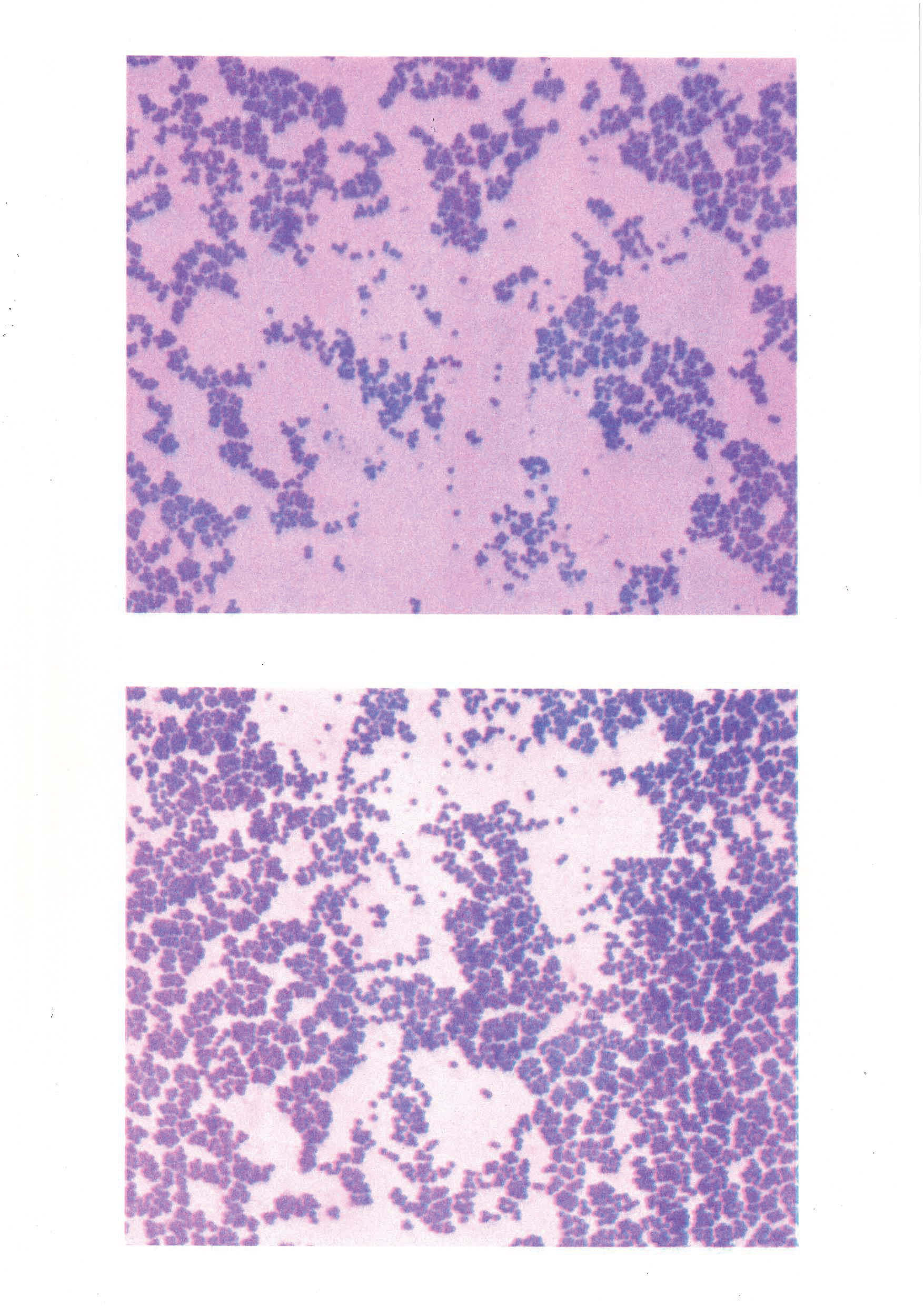
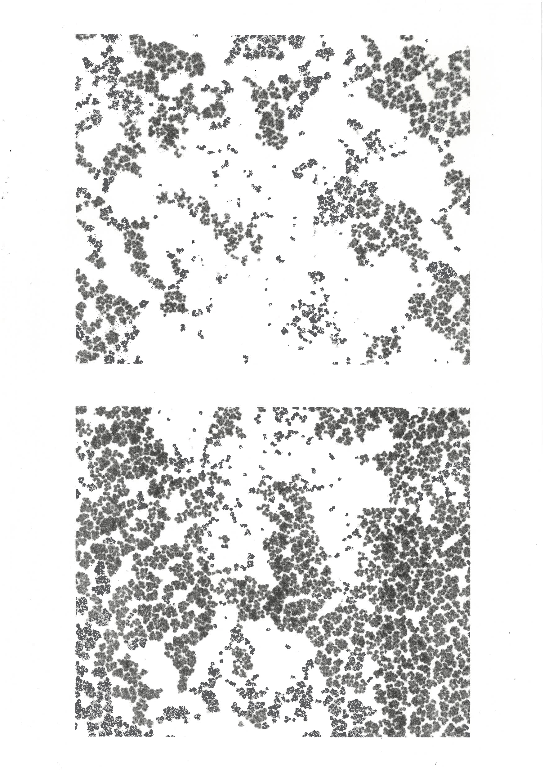
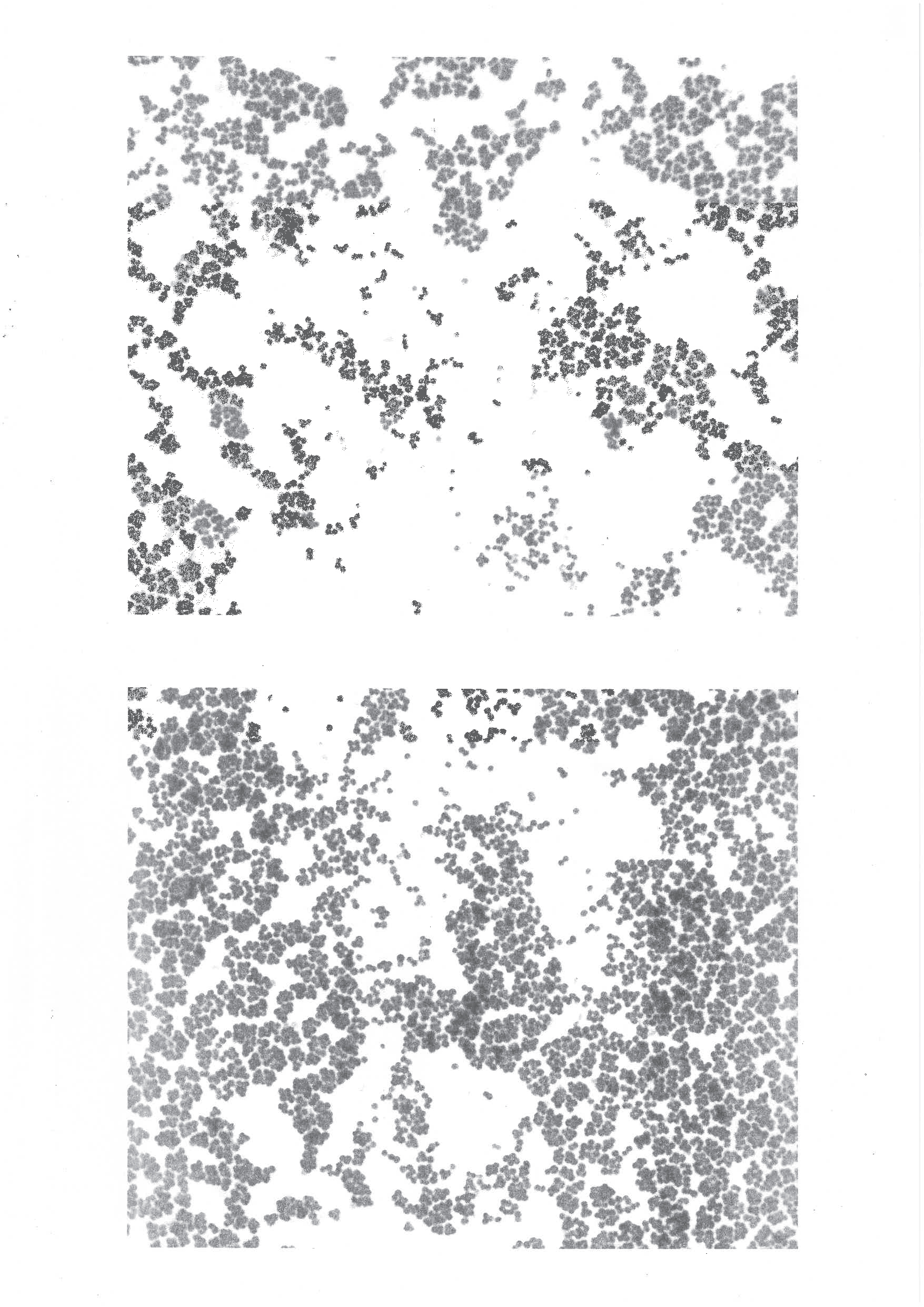
After doing some intial drawings I wanted to use different printing methods to show the images I took when visiting the lab, I made a book presenting riso
prints. I wanted to make them into two
books so that I could see something
tangible and start thinking about how
I could use these drawings paired with
the information found through Elif’s
studies to make an info graphic style
hand book of some kind.


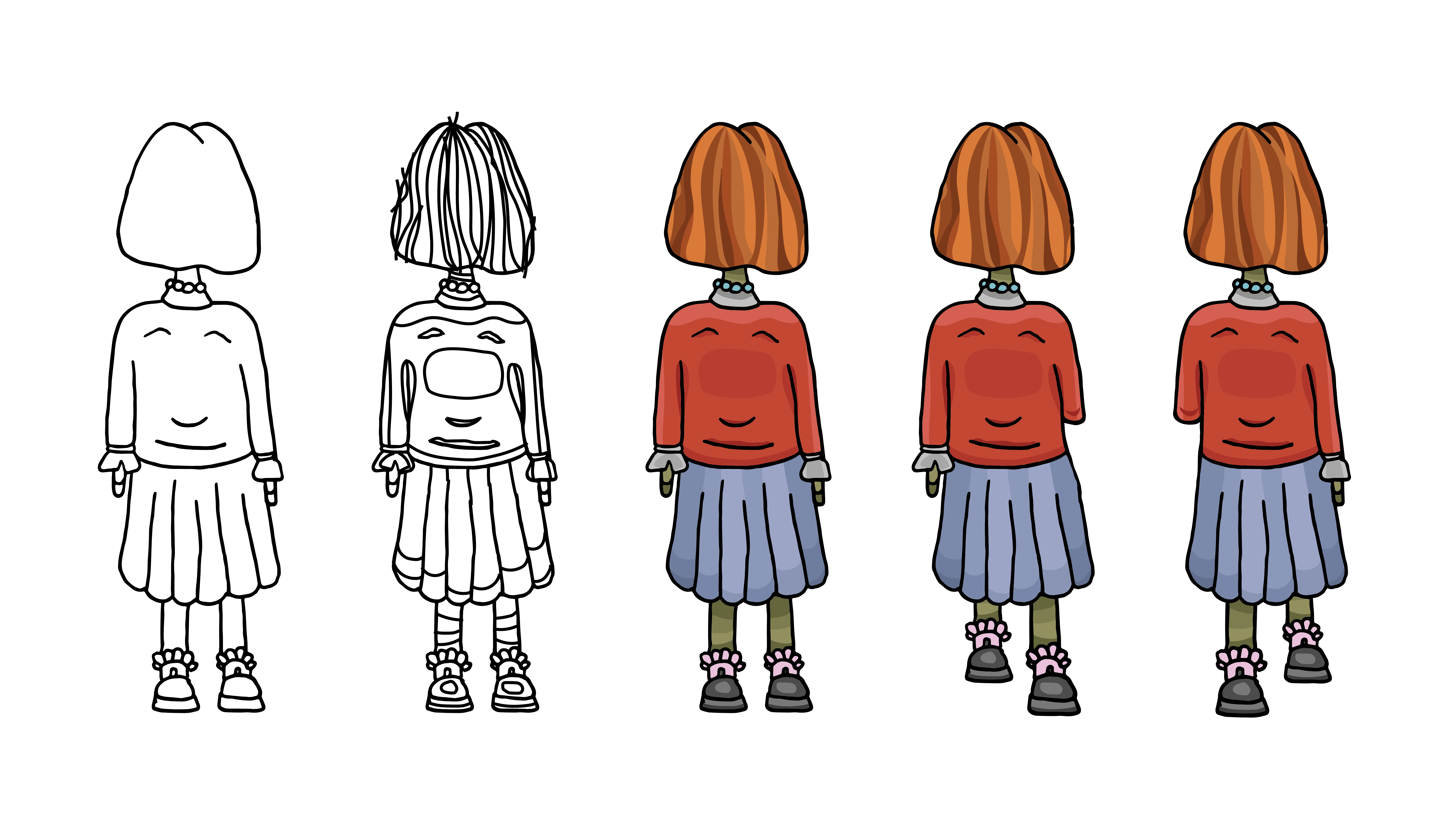

I knew I wanted to animate as part of this project so that I could visualise the written and
numerical findings from Elif’s work. Through
email exchange, I knew the project was about
hand dryers and their spread of bacterial
particles through air. So I began to draw a scene
of the animation beginning in a toilet where a girl
starts by washing her hands and then using the
hand dryer, I wanted to animate the bacteria that
can be seen microscopically on her hands once she
has used the dryer then her frightened reaction to
what the viewer had seen. This was to highlight
the lack of knowledge surrounding the use of
hand dryers and to communicate the shortcoming
of its use.
I continued to animate, in total making a collection of 4 animations. My work was inspired by two different artists: Len Lye and Howardena Pindell.
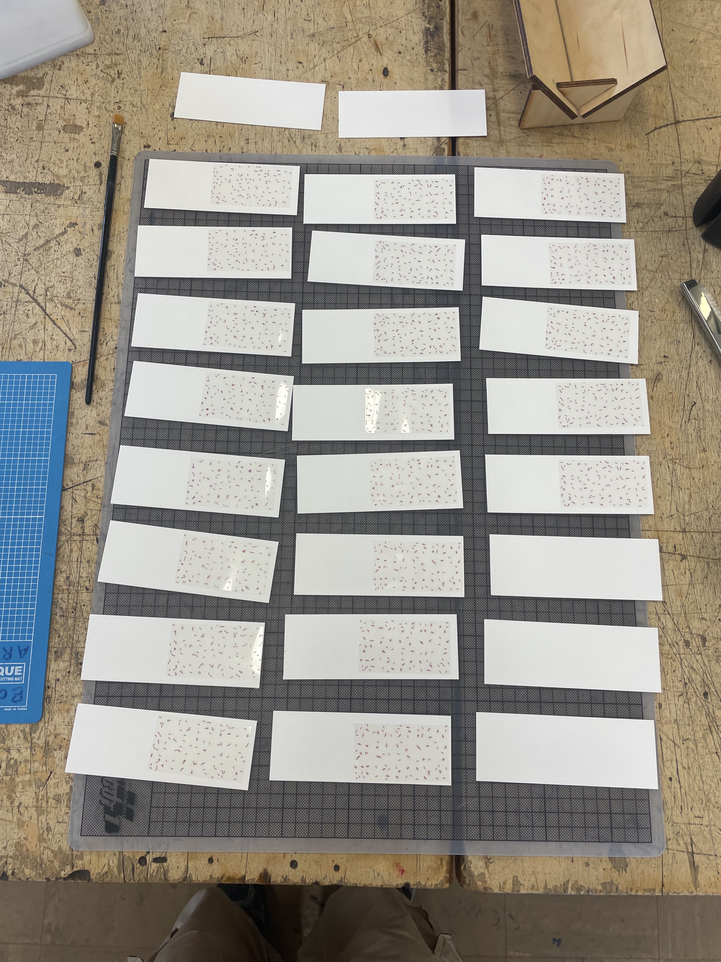
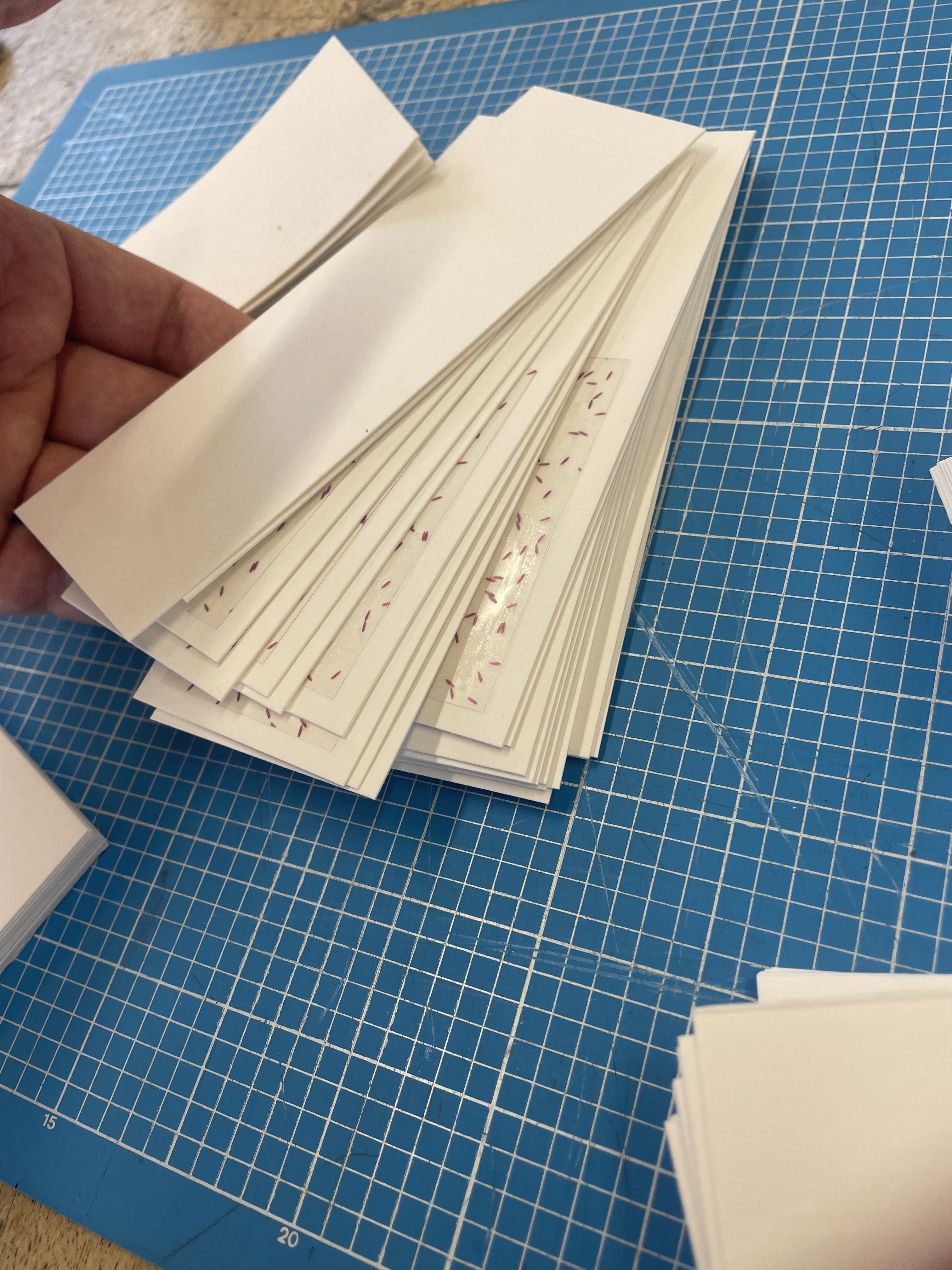
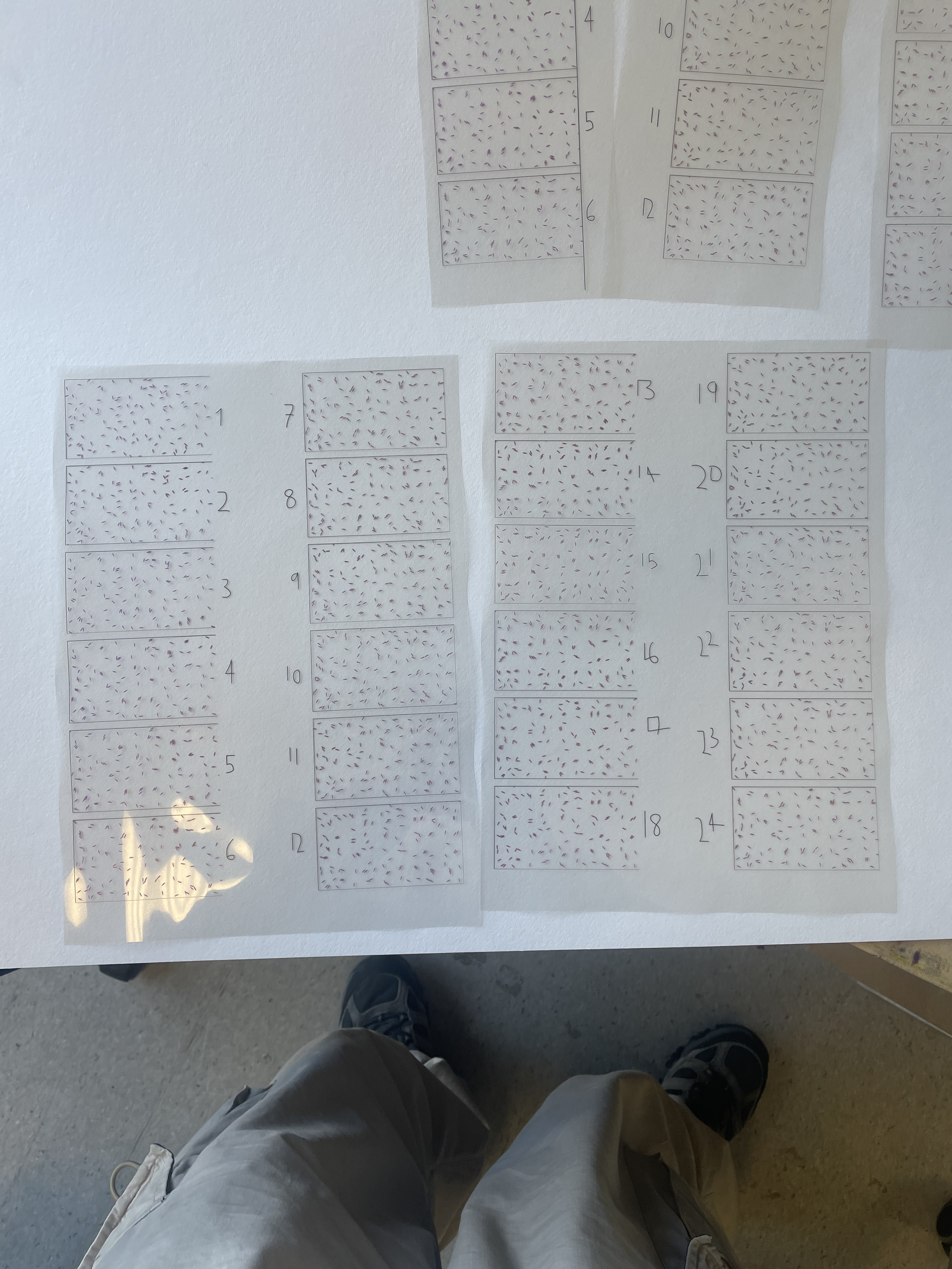
Following the decision to make a collection of items, I wanted to try and create a better designed more clean flip book presenting one of my animations. I chose to use the same animation but change the colours and printing method before making the book. I chose to just have a purple colour for the bacteria and have them printed onto acetate. I decided this because I wanted to replicate the colour of the solution used to see the bacteria on the slides on a microscope, also as it looks like the glass slides used on microscopes.
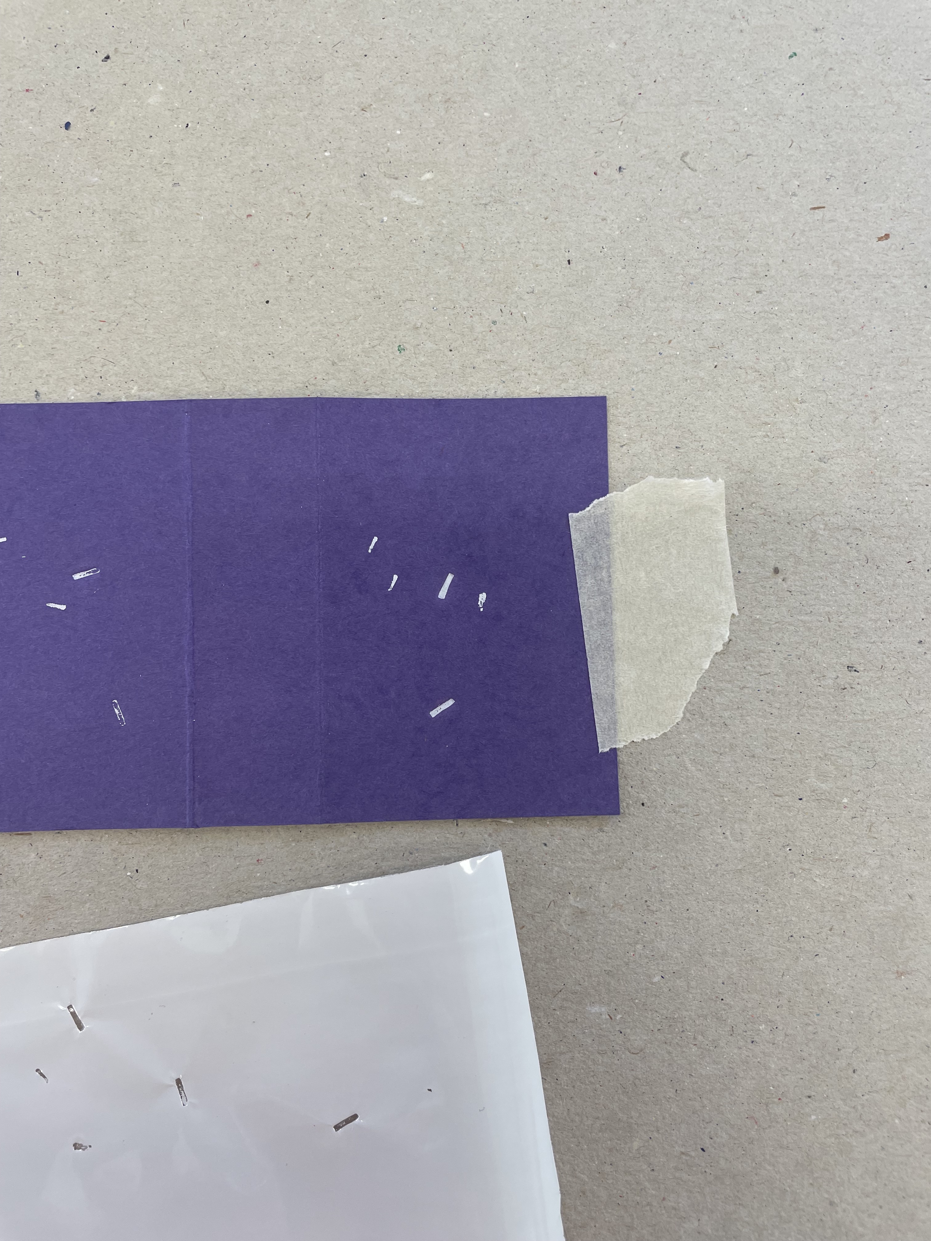
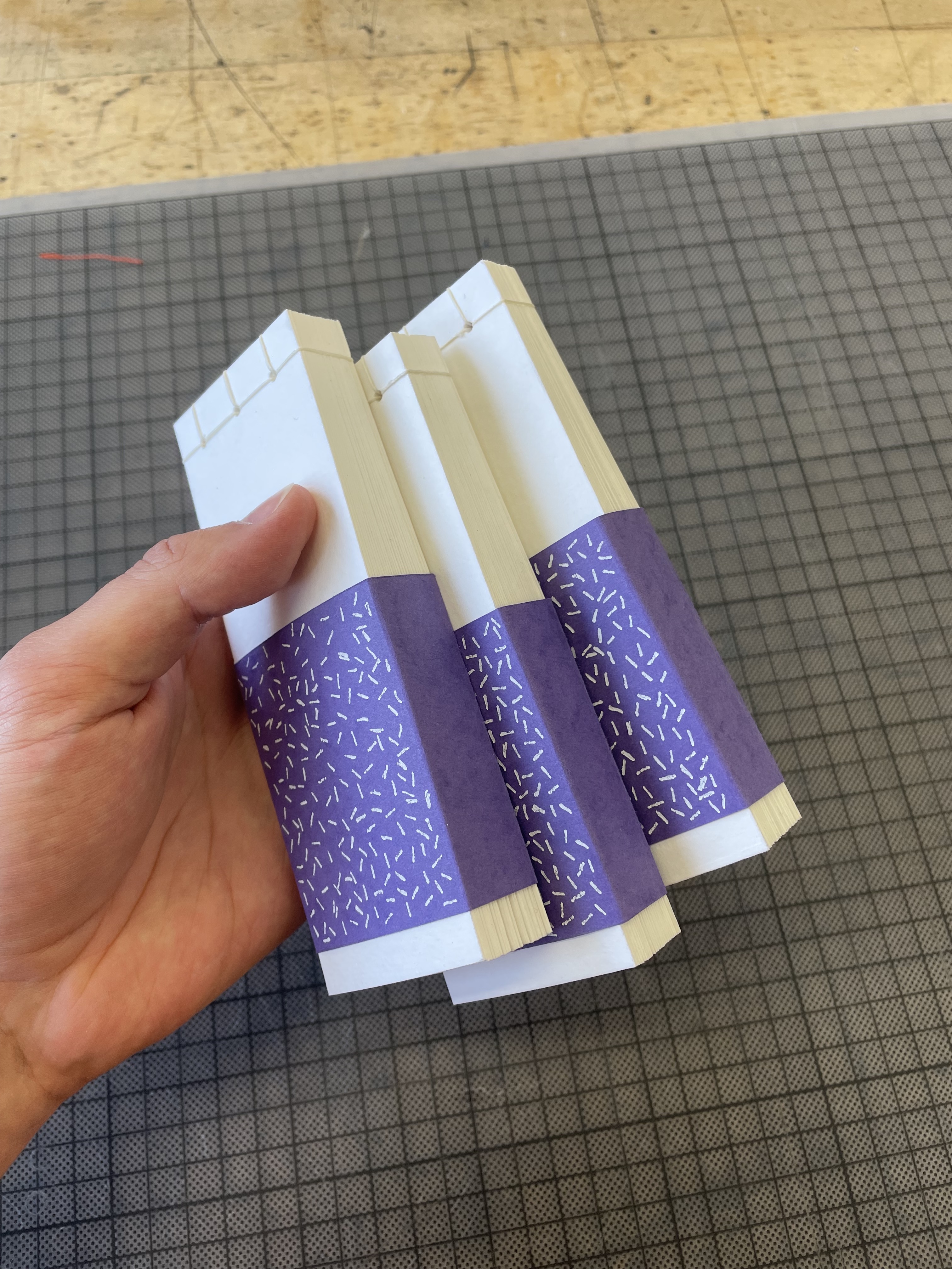
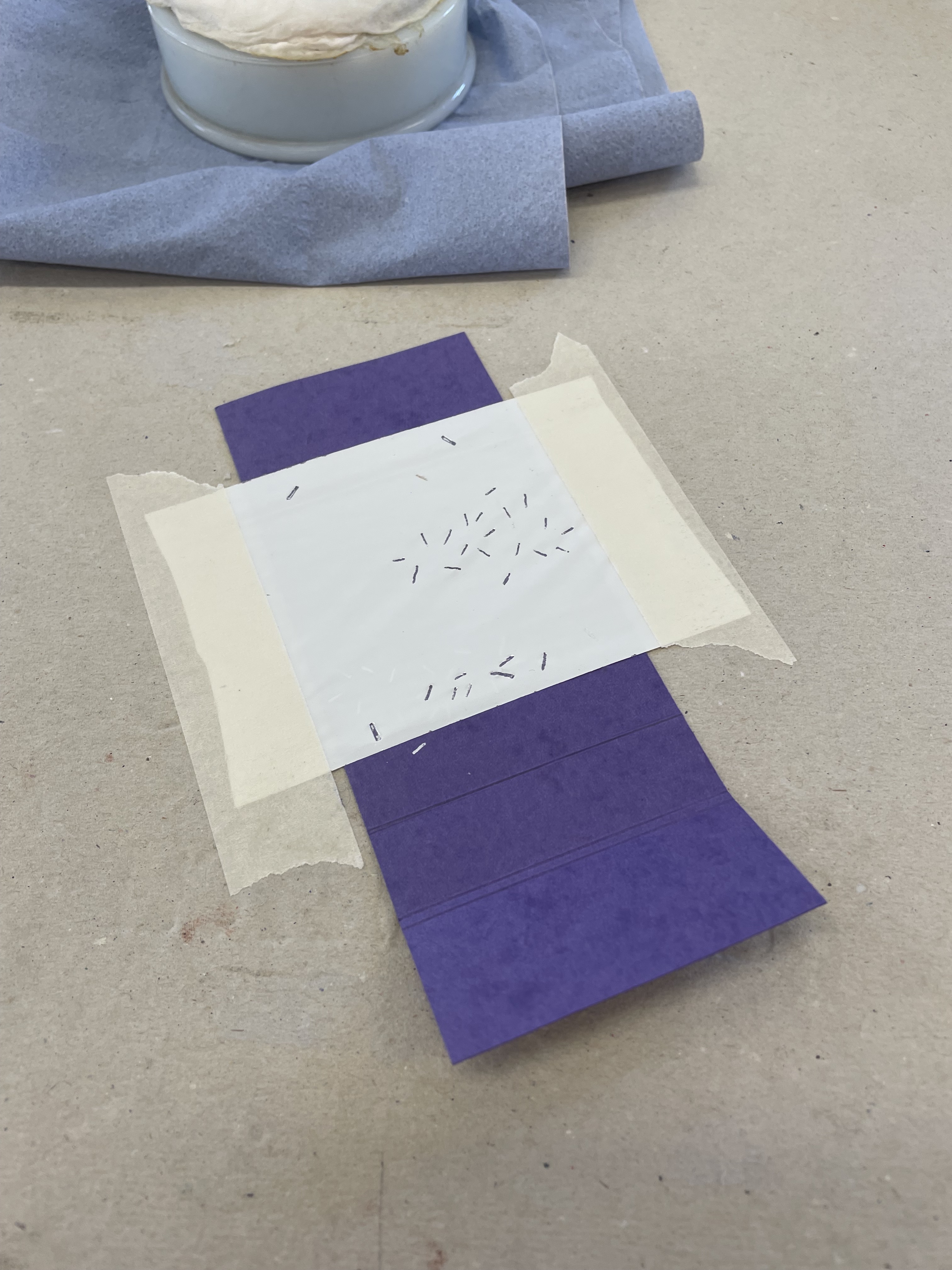
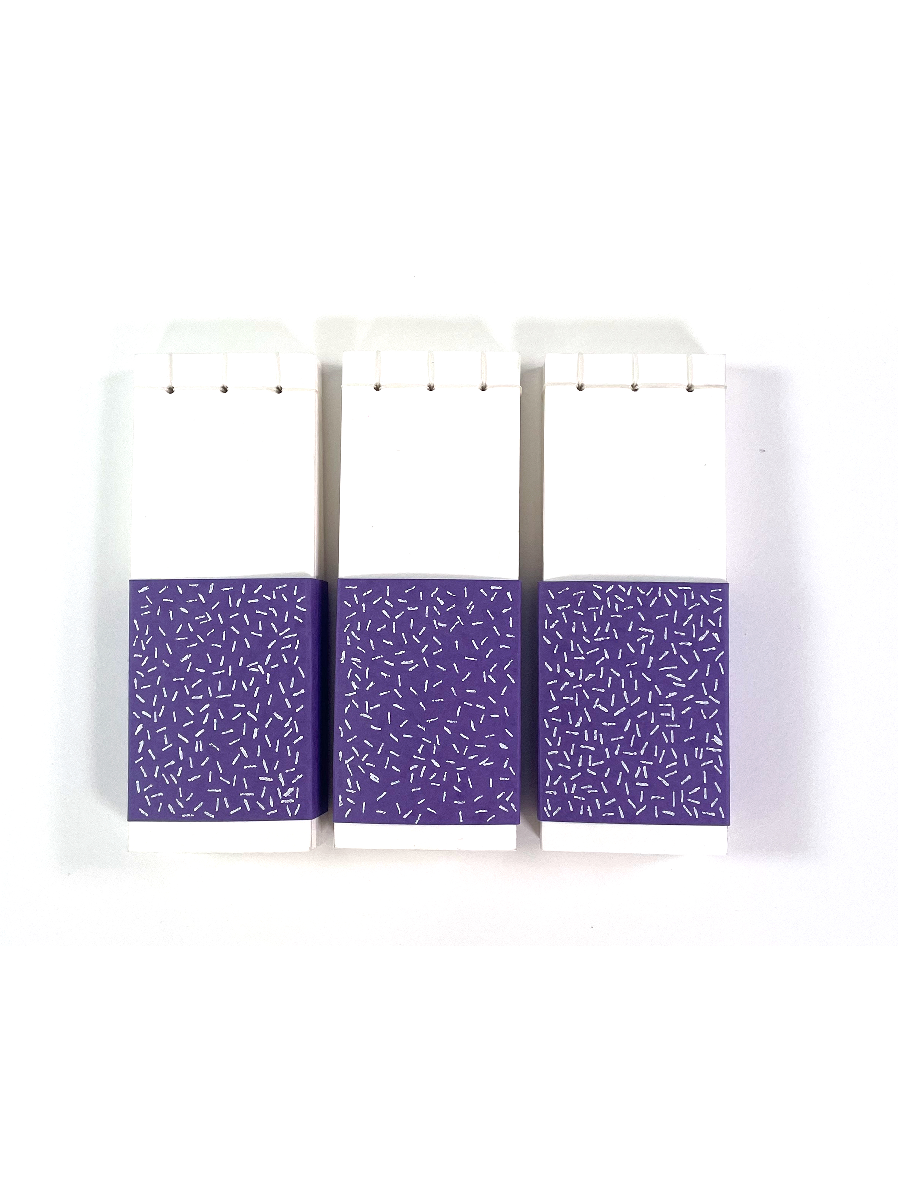
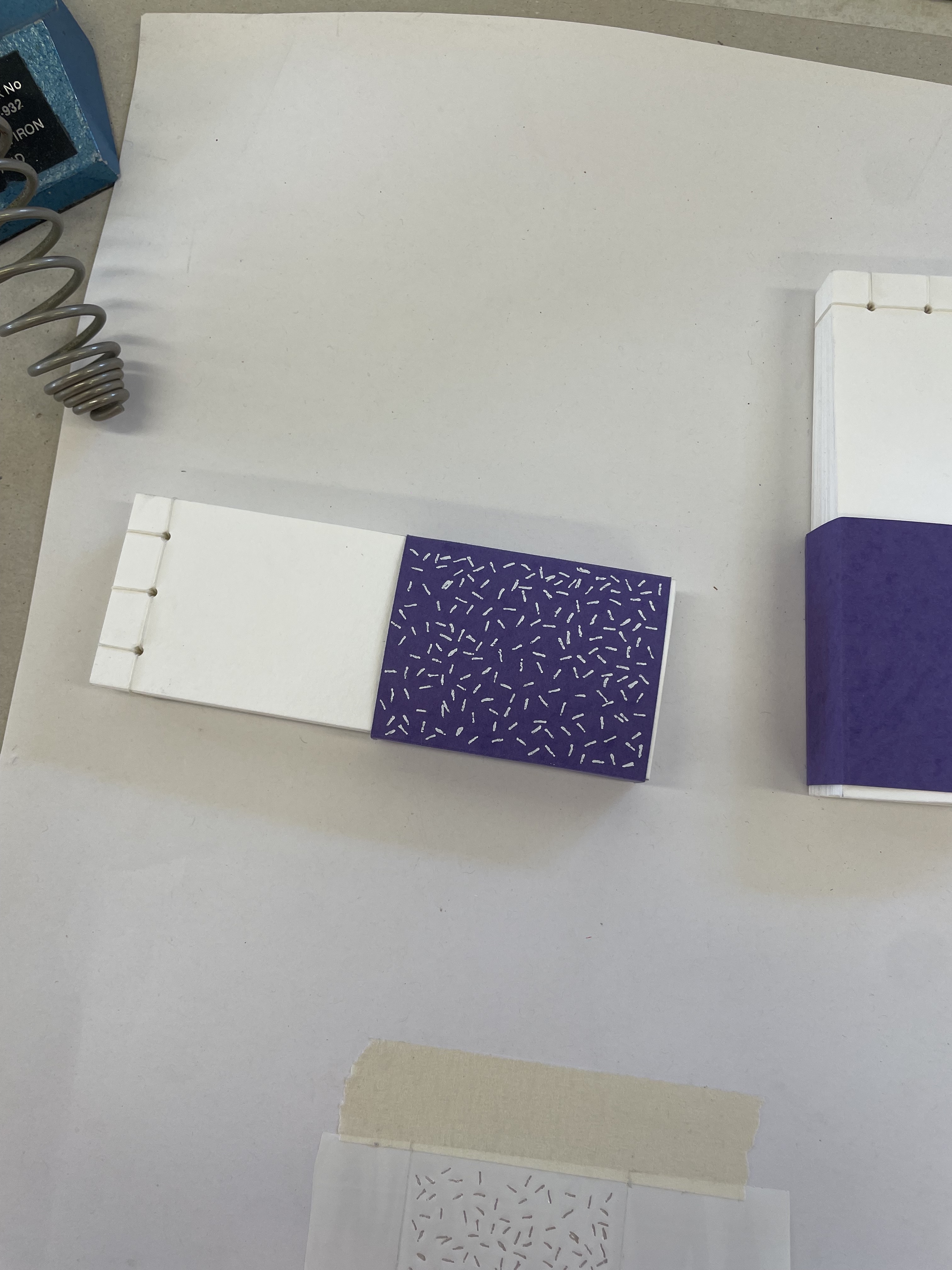
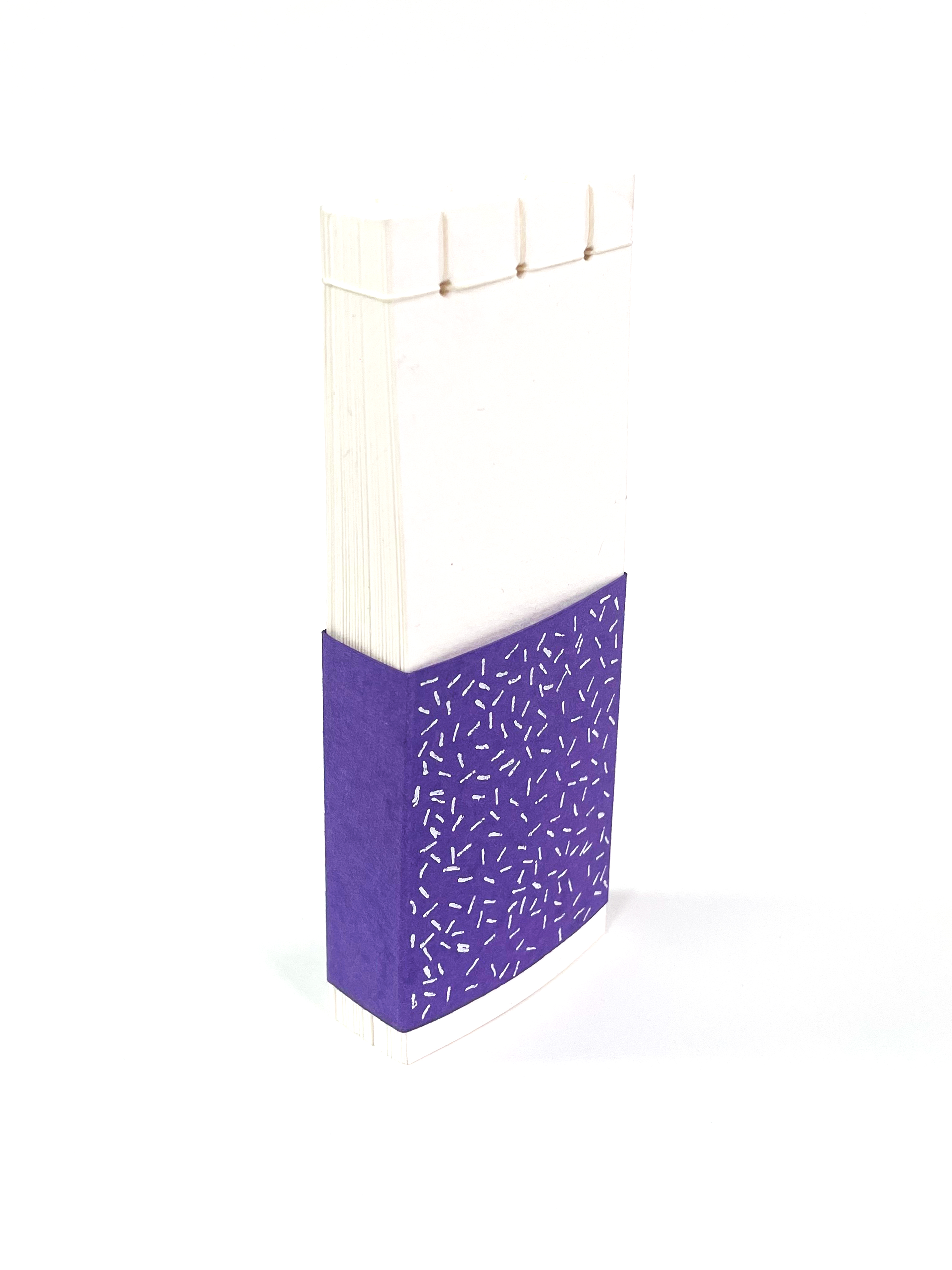
After making the covers I realised they looked a little plain and a bit too neat. I wanted them to reflect the animation inside, with the same chaoticness of the bacteria. So I chose to use white foil and a hot pen tool to mark the slip case with bacterial looking shapes and lines. It took a few tries but I think those times the pen just wasn’t hot enough.
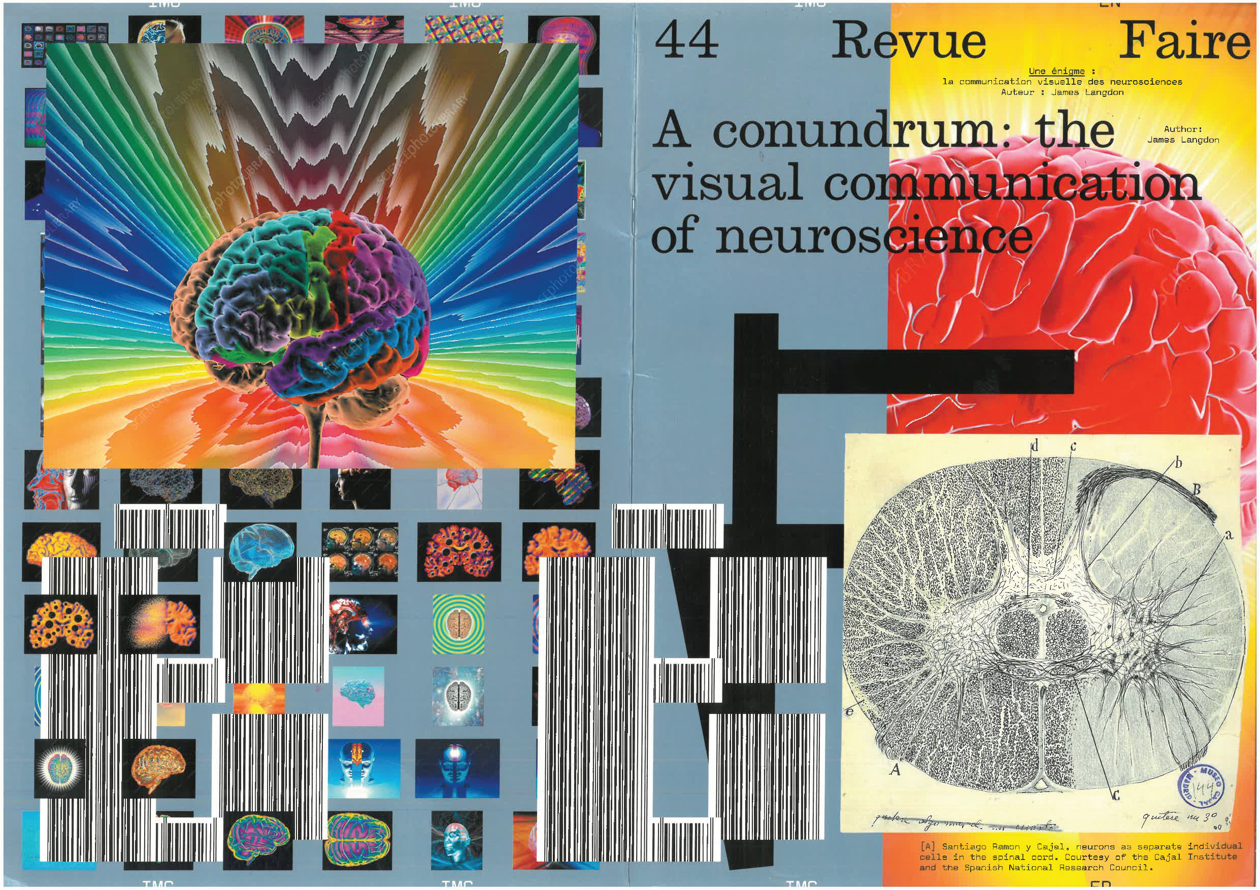
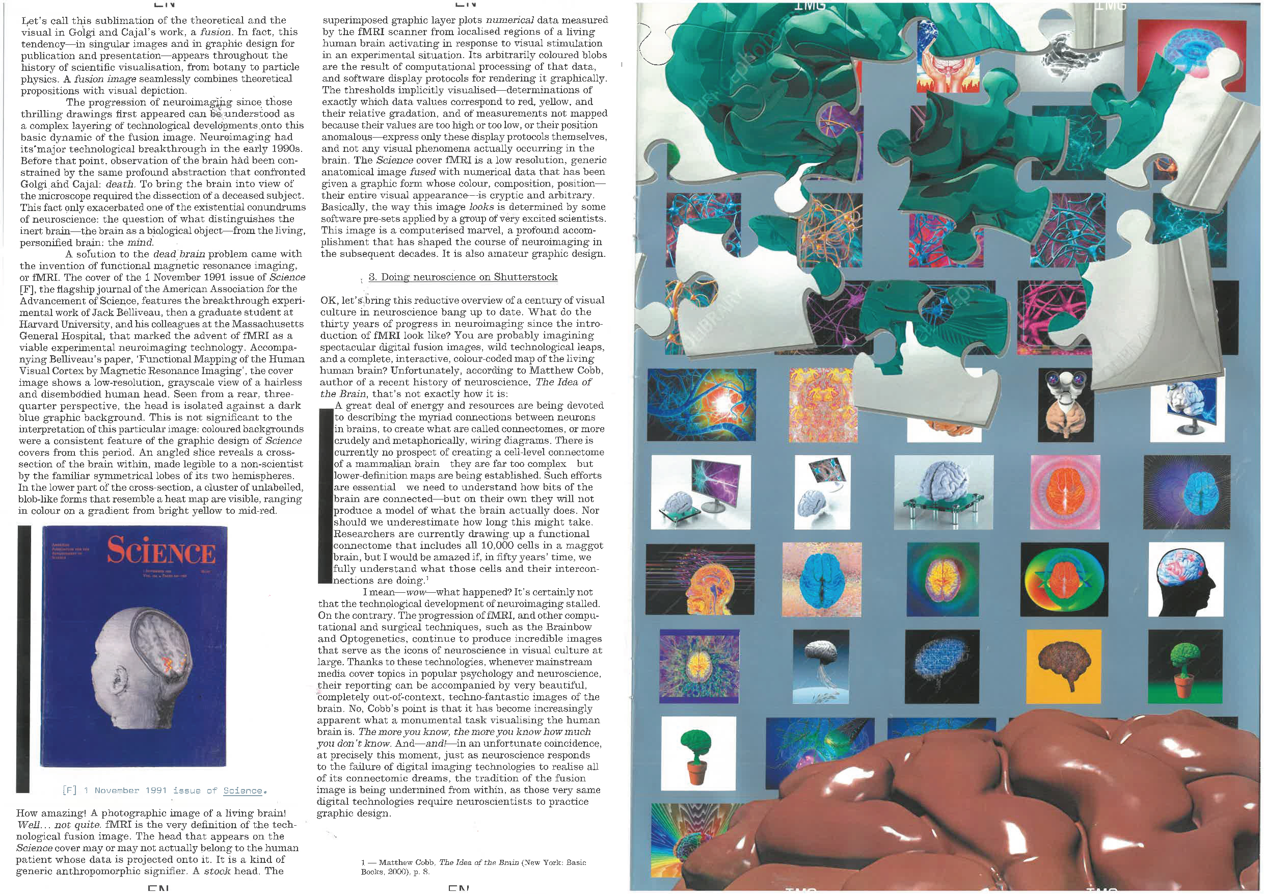

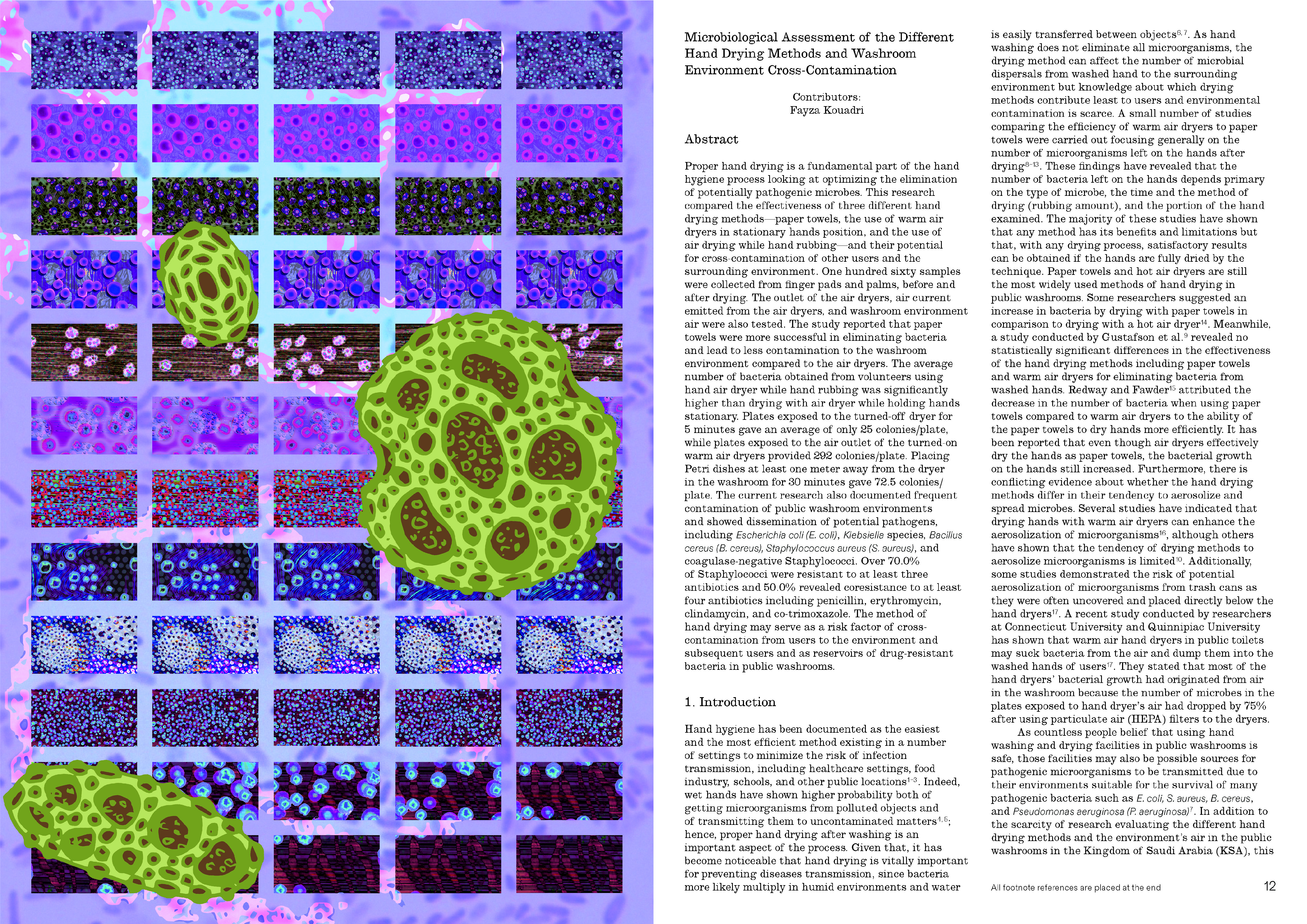
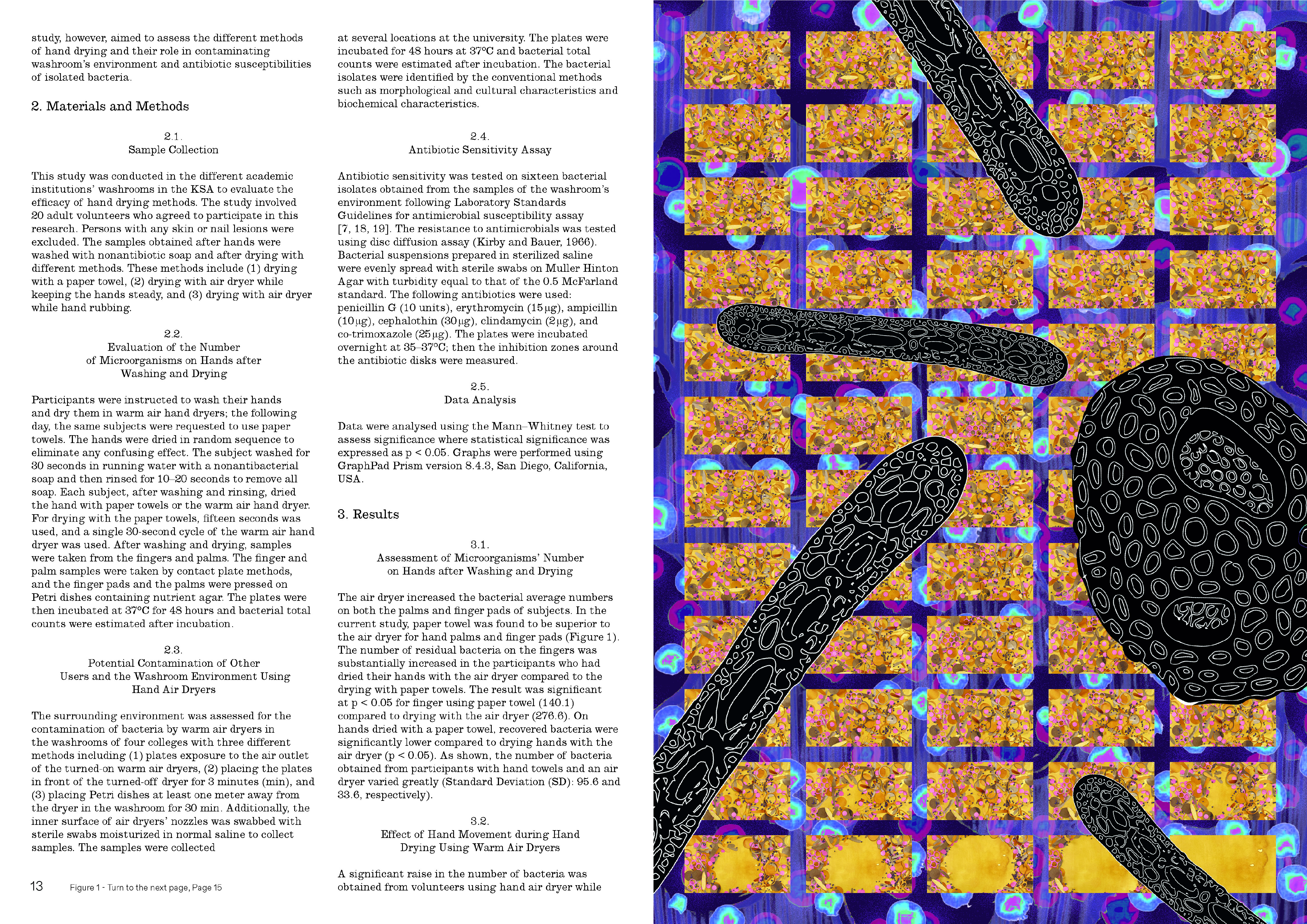
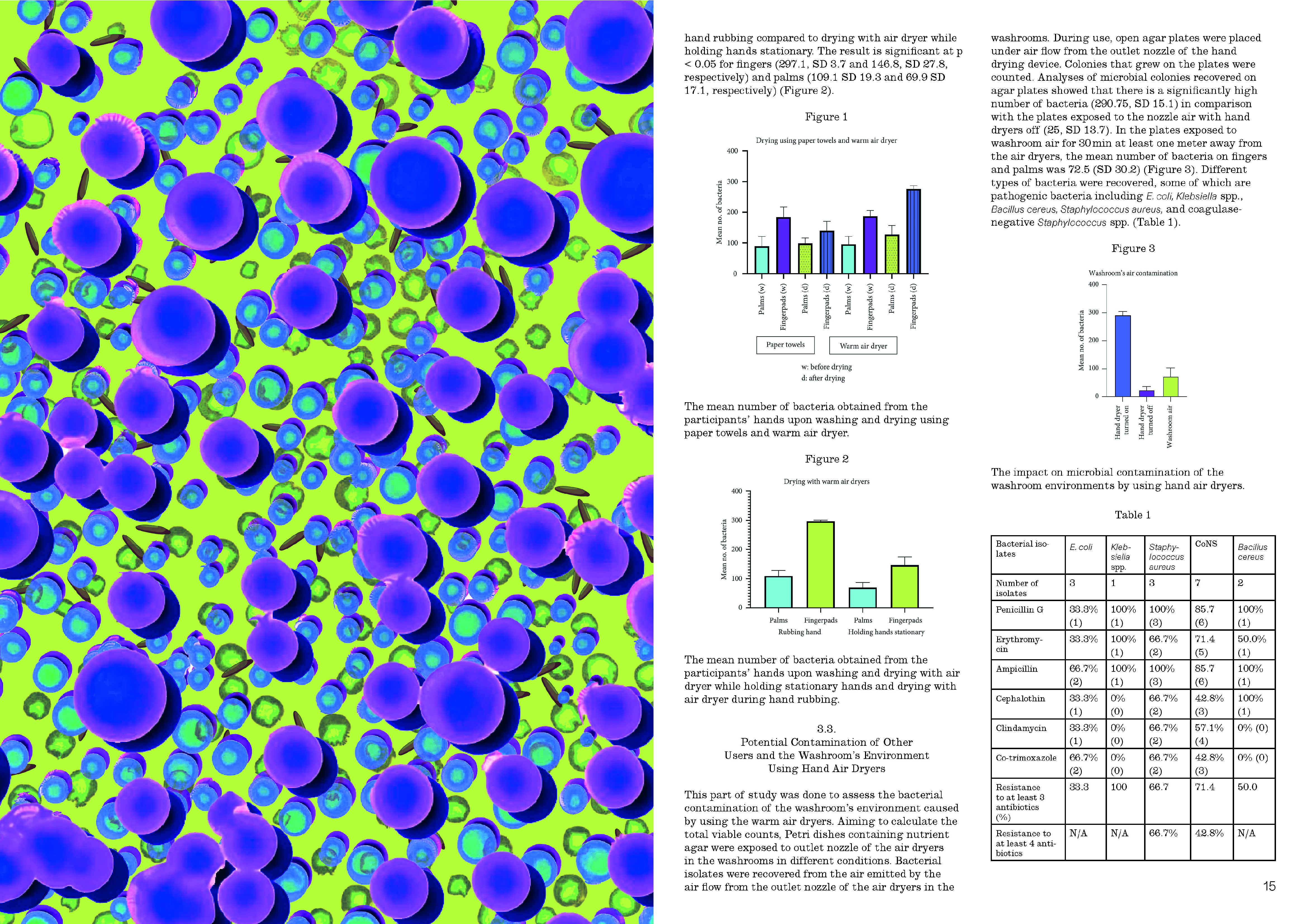
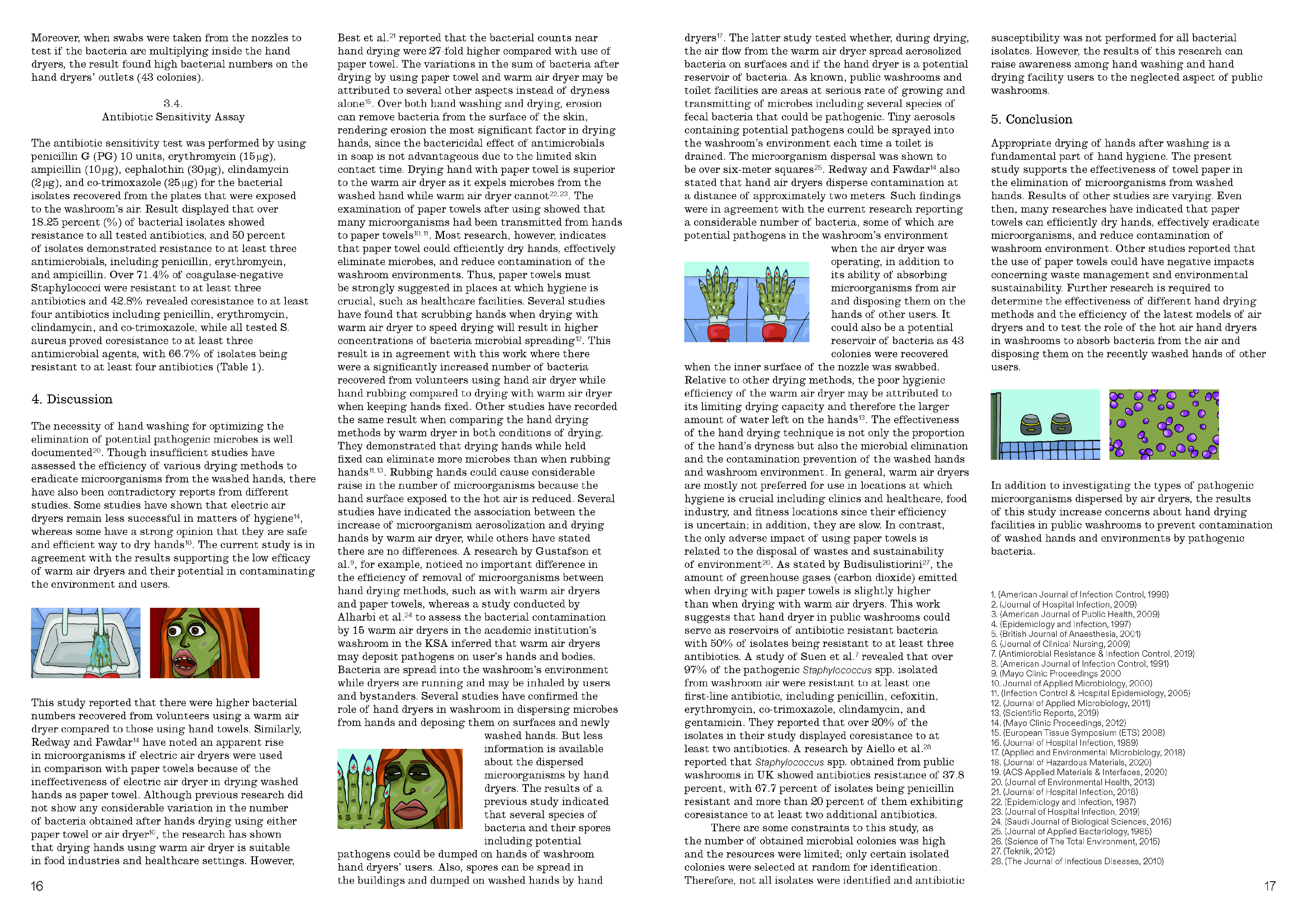
To see all of the pages of the magazine publication click the images above.
I then arrived at the point where I had to start researching for inspiration for my magazine I was going to make to go alongside the animations and flip book. I found a publication designed by James Langdon, called Revue Faire. This magazine has had 45 release over the last 6 years. I will be looking at the 44th specifically, the publication talks on the visual communication of neuroscience, relating not only to my subject area but also has some design rules that would suit my document perfectly. This includes the way that small images have been laid out across the pages. I also knew I wanted my document to highlight the duality of ‘Jolie Laide’. I thought that the design of having a very clean sleek design for the text and then a busy layered colourful page next to each other highlighted that duality I was looking for. I started to note some of the design cues from the magazine so that I could start mocking up what I wanted my document to look like. I was also inspired by graphic books, ‘Designers against Corona Virus’, ‘Migrant Journal’ and ‘Can Graphic Design Save Your Life’.
For the text inside the magazine I chose to use two articles that were supplied to me by Elif Erdem. Click here and here to be sent to each academic piece of writing.
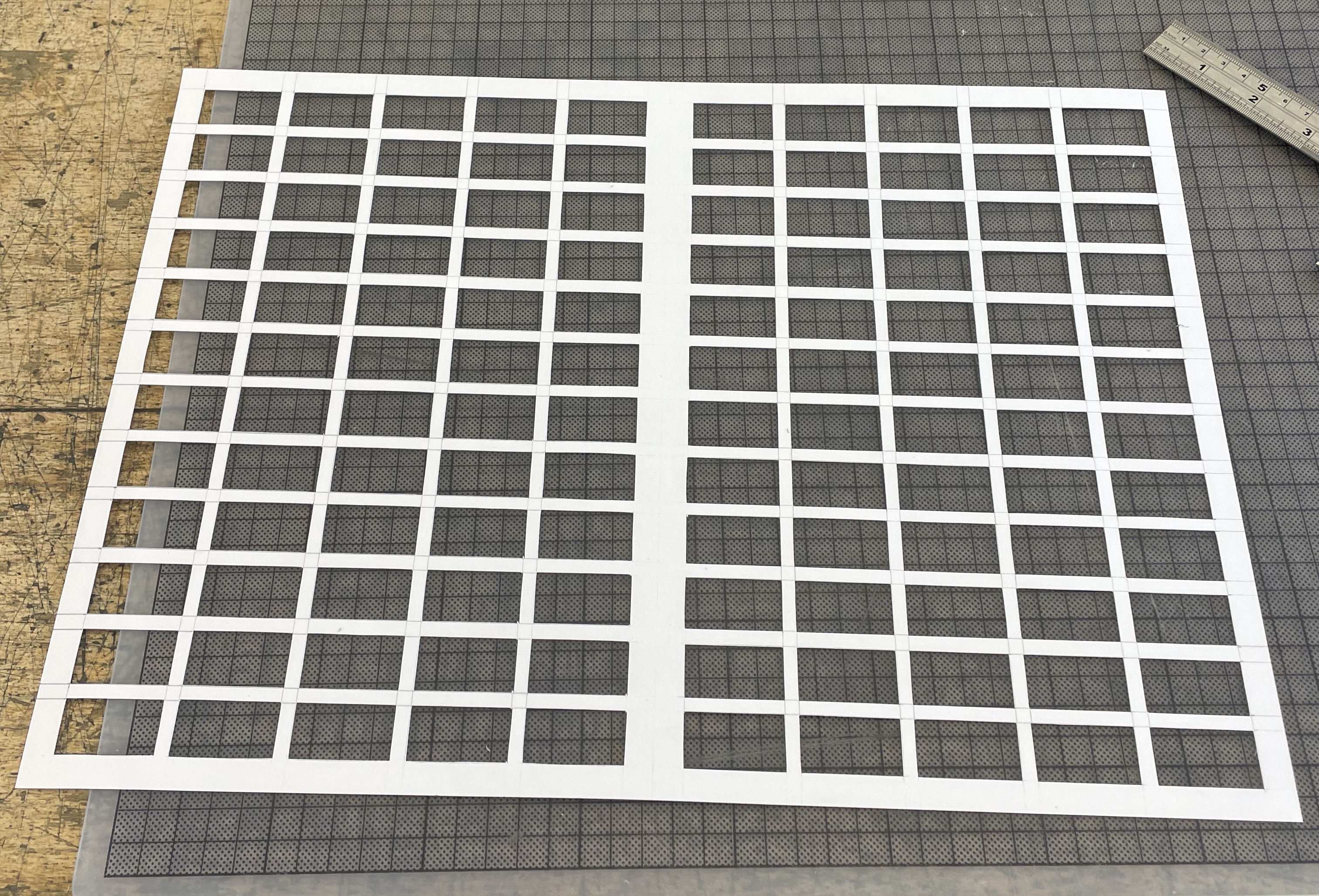
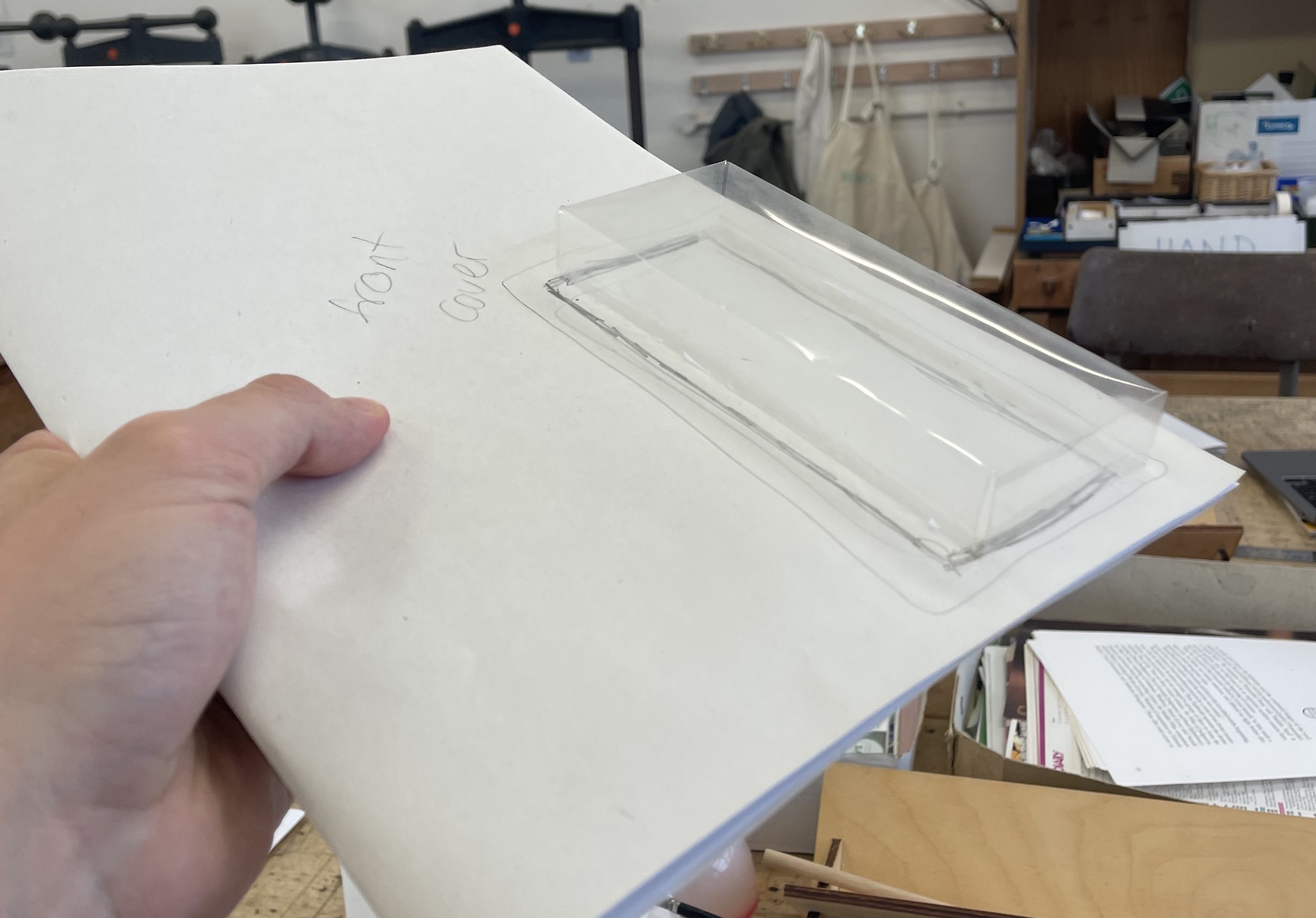
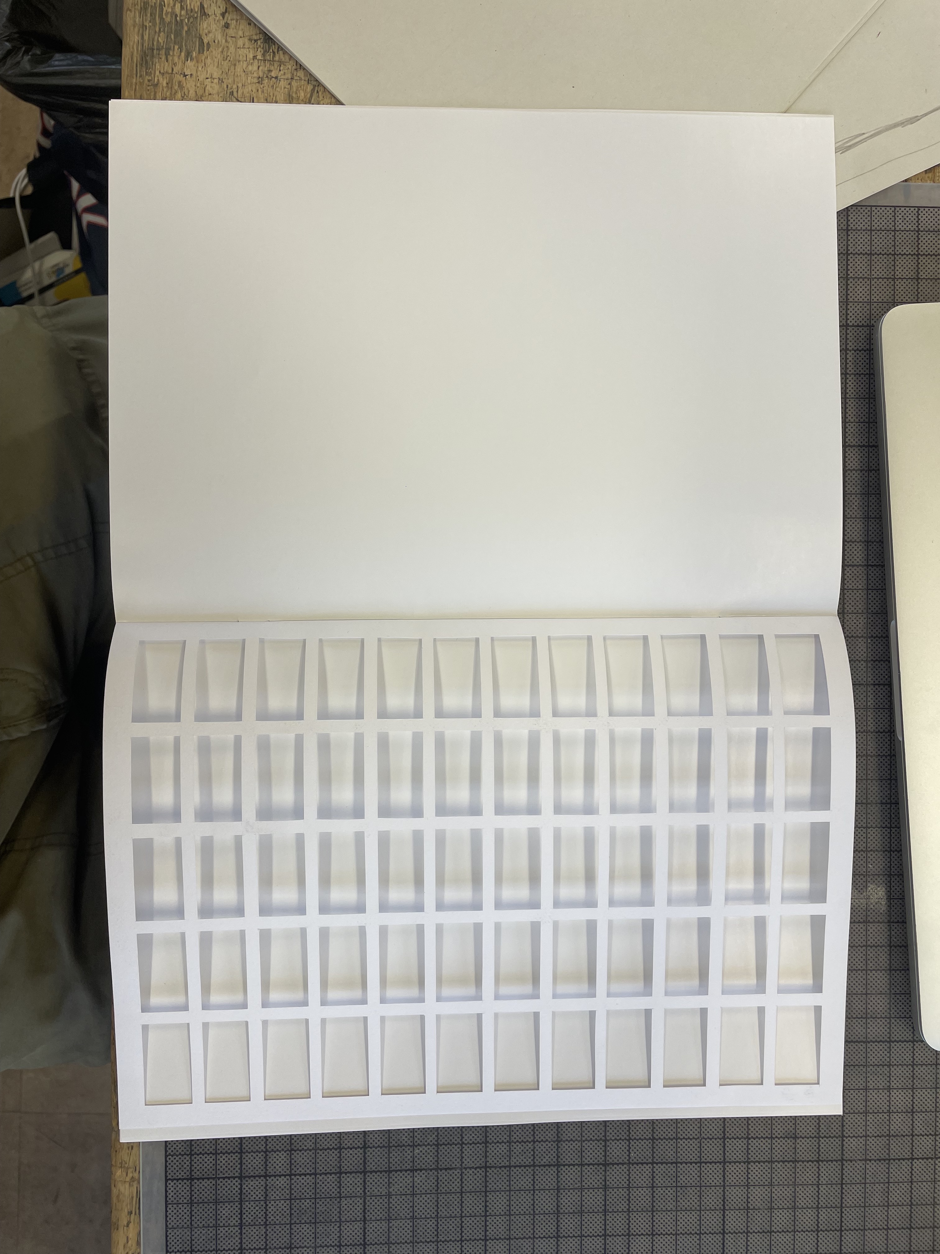
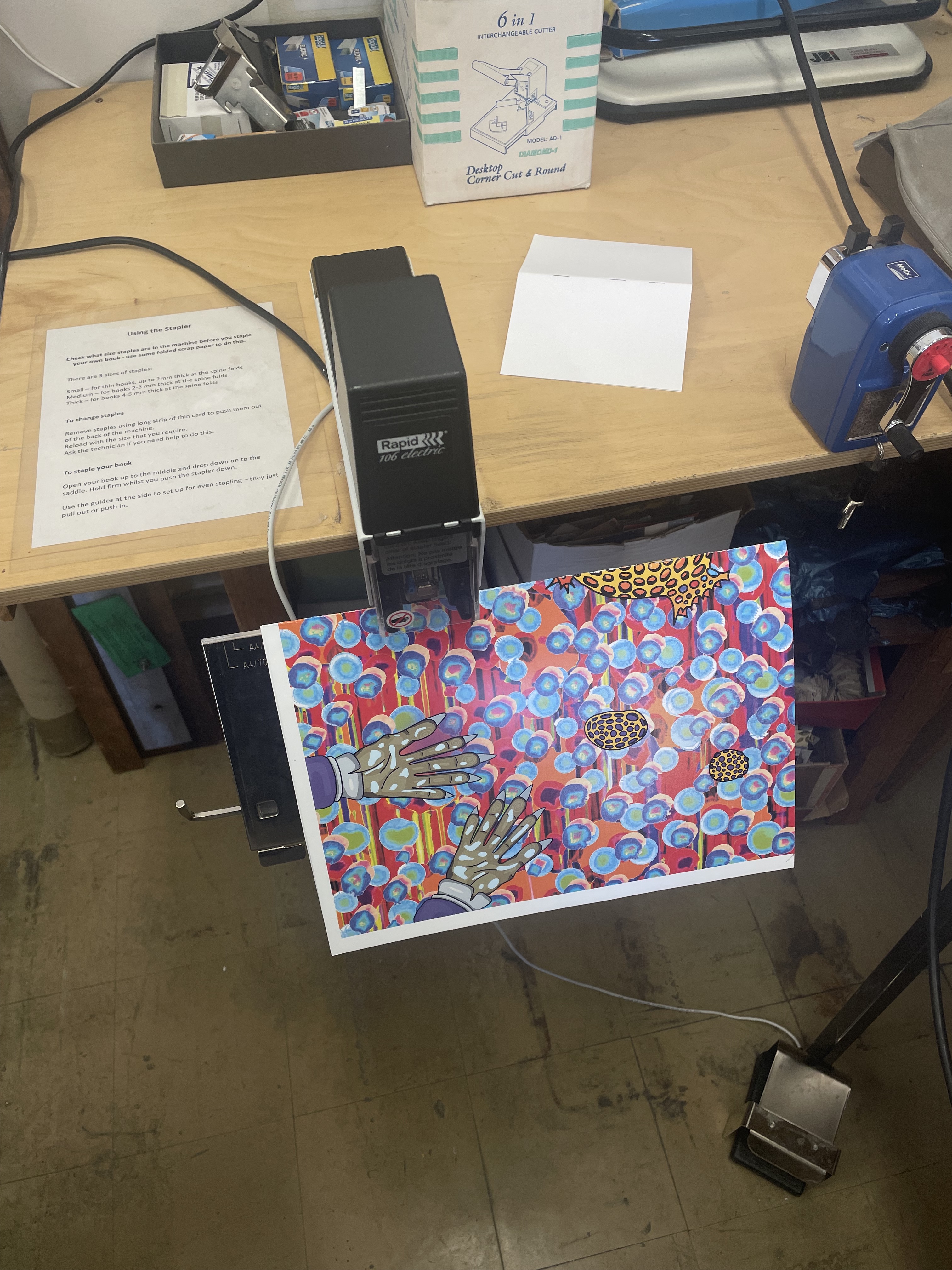
I then made a mock magazine with blank pages to try out paper stocks. I went with 300gsm galleryart gloss for the front and back cover and 130gsm of the same for the inside pages. I also knew from looking at other science magazines that they are usually staple bound, so I knew from this process that the inside pages could not be any thicker, as the staples wouldn’t be able to puncture through. I also realised that I wanted to incorporate some riso printing as I thought it showed the colour from the images, from the lab, so well. I chose to add a piece of cartridge paper to the book to symbolise the riso prints, and added it to where the frames would be placed in the book. I wanted the viewer to be able to see the frames through the print.
I then chose my font - New Clarendon MT Std, and started to have reviews to refine the text layout design.
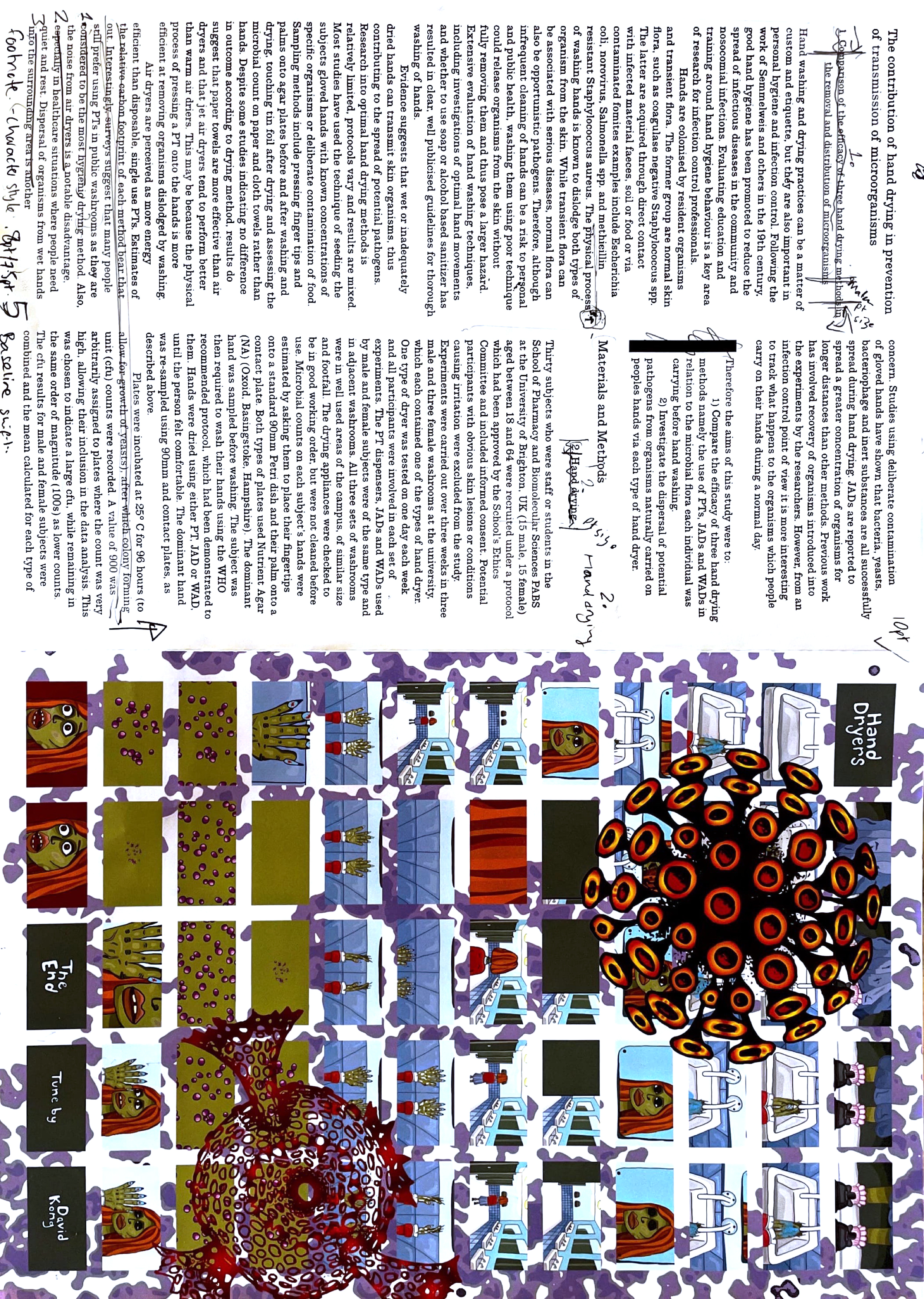
I also finished and coloured all of my initial drawings. I added them to the frame pages of the magazine.

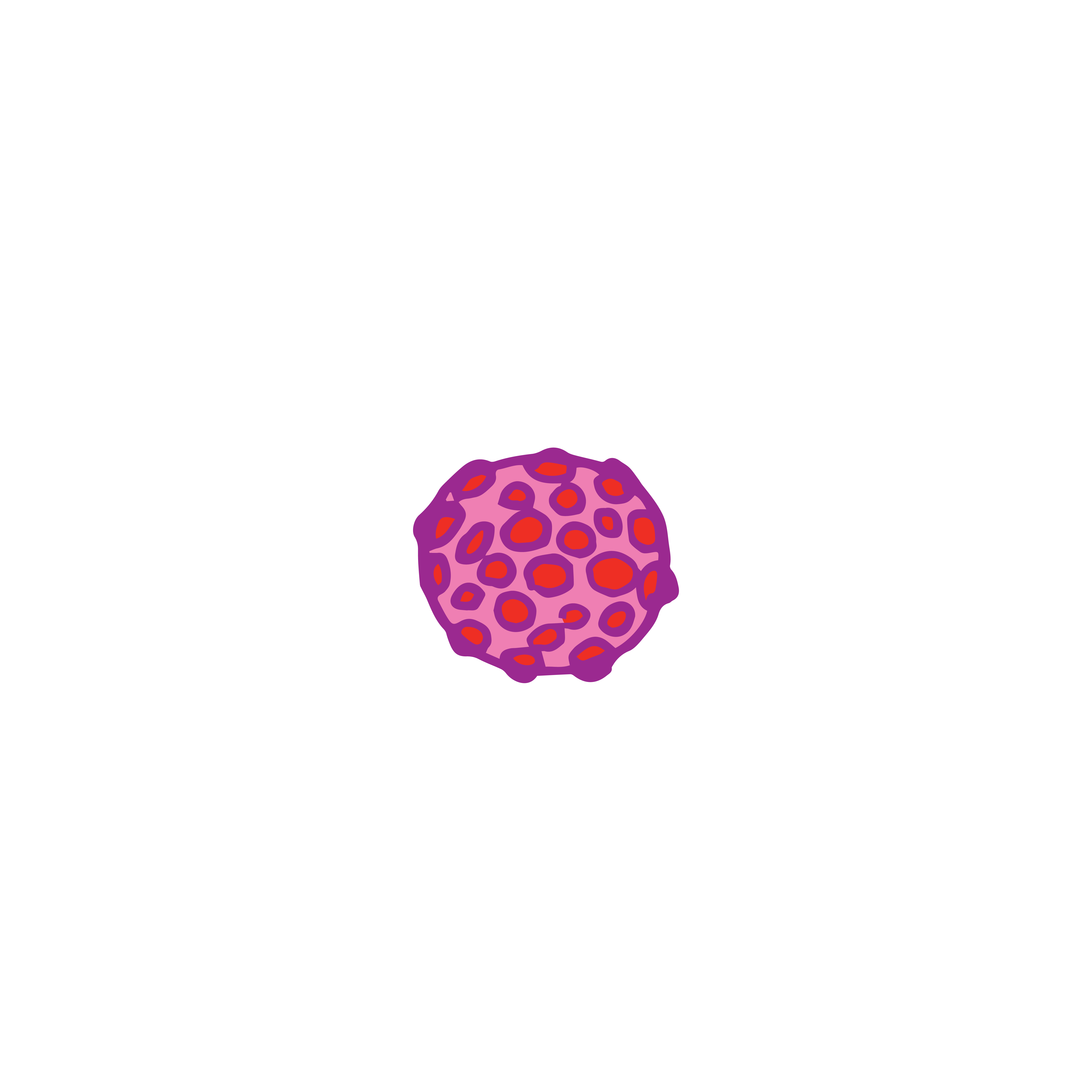
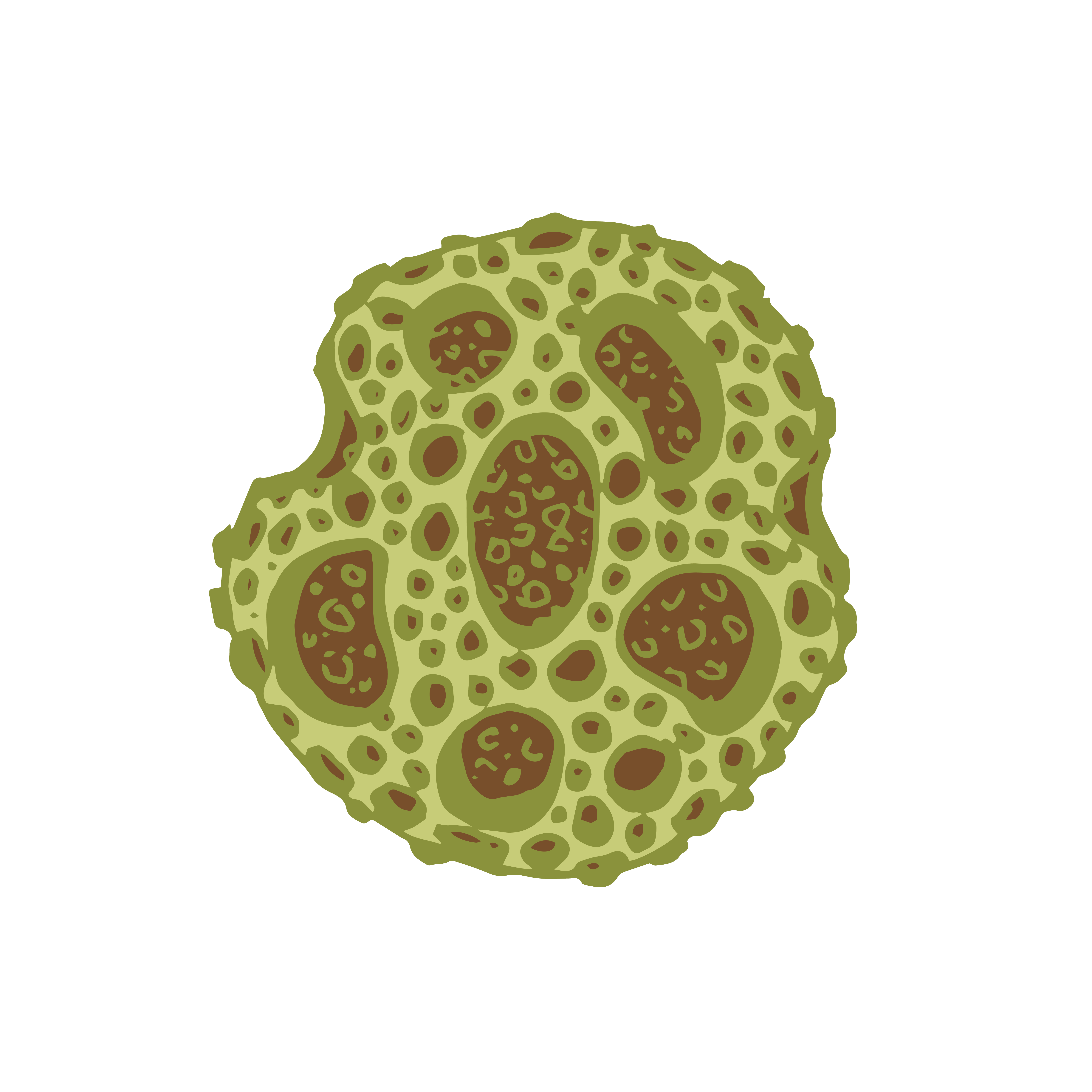


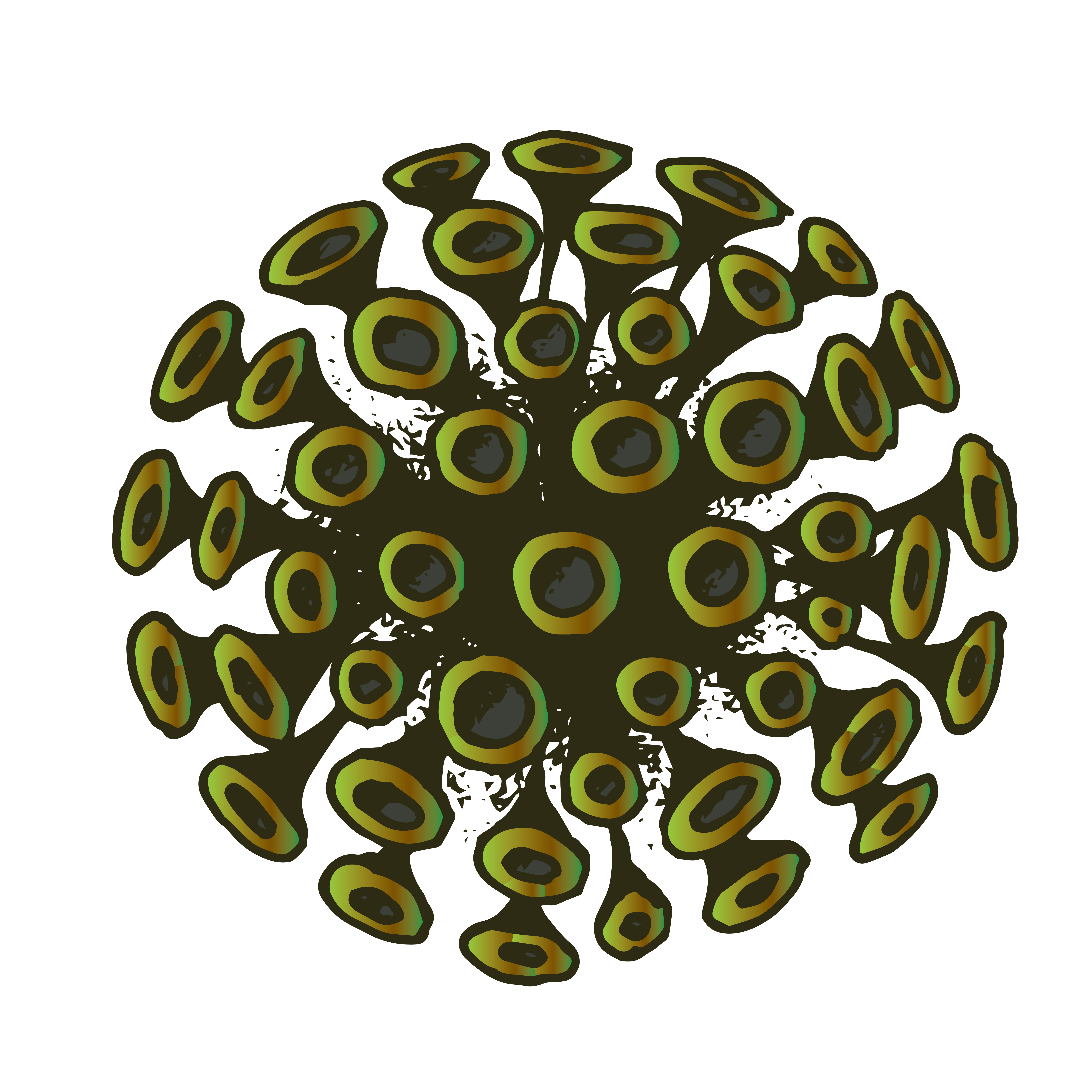
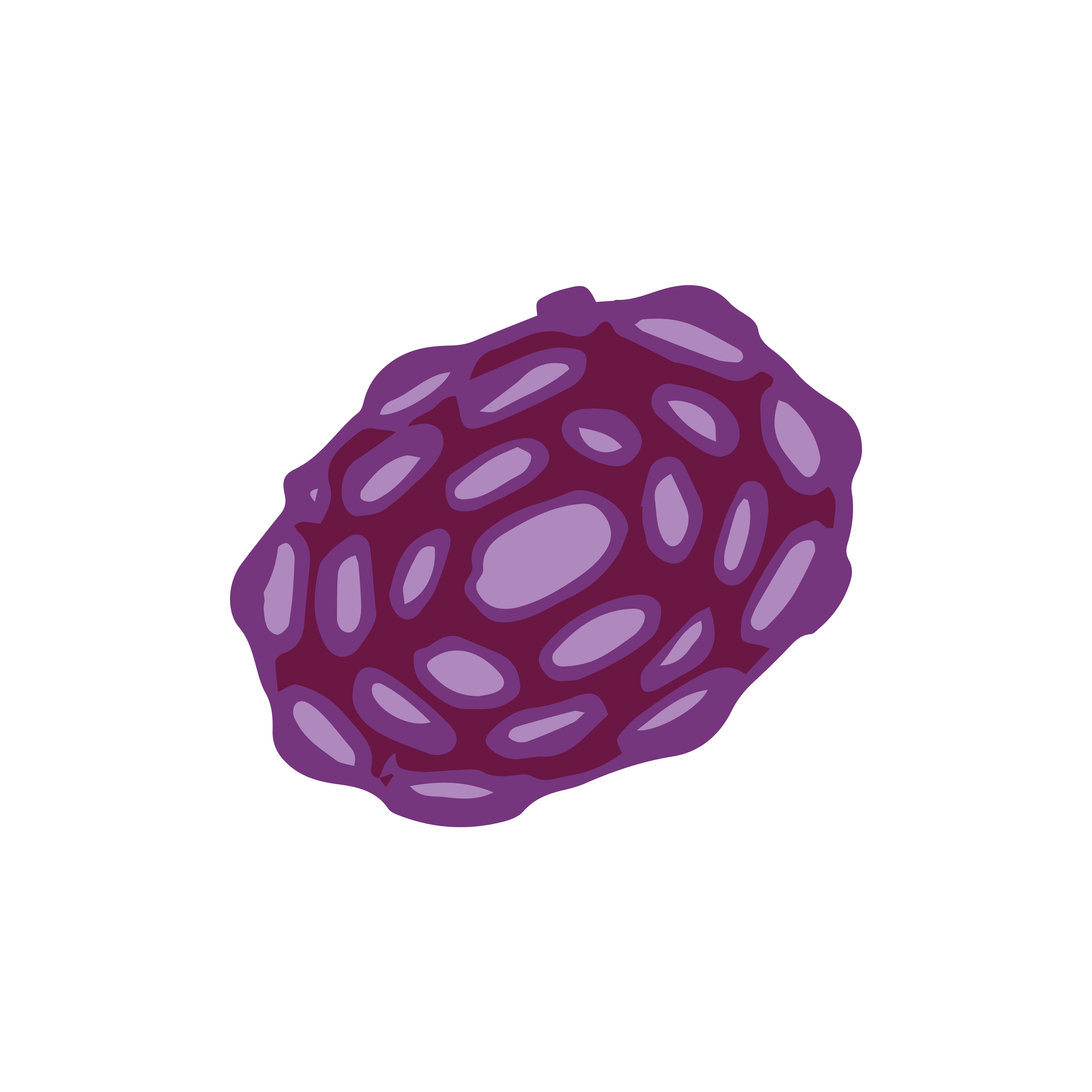

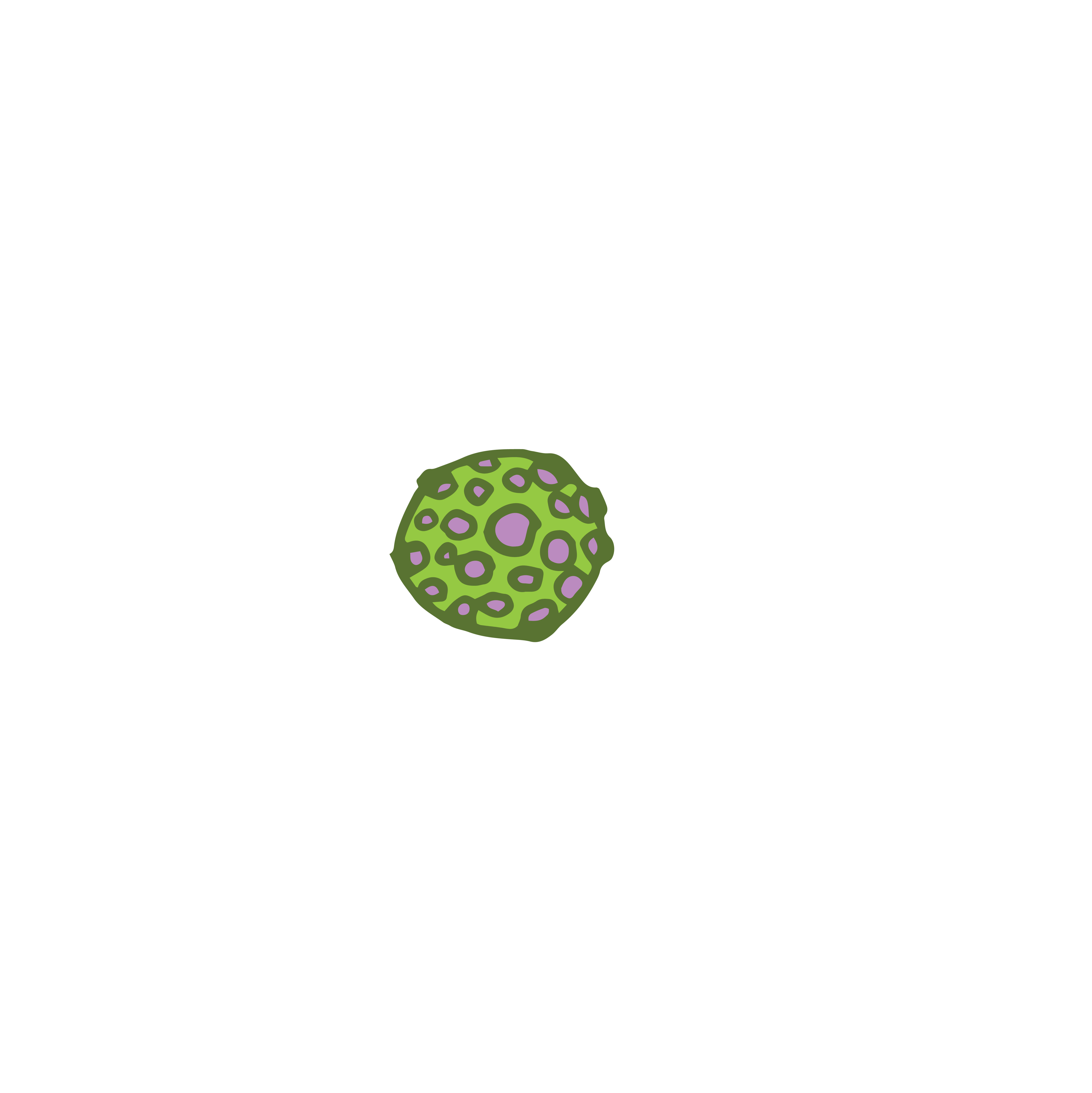


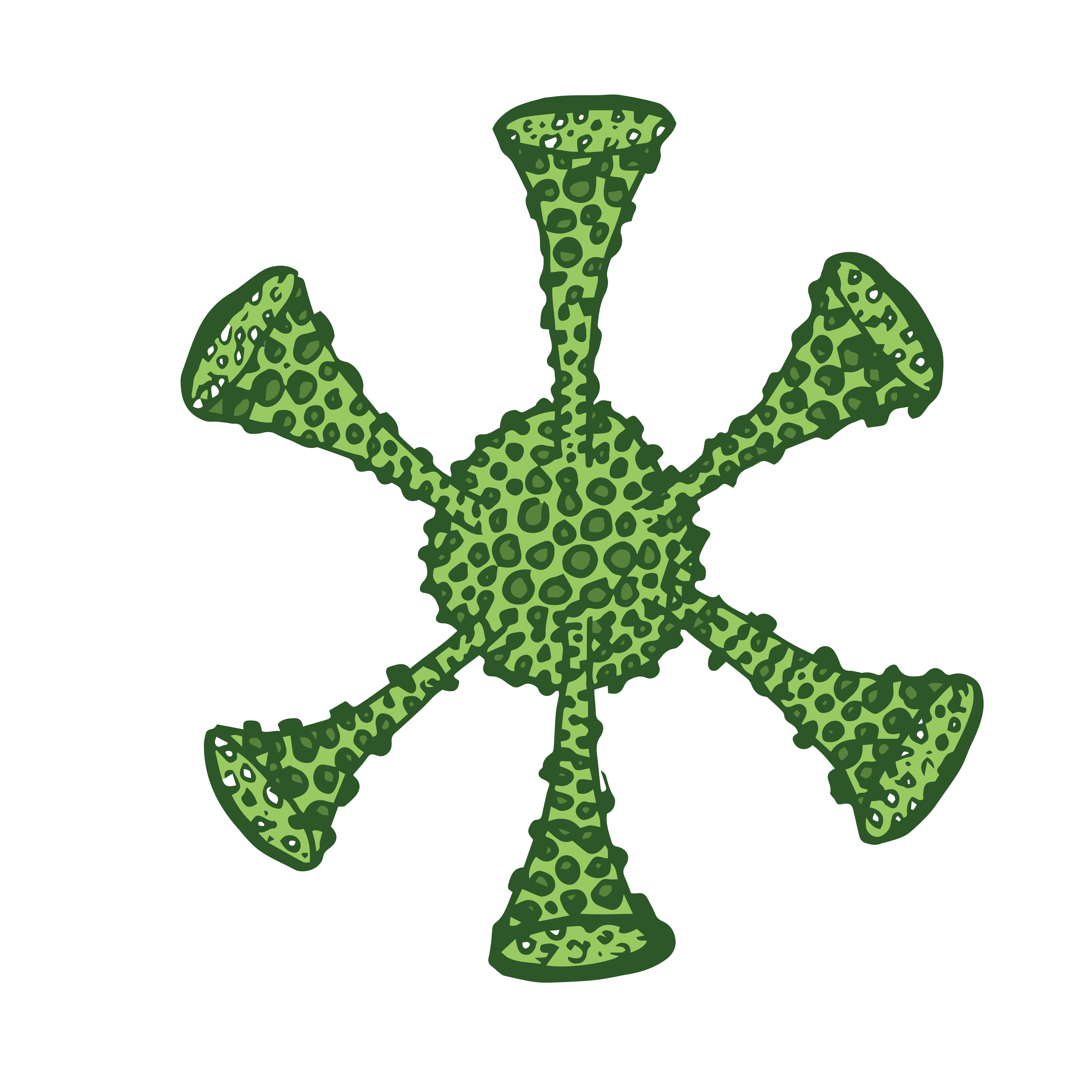
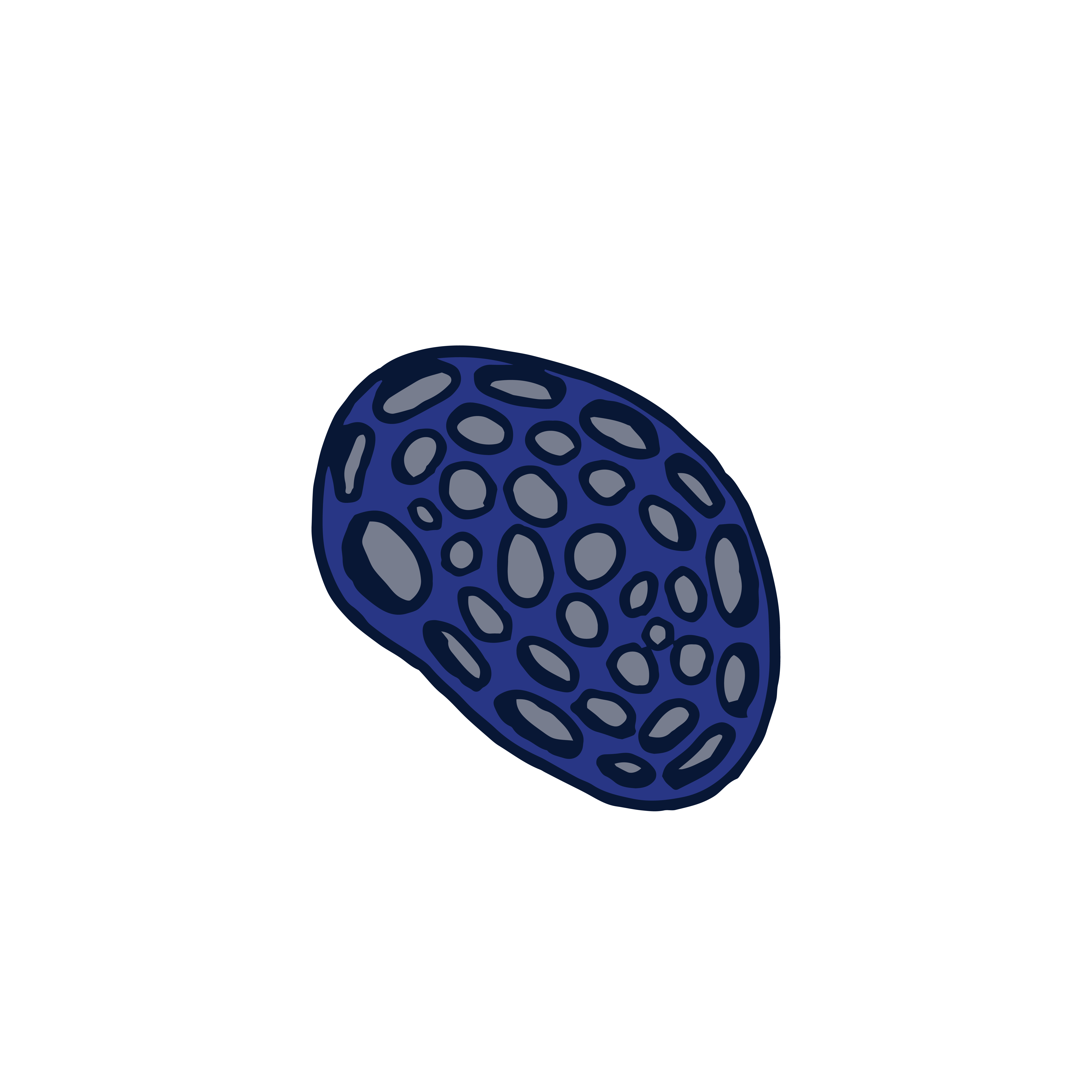
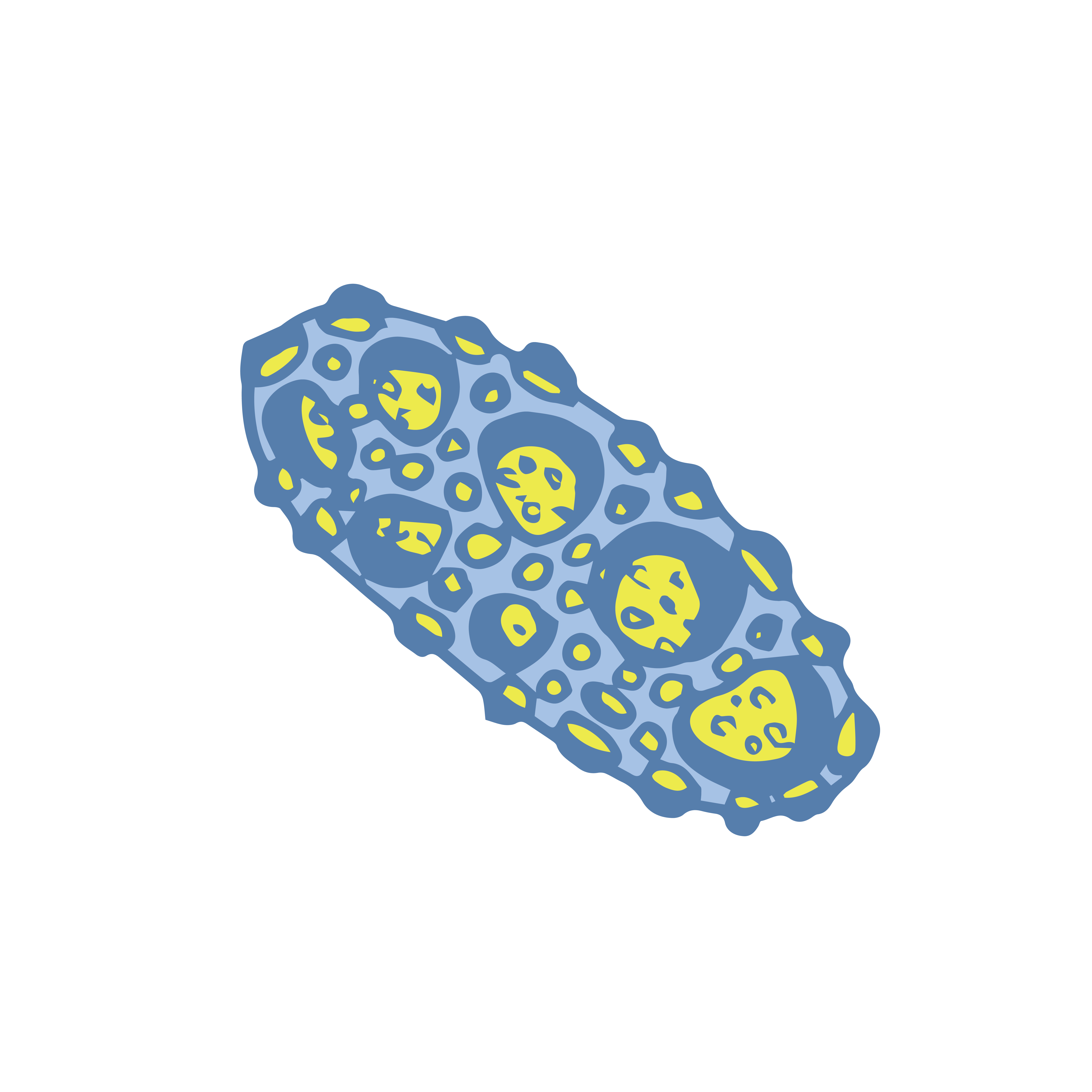


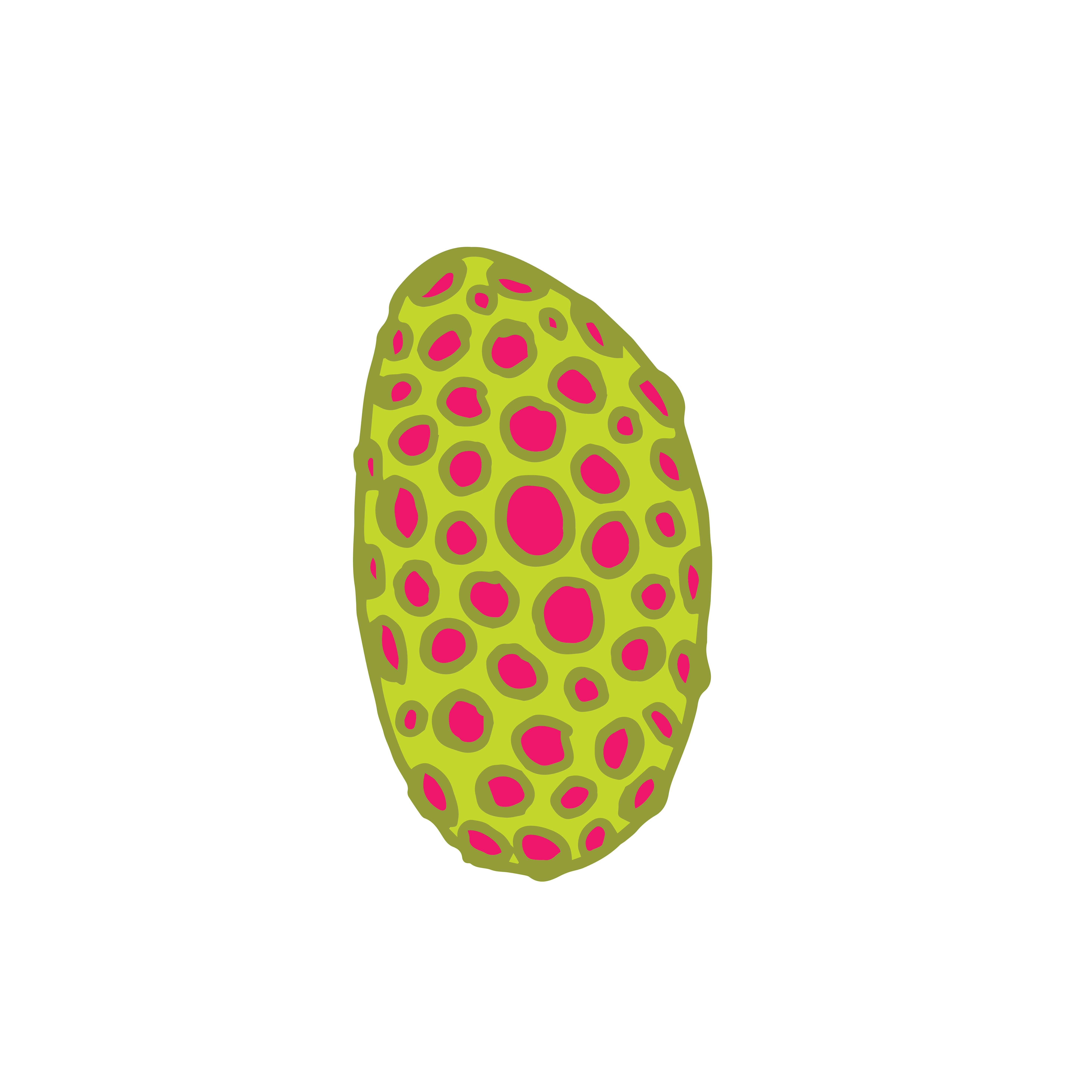

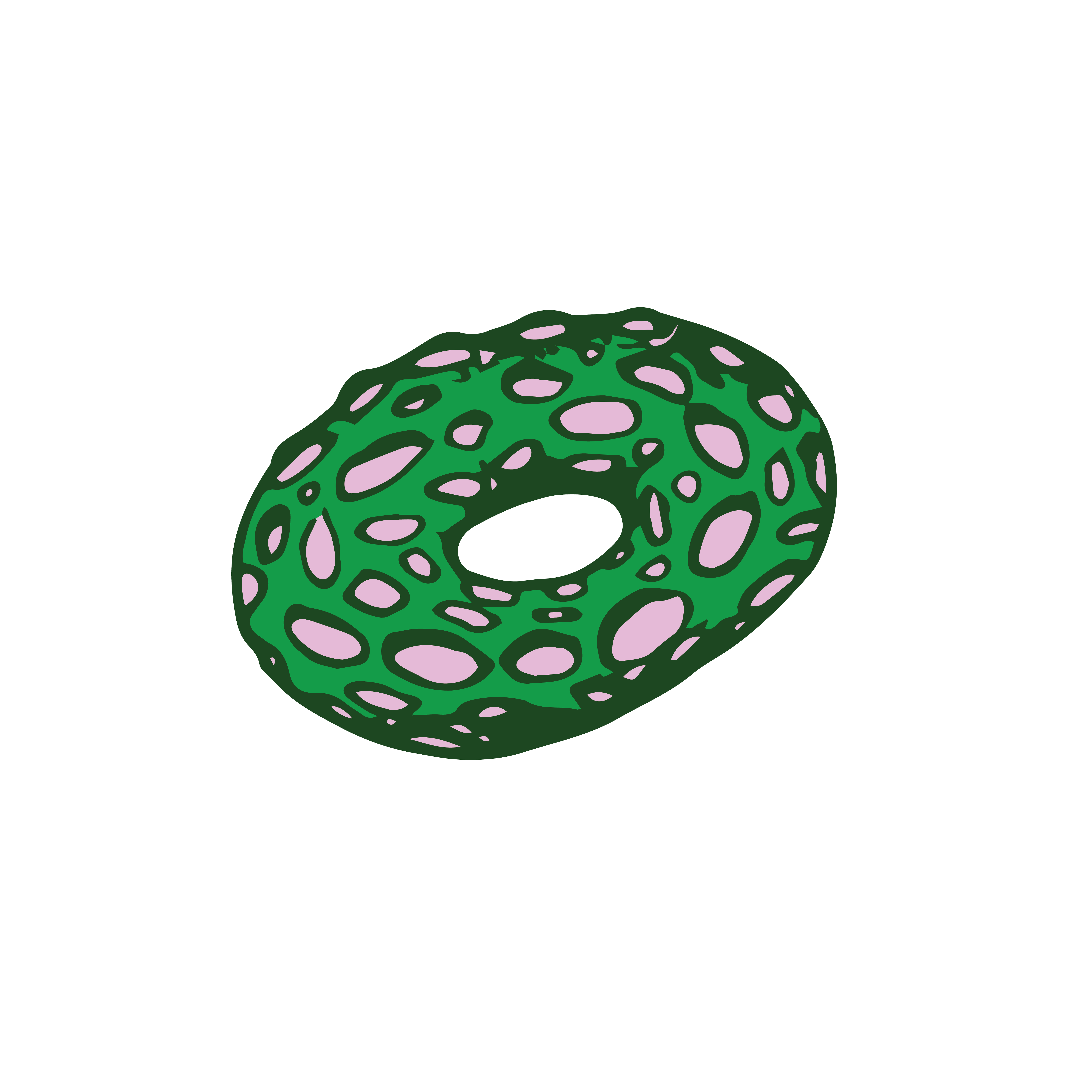
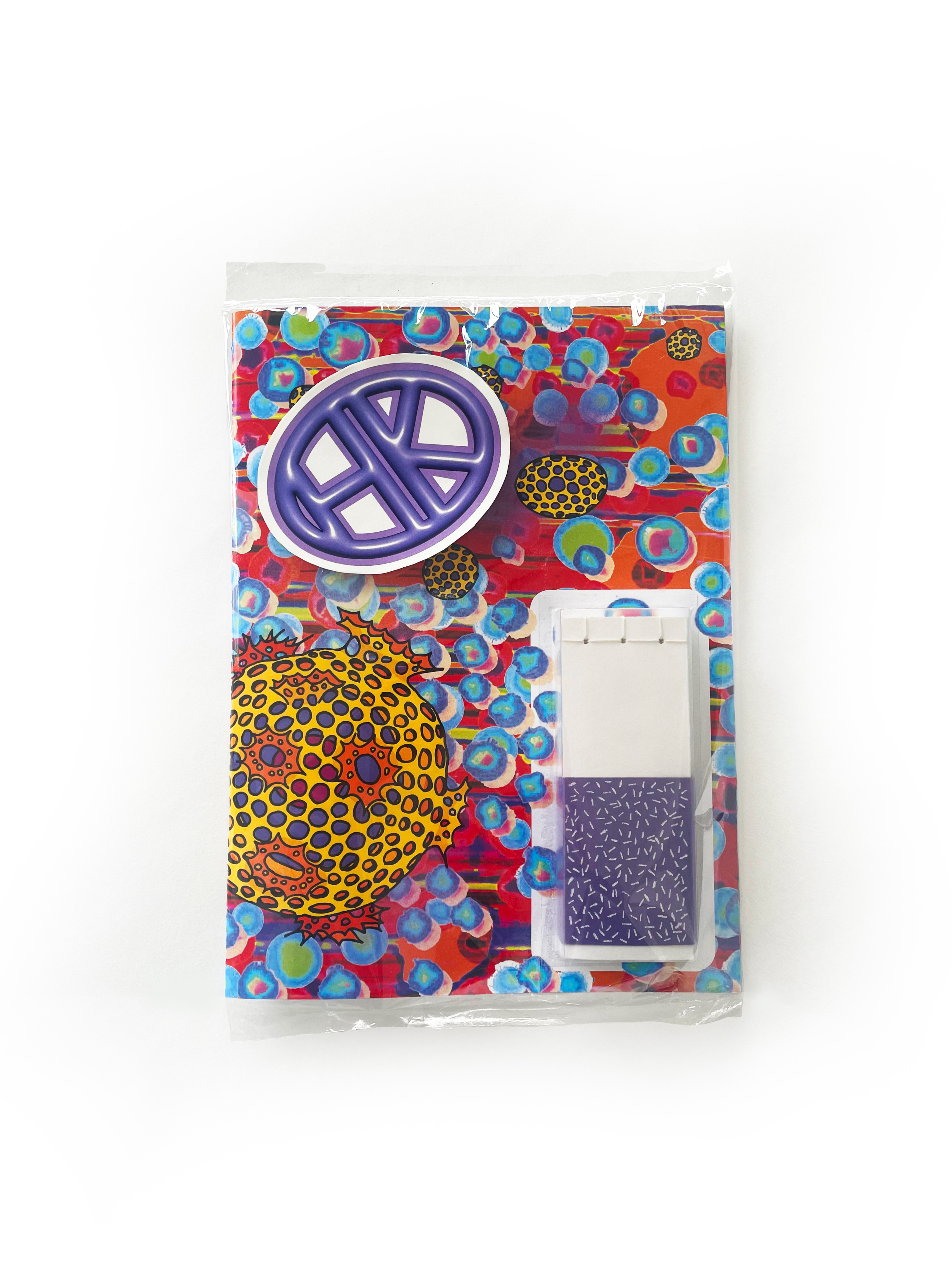
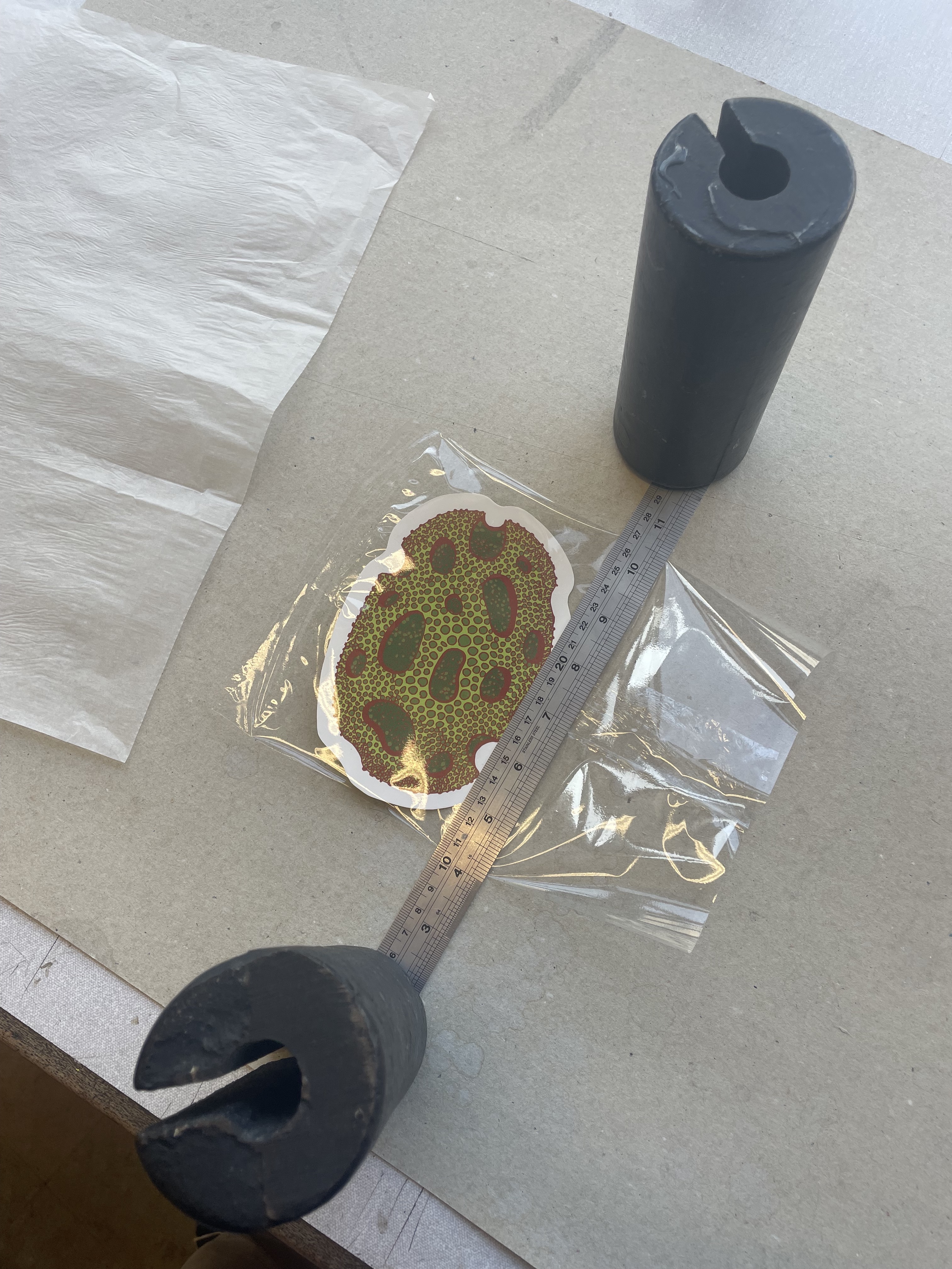
Here are the final pages of my magazine. The top two are the front and inside covers. On the inside will be a poster, sticker collection and post card collection.


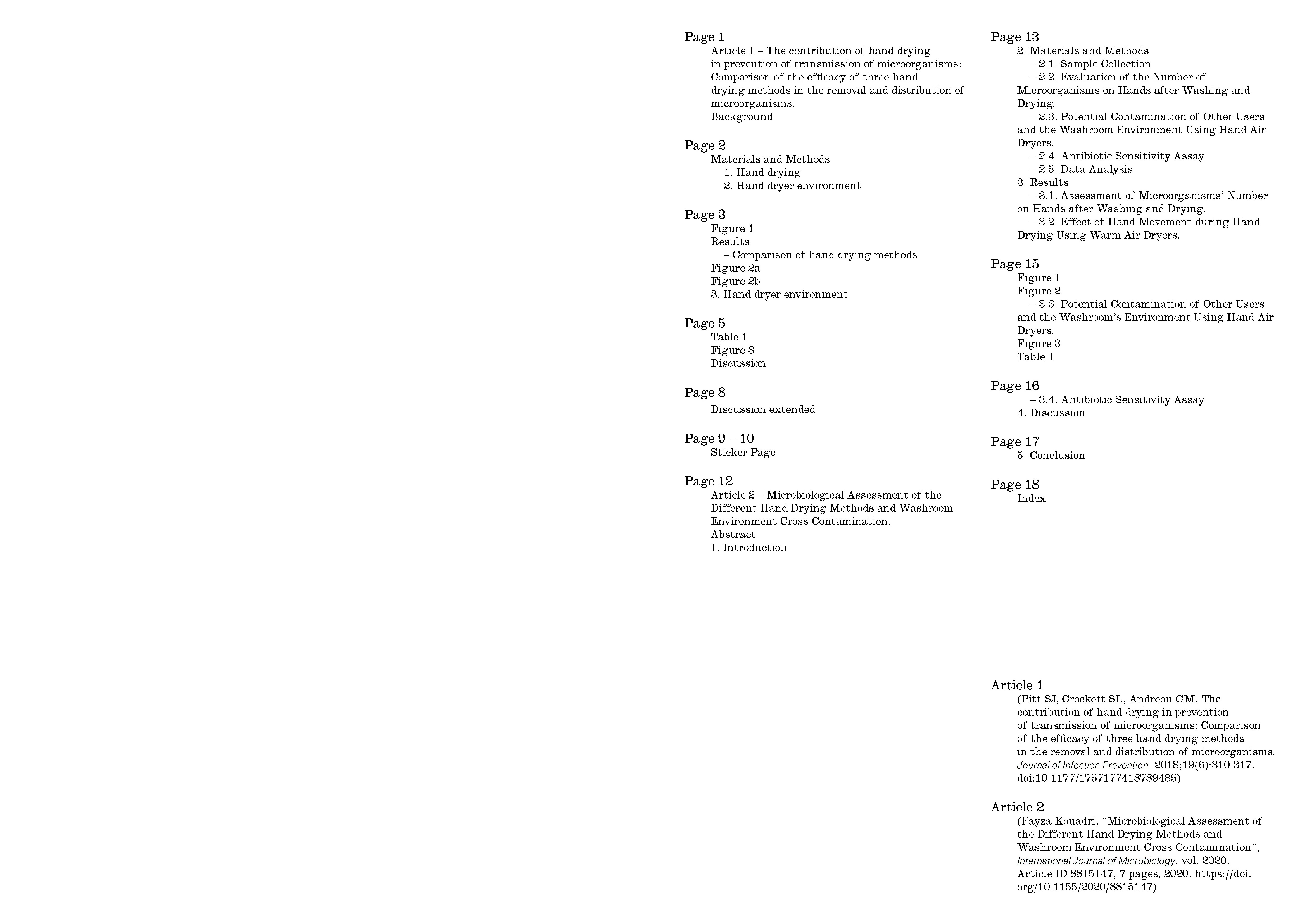
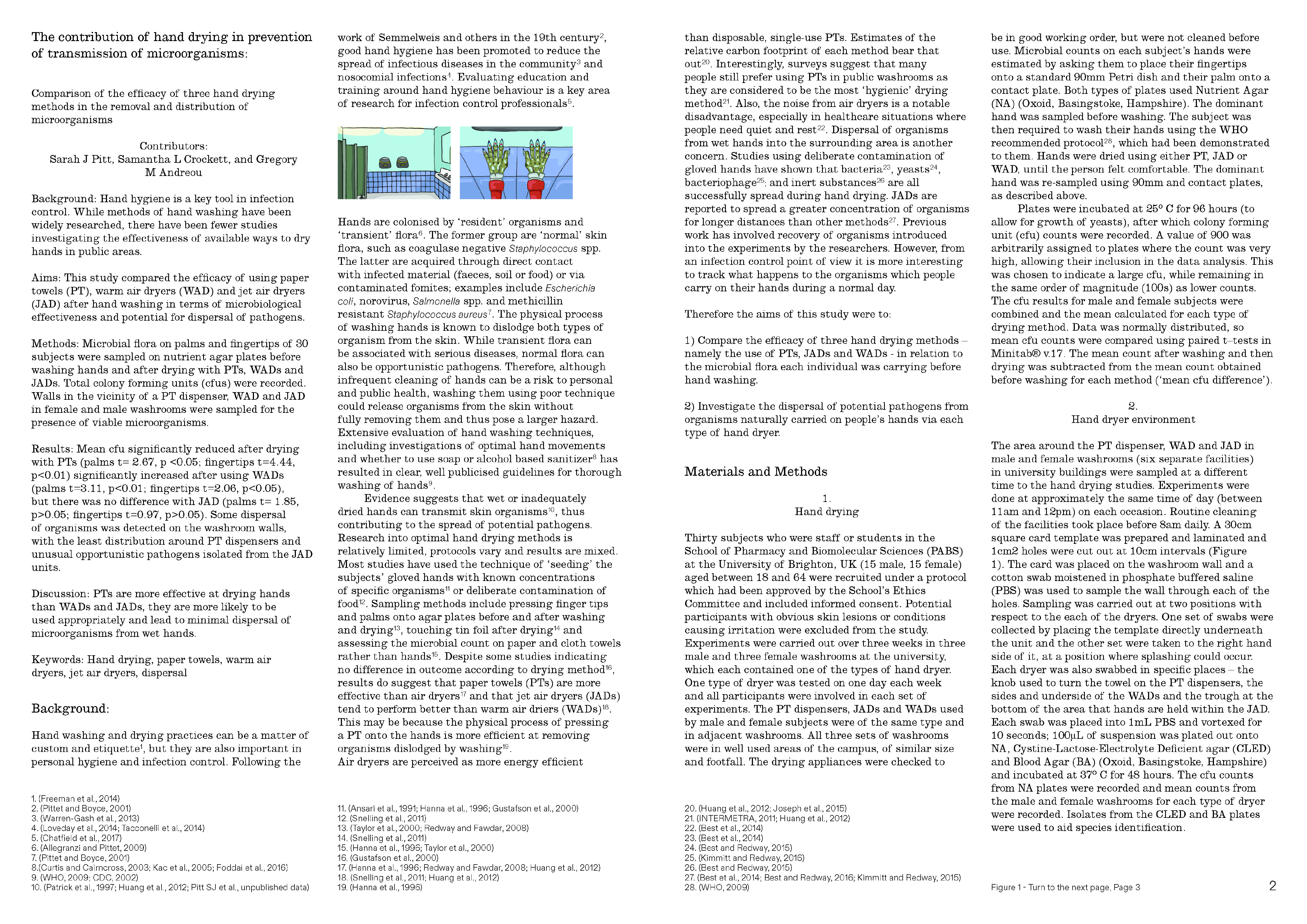
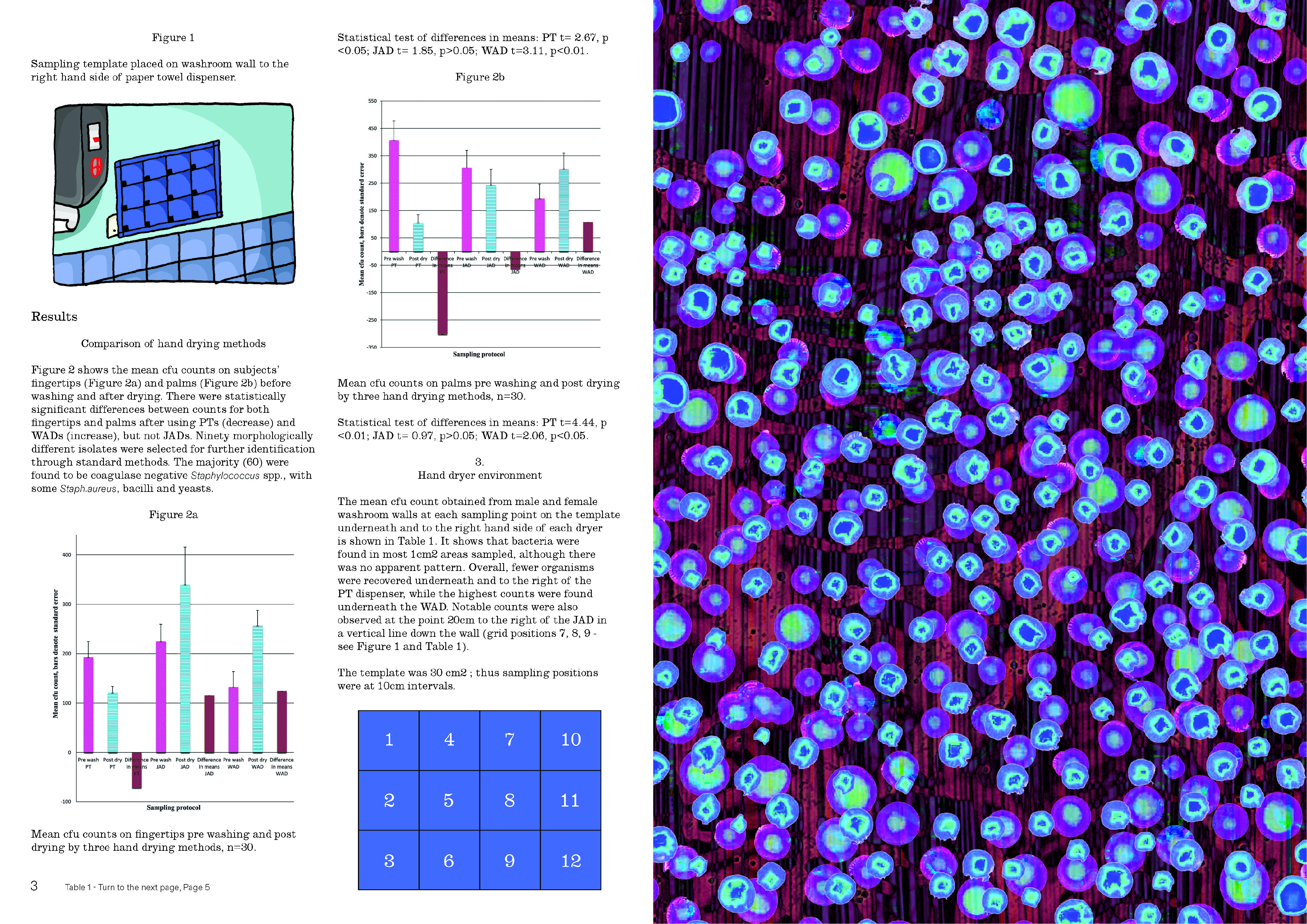
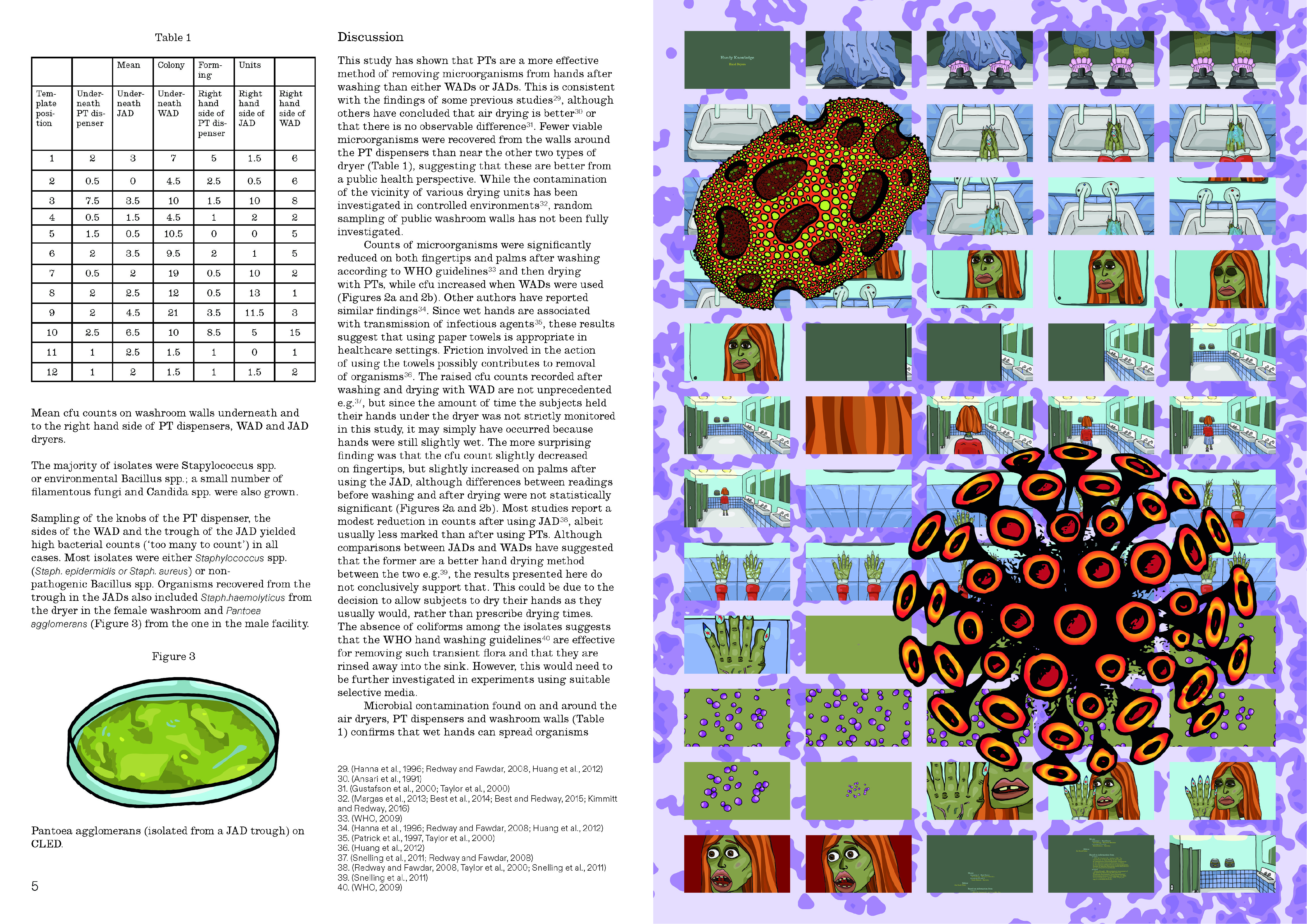
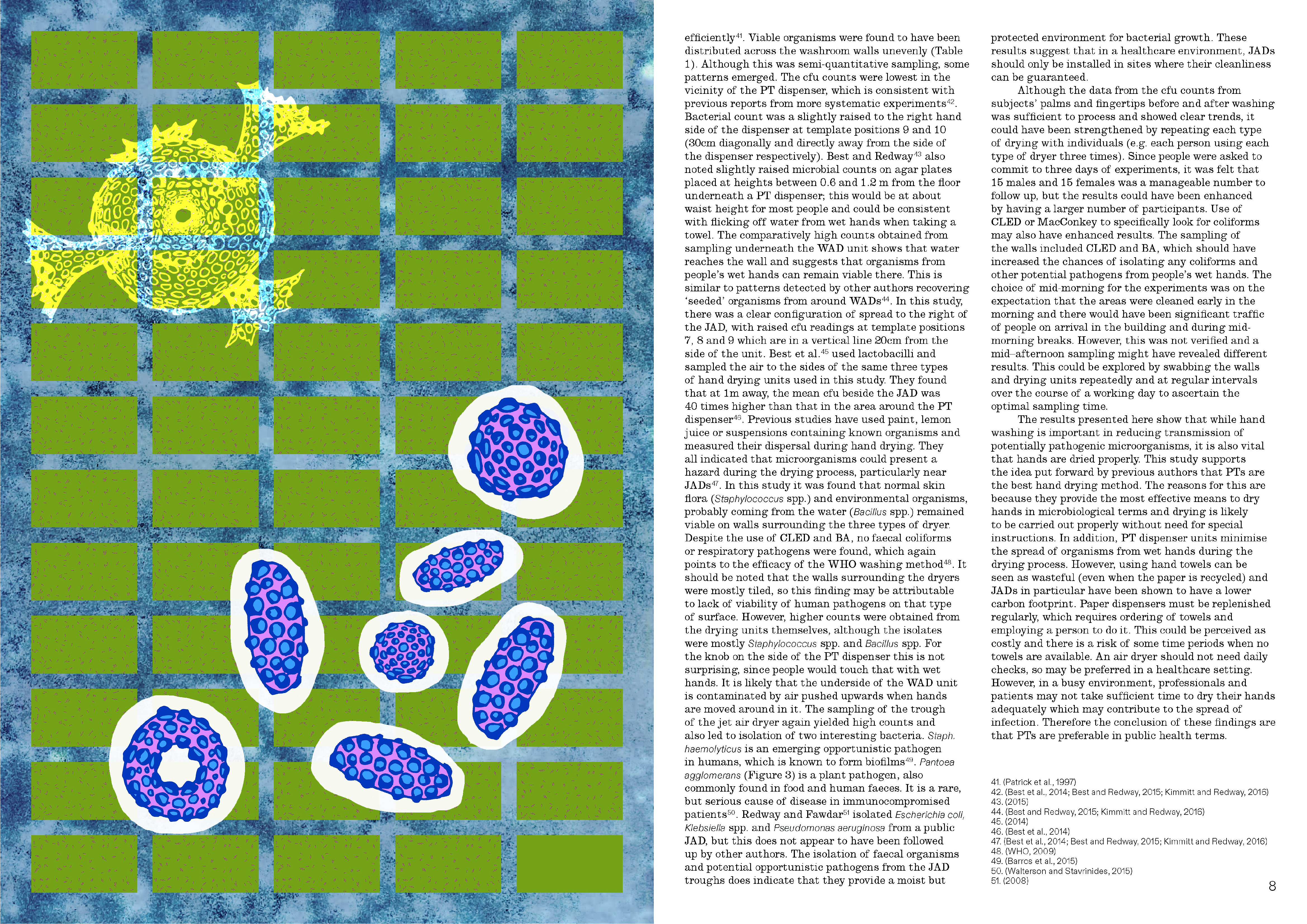
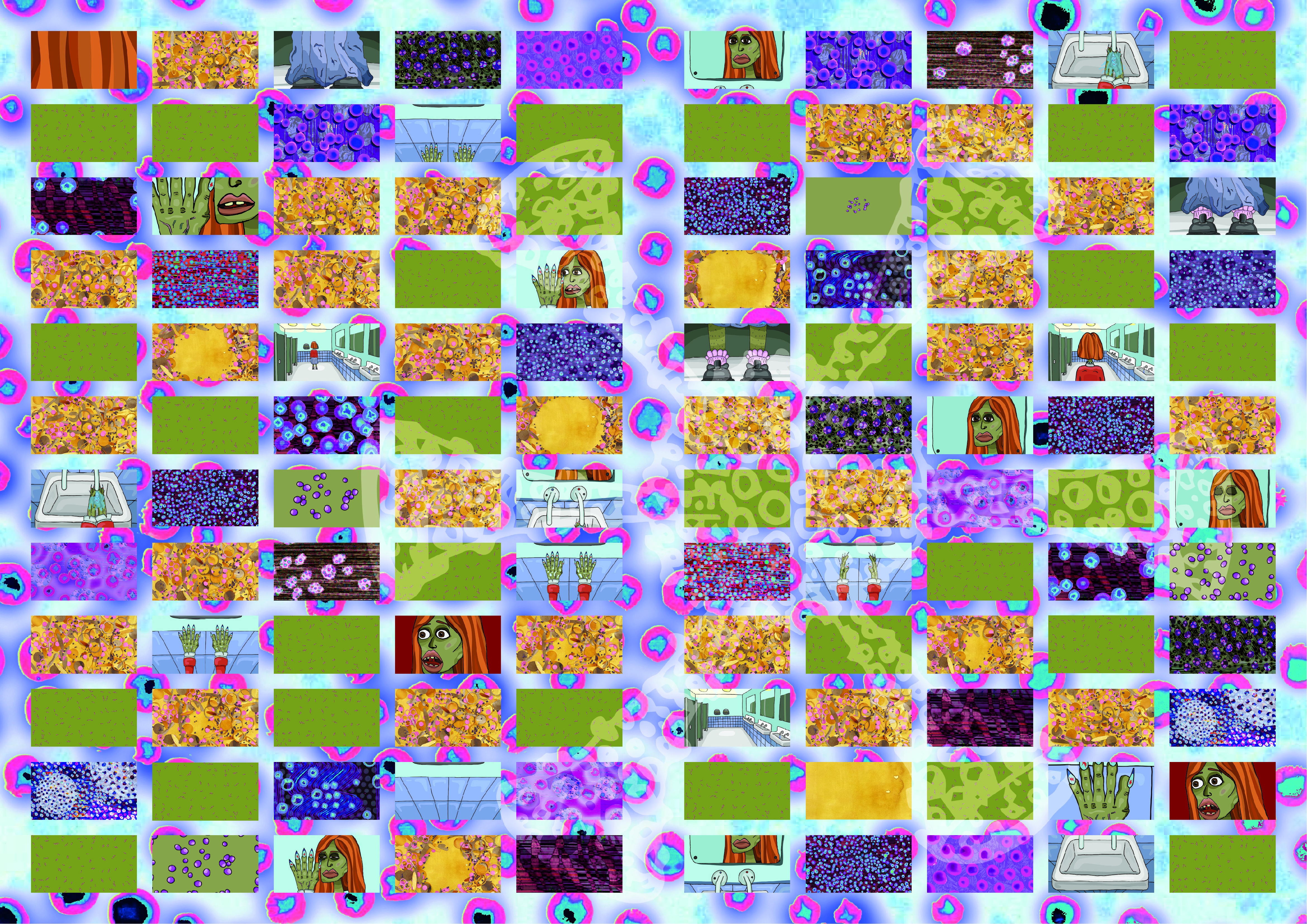
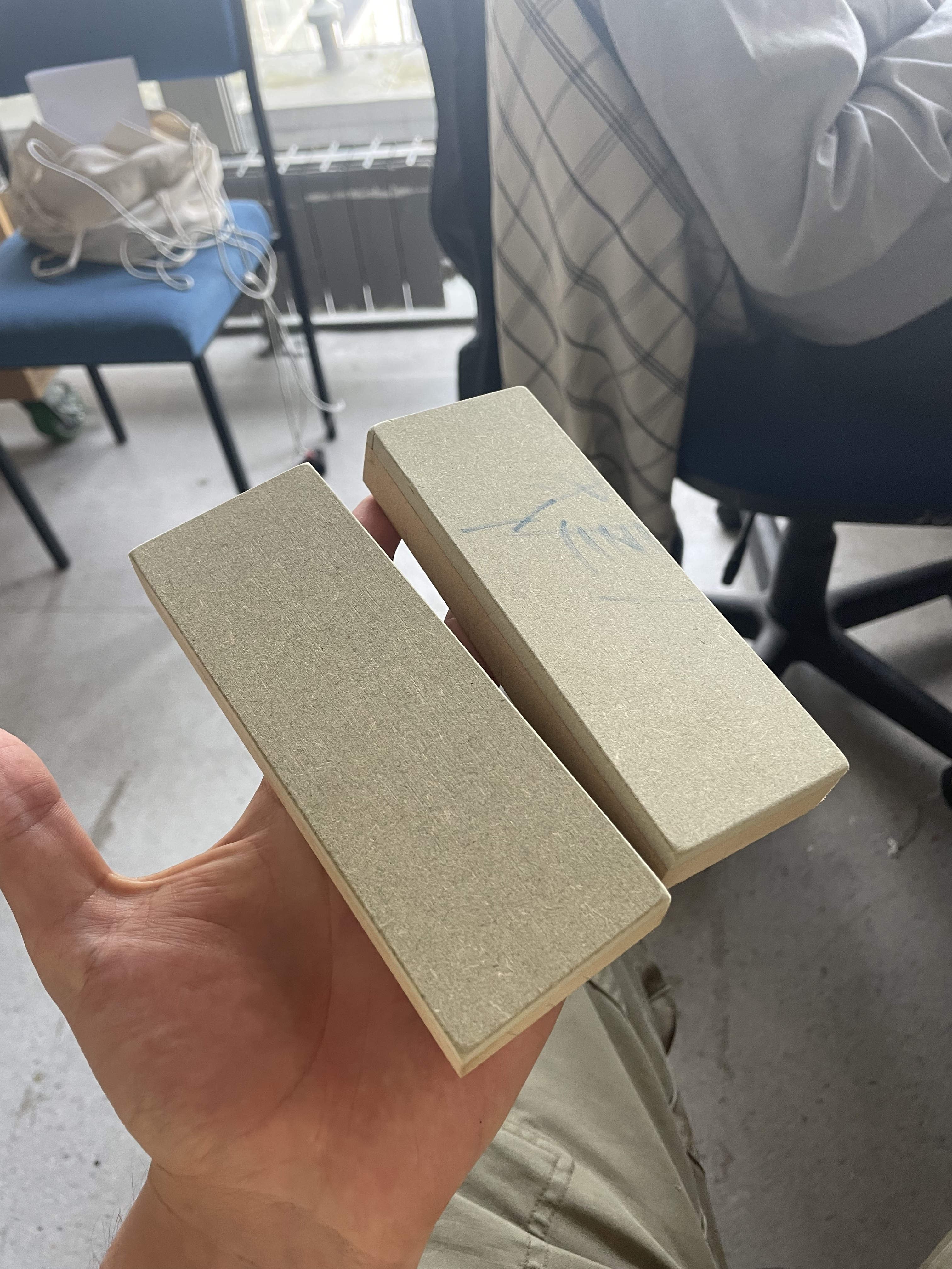
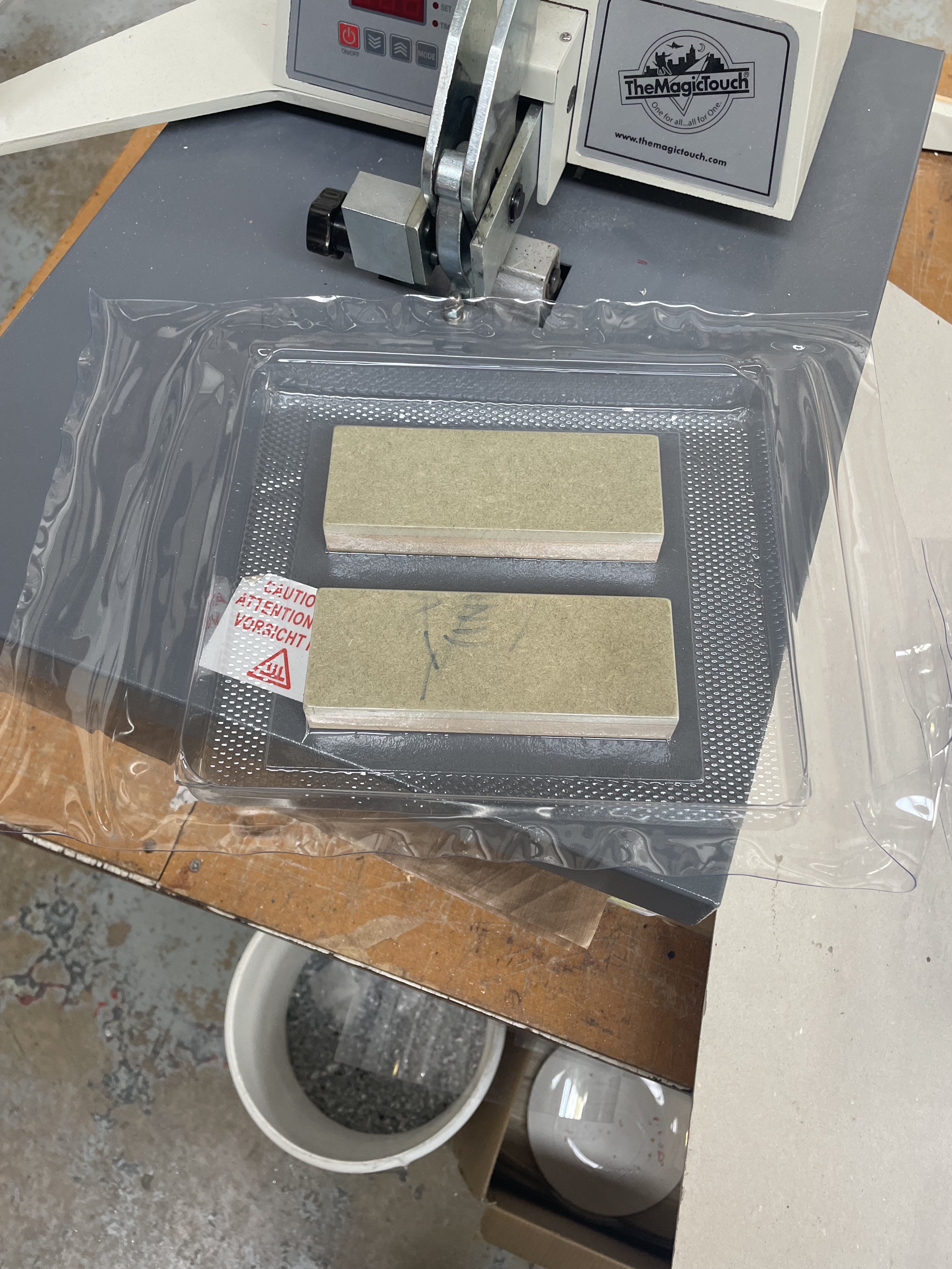
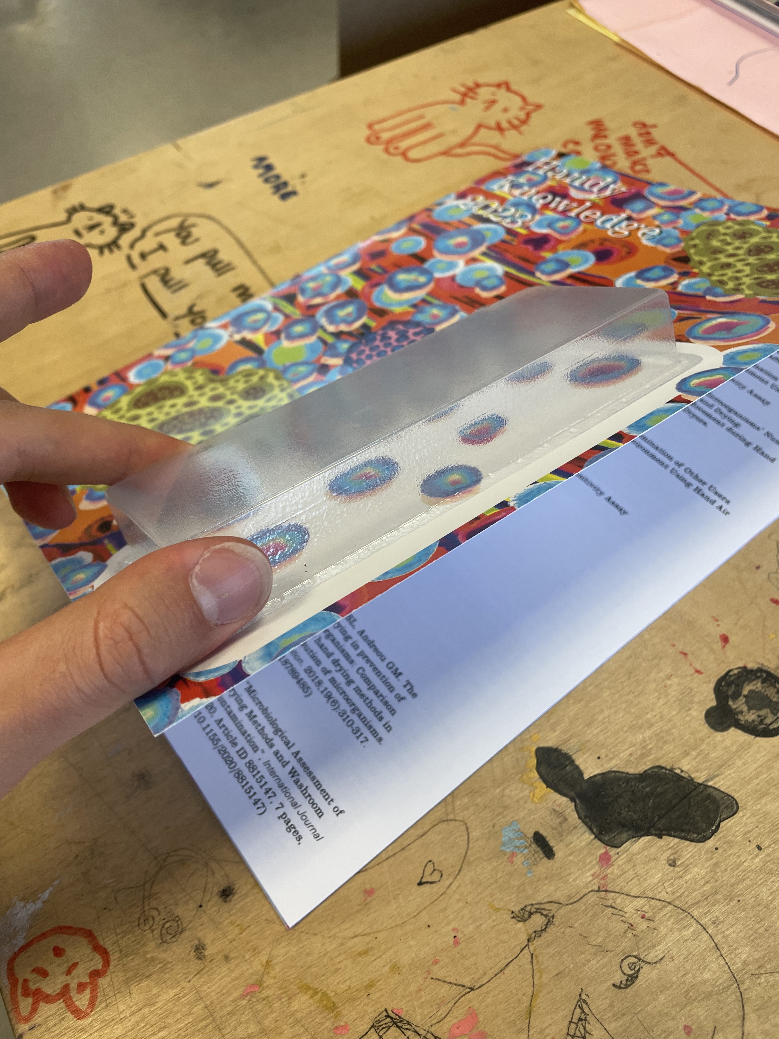
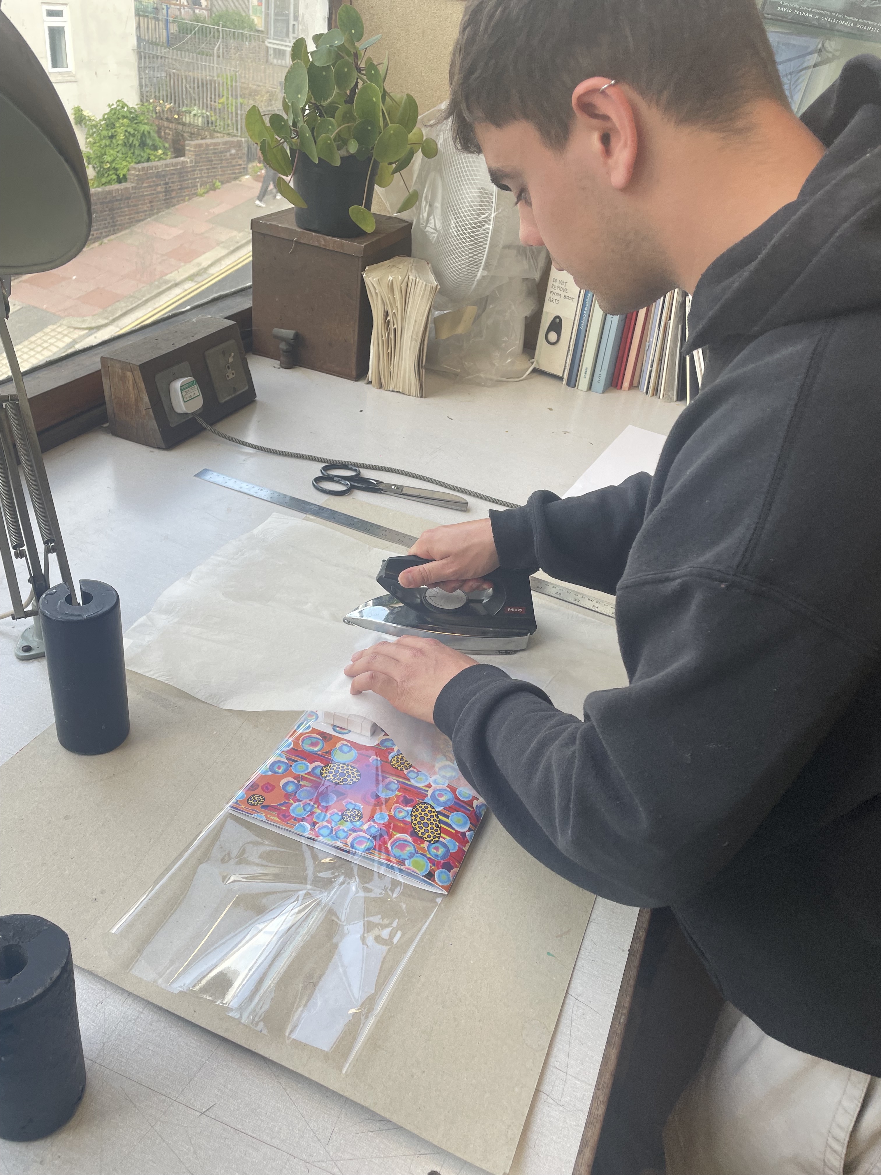
Then I realised that I wanted to vacuum form the flip book onto the front of the magazine. I started at the wood workshop and got two blocks made to the exact size of the flip book. This is due to information I found out in my initial talks with the technician, they said that the flip book could get damaged in the process and the foiling could print onto the plastic. So the wood blocks were the best option. Then I tested it on a test print of the magazine, it worked perfectly.

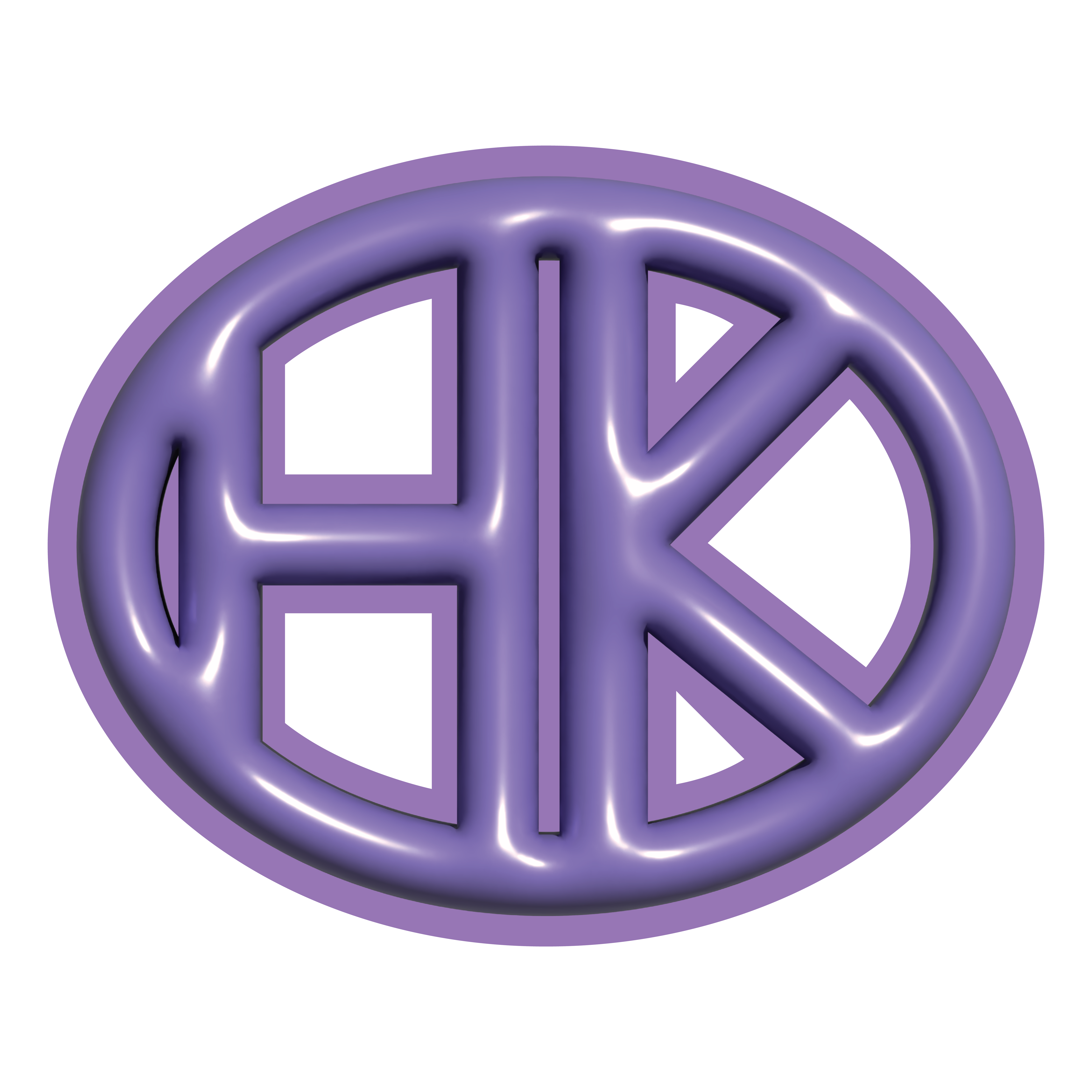
After trialing the design of the logo, I came up with this that I chose to stick it on the front of the magazine when the flip book was covering the main title.

I then had my riso prints laser cut so that I could use them in my magazine.
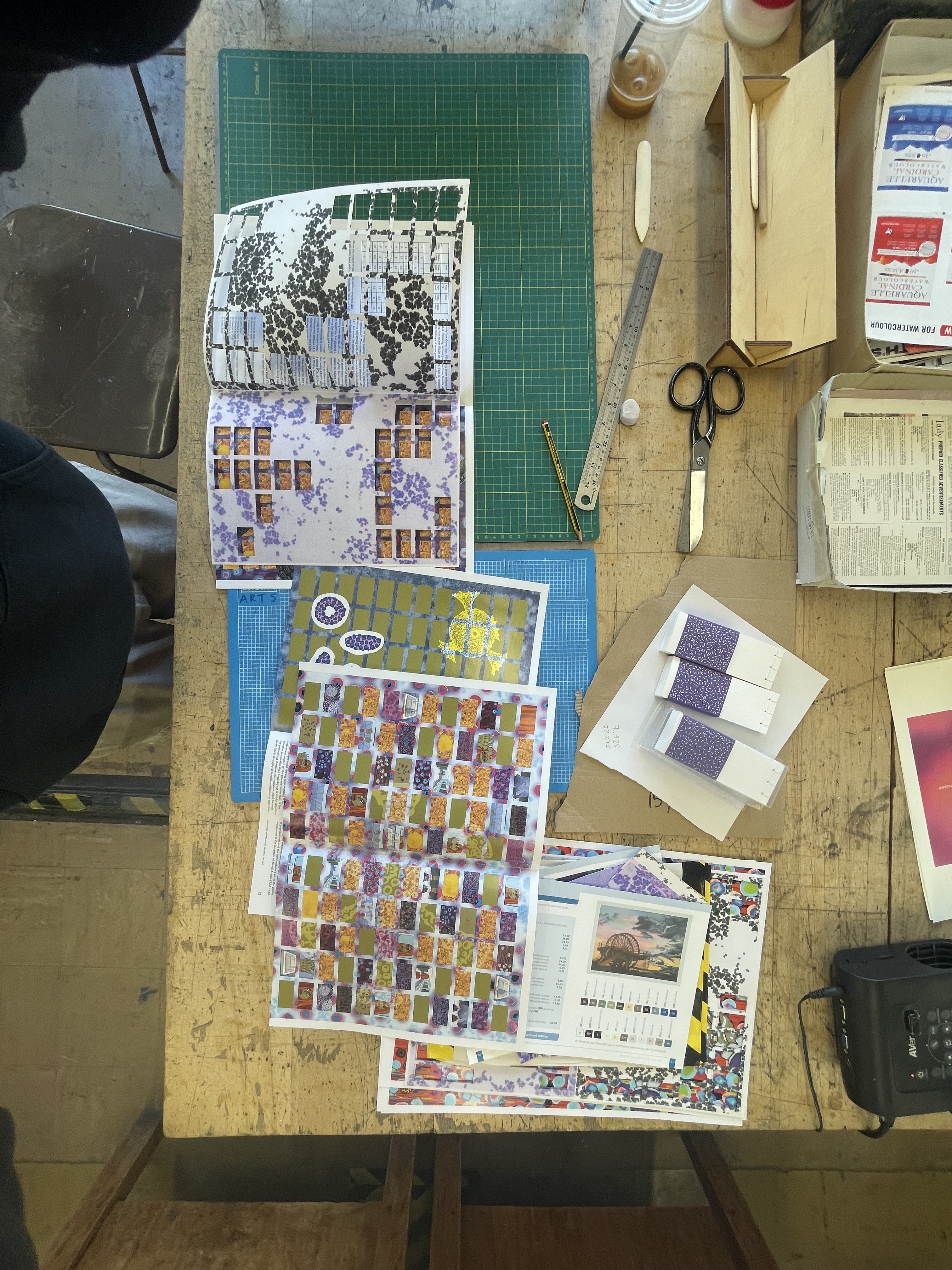
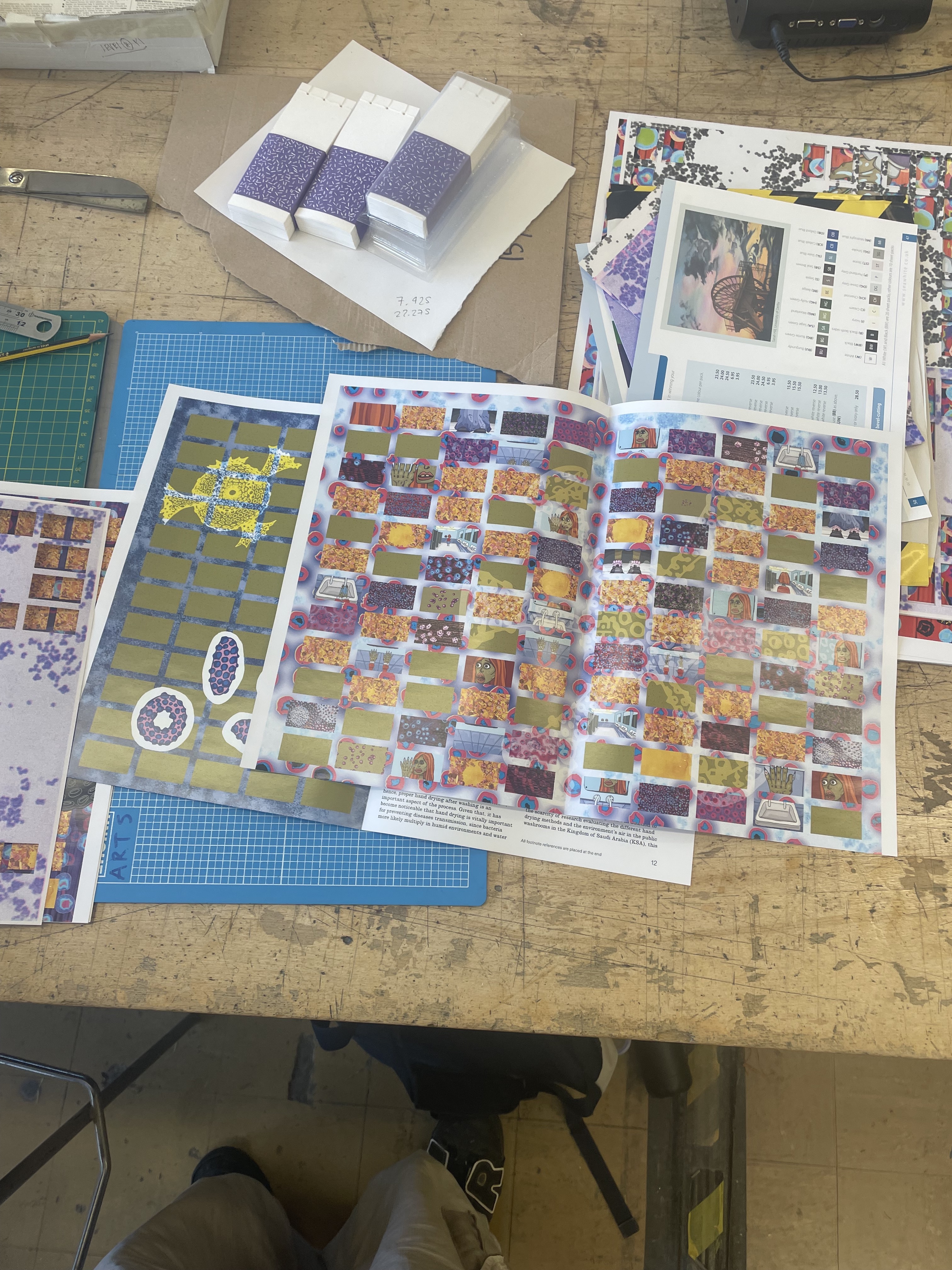
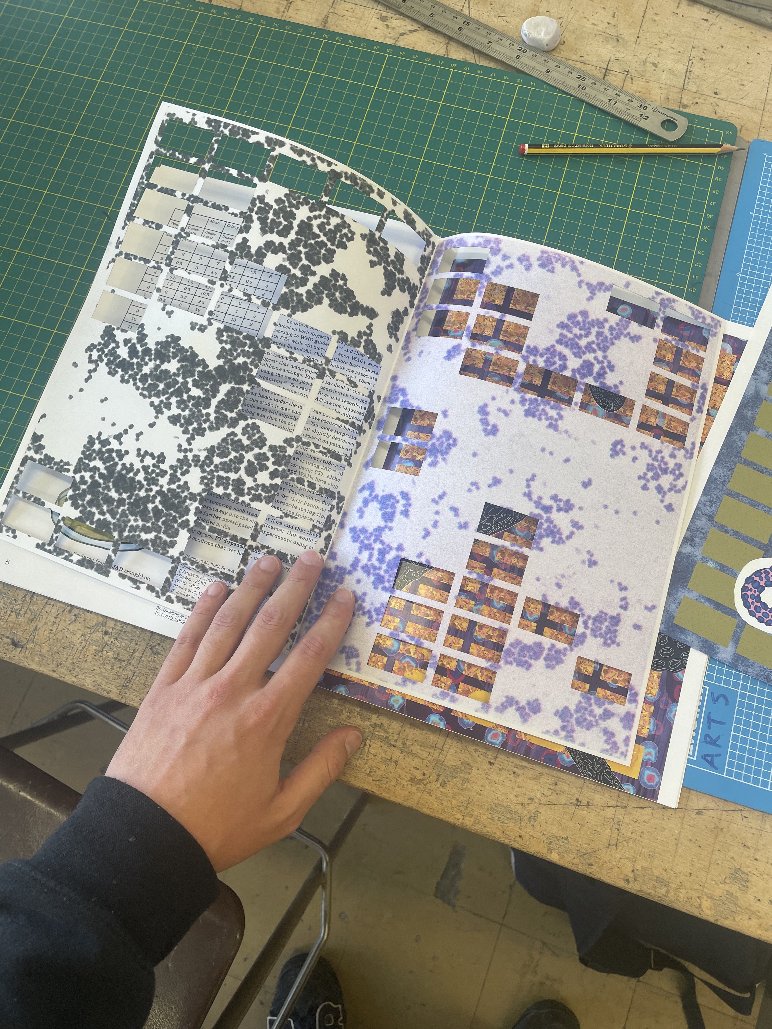
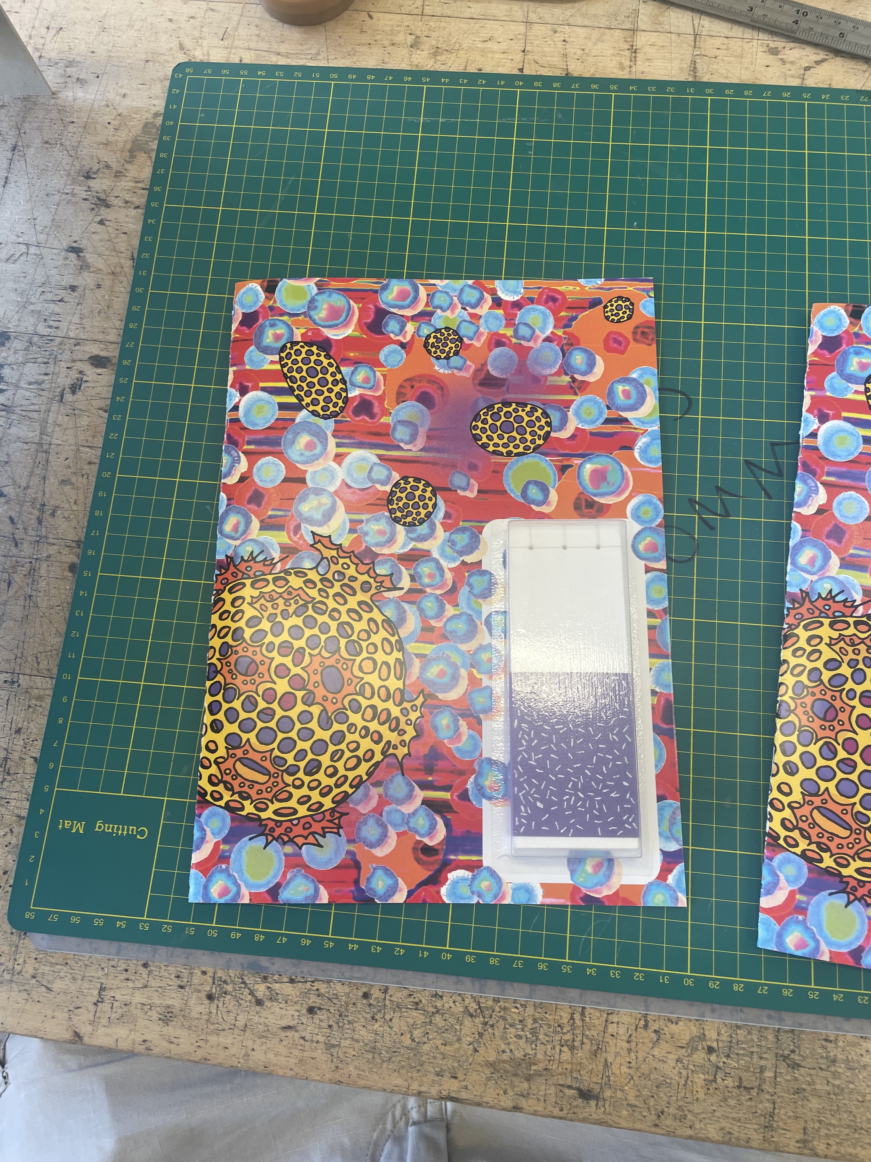
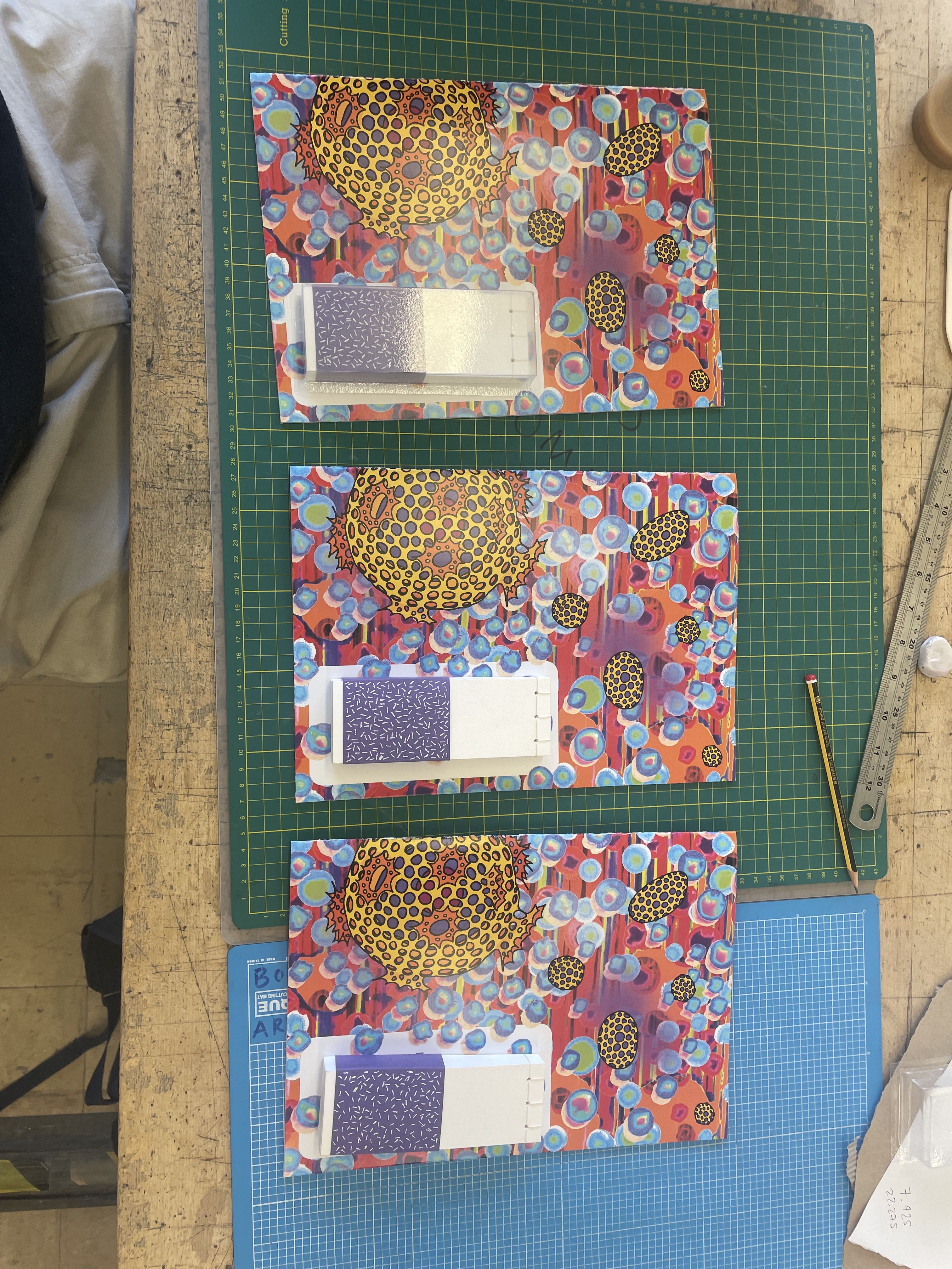
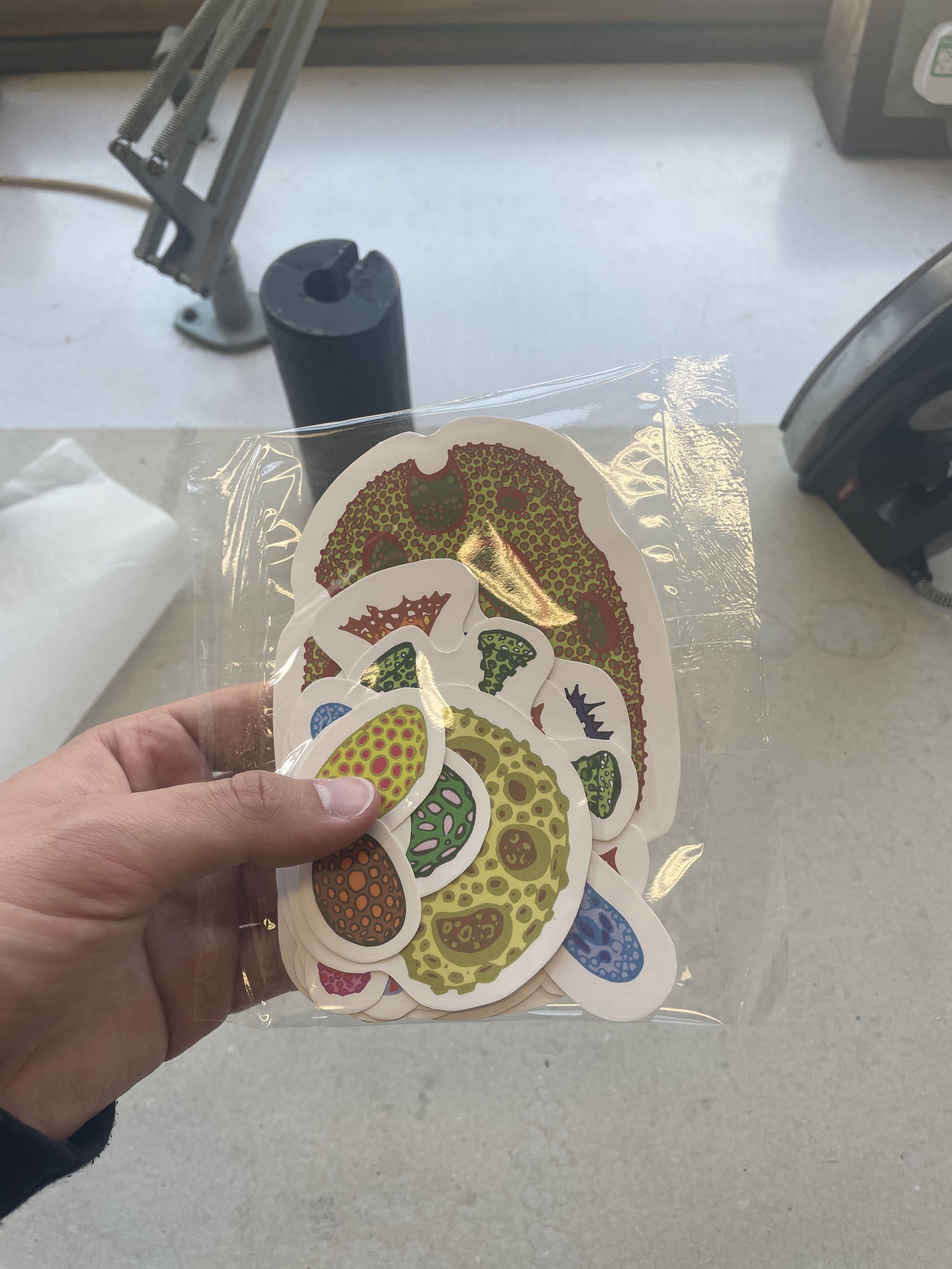
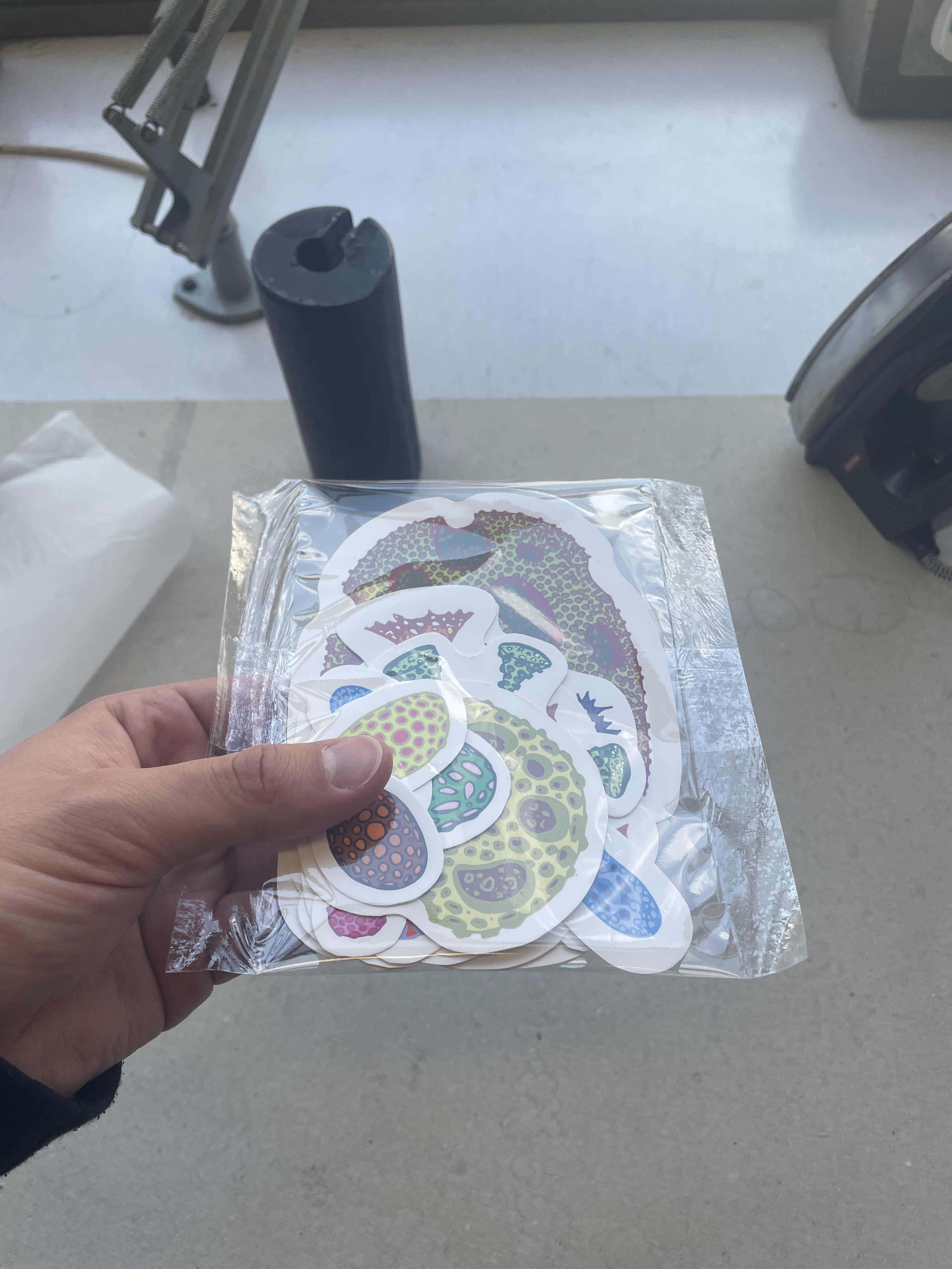
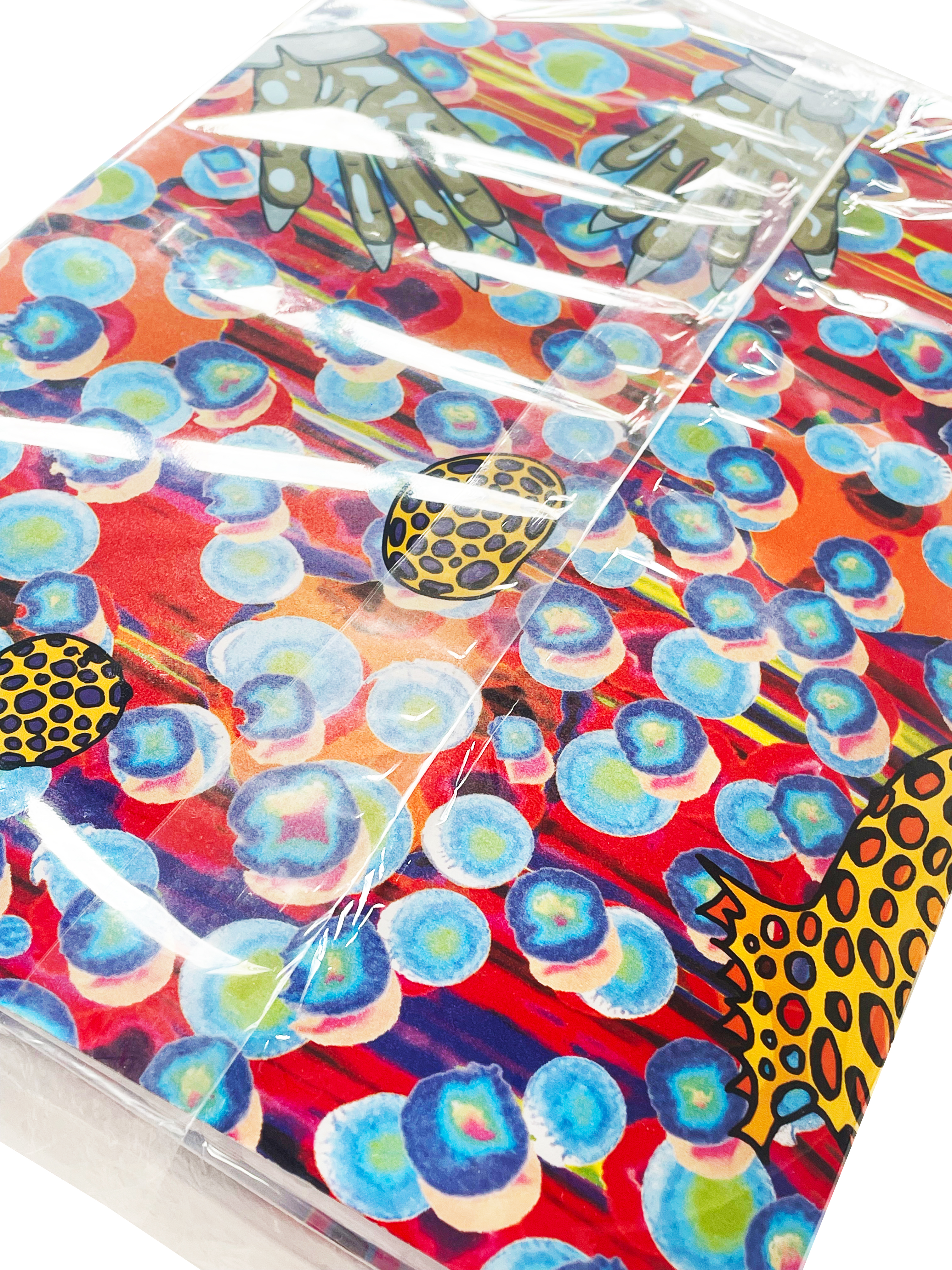
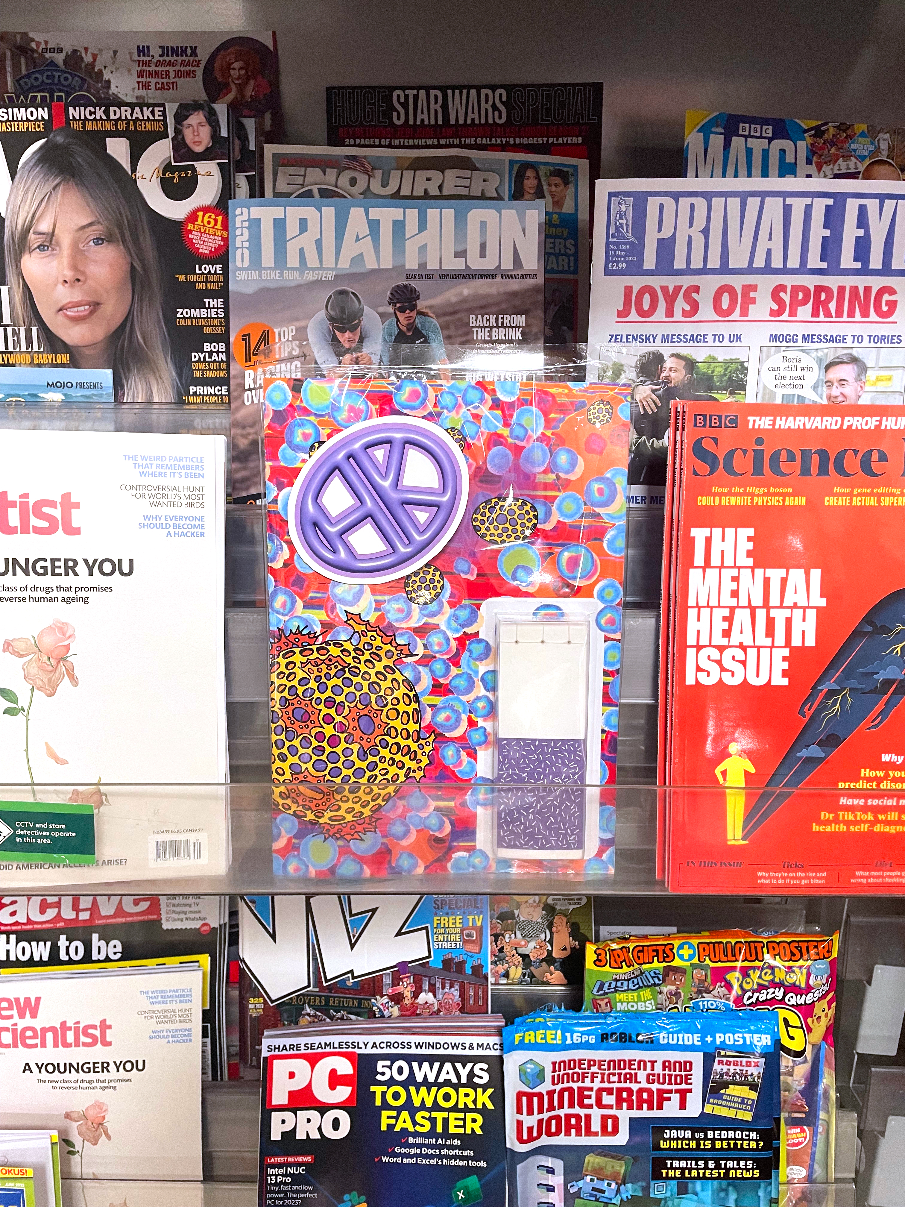
Here is the final studio images of my magazine, I am so happy with how it turned out. I think my favourite parts would have to be the vacuum formed flip book on the front or pages 7 and 8. I think those pages specifically are really successful as they really show the duality that I wanted in the design of the book, with one side very clean and sanitary and the other messy and ugly, I think this also reflects this project as a whole, maybe a beautiful outcome but an ugly premise - Jolie Laide. I loved working with Elif so a special shout out to her because none of this would have been possible without her. I was really worried about working with someone and trusting in them to provide the necessary materials but it worked perfectly and would love to work on a similar project again. If I could change one thing about this project I would have added another smaller book, maybe like a photography book showing images of hand dryers, to make more of a collection. But all in all I think the brief was successfully answered.
Final Outcome:
