Good Day
Personal LBA Branding Internship – Junior Designer
From: Nov 2023
Good Day is a well-loved Indian premium cookie brand
that launched in 1987, it’s a universal brand, loved by all ages and genders and class. This food product
has always been associated with the delight of an
abundance of butter and nuts in its cookies. The brand
promise, that I had to communicate, was ‘Make every
small moment, momentous with a Good Day’.
Brand Personality:
– Cheerful
– Infectiously optimistic – Rooted yet progressive – Approachable
– Generous
I was asked to redesign the packaging. The brief asked that I enhance their premium, modern &
contemporary cues on pack, build distinctiveness with the consumer, bring brand architecture to life;
adequate balance of Masterbrand coherency and sub
brand differentiation and lastly ensure the inclusion of
their brand identity – celebrating everyday moments/smiles on the packaging.


The lead designer working on this project loved this idea and I was told to work on iterations of this design.


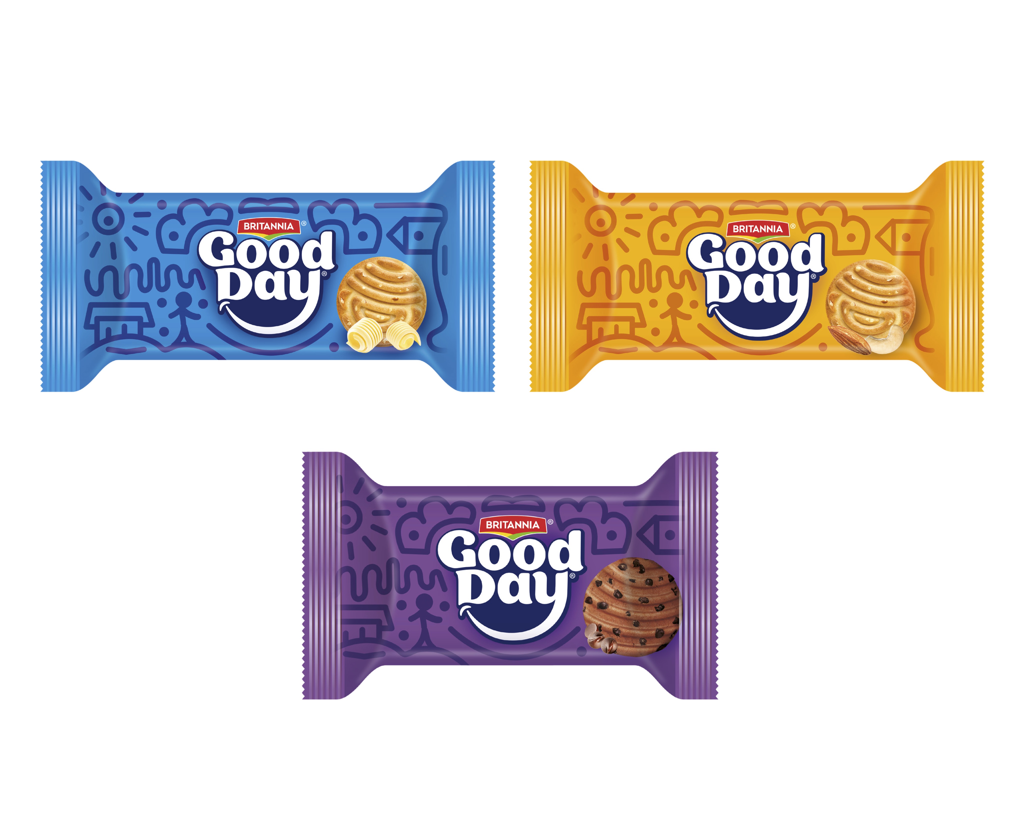
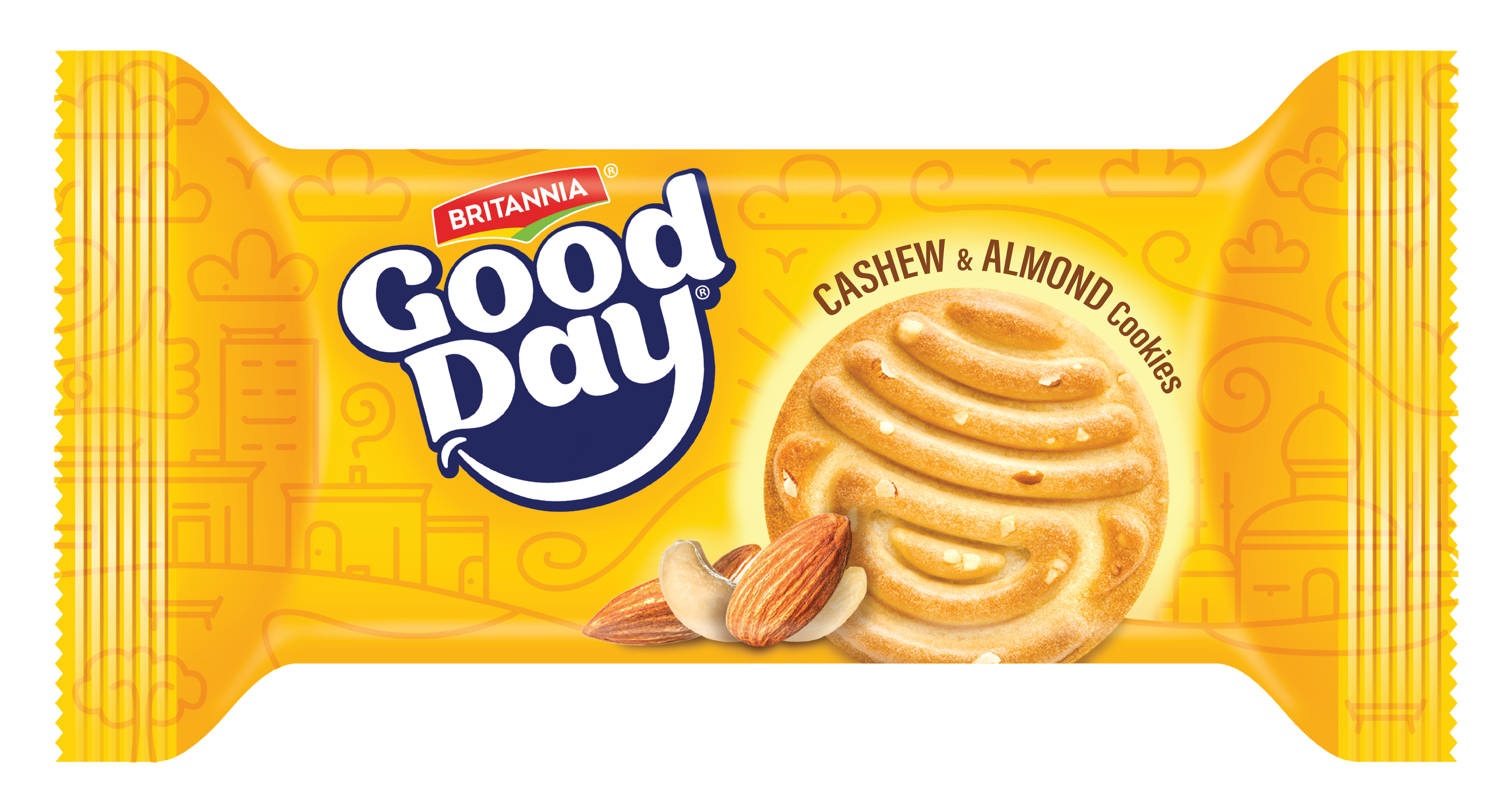
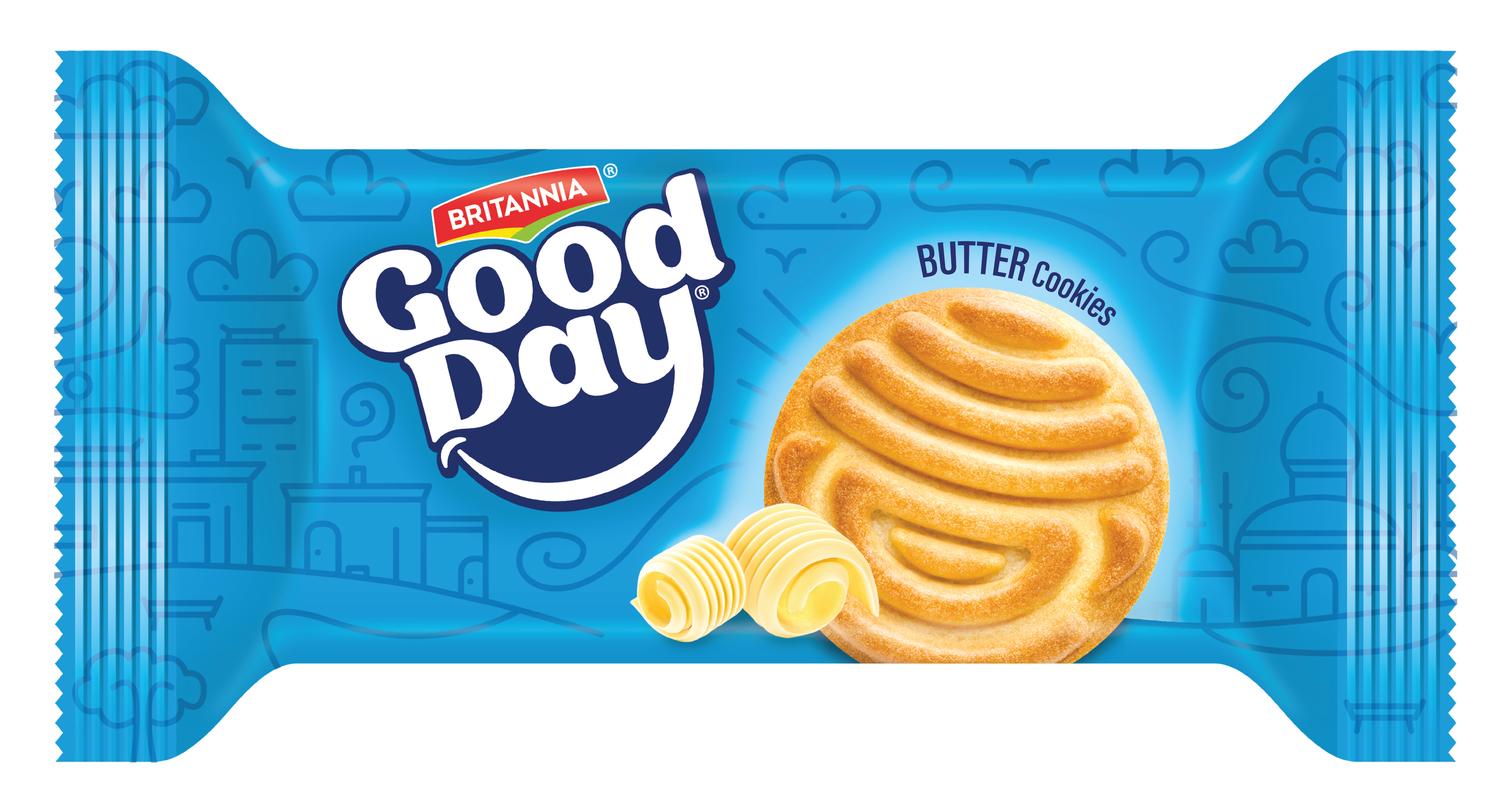
In developing the packaging design, I focused on incorporating elements that reflect the joyful essence of the brand. Additionally, I crafted a distinct side profile for the packaging, as the product will often be viewed from this angle. To ensure recognizability from a distance, I utilised prominent branding and a continuous smile motif that flows along the side. This approach makes the packaging instantly recognizable and reinforces the brand’s uplifting character, even from afar.

During the development of the illustration, I realized that my initial design did not fully align with the landscape and architectural styles familiar to the target demographic. It struck me, how had I overlooked this critical detail? Recognizing the importance of cultural relevance, I revised the illustration to better reflect the distinct housing and structural elements commonly seen across India. By incorporating these familiar visual cues, I aimed to create a design that resonates more deeply with the audience, grounding the brand’s joyful message within a setting that feels authentic and recognizable.


With these adjustments in place, I was able to develop a final packaging design that felt both culturally authentic and visually compelling. By incorporating architectural elements and landscapes recognizable to the Indian demographic, the design became more relatable and engaging. The cohesive layout highlights the brand’s joyful identity, with the smile motif subtly woven into the landscape. This final design not only aligns with the brand’s ethos but also ensures high visibility on shelves, with prominent side-profile branding that makes the product easily recognizable from a distance. The end result is a packaging design that resonates emotionally with consumers while meeting all practical requirements.This packaging design route was sent to the client but not chosen for crowdtesting.


