Expanded Reader
AGP606
From: Third year studies at Brighton University
In this project we were asked to compile, curate, edit, design and produce a printed or screen-based anthology/compendium/compilation/collection of writings that are thematically linked in some way. An anthology can be defined as a collection of writings by various authors or as a collection of selected writings by a single author. The texts we choose to work with could be a combination or selection of essays, interviews, fiction, translations, short stories, recipes, plays, poetry, lyrics, letters, criticism, lectures, marginalia, emails, etc. These could also be historical or contemporary, jump or span across periods of time, and can be reproduced in full or amended/excerpted/edited at our discretion. Images and supplemental material could be included if we wanted, but the publication was aksed to have a substantial typographic component. Beyond this, all decisions regarding form (dimensions, format, page count, modes of production, etc.) and content was entirely up to us; we were operating as both editor(s) and designer(s).
Scans above sourced from Brighton Library. Please click here or on the images to be sent to The Whole Earth Catalog scanned sample PDF.
This project was a hard one to start, I began with researching lots of different ideas. Once I had settled on predictions as a theme for the readings, I had to choose whos predictions were most credible and that there would be enough to fill the amount of pages I wanted to have. I wanted to include predictions as I have a genuine interest for technological advances and I am excited about what the future has to offer, and the best way to predict the future is to look into the past. I decided to go with two scientists and technologists; Isaac Asimov and Ray Kurzweil with predictions from 1964,1983 and 1999. Their work still carries on today with Kurzweil recently seen on the stage of the Ted Talk series.
I wanted the readings to predict what the early 21st century would be like so that we could know if these predictions had been correct or not. Having the collection of predictions allowed me to start the editing process, Shortening parts and deleting others. I added titles and markers, such as true or false on each prediction, so that when I came to formatting them I would easily know what the paragraph was speaking on.
For the layout of my text, and other key design features, I was inspired by The Whole Earth Catalogue’ an American counter-culture magazine and product catalogue for technical appliances. The magazine was published several times a year by Stewart Brand. The catalogue was also compared to Google in the early 2000s due to its ‘do it yourself’ style adverts and product information.
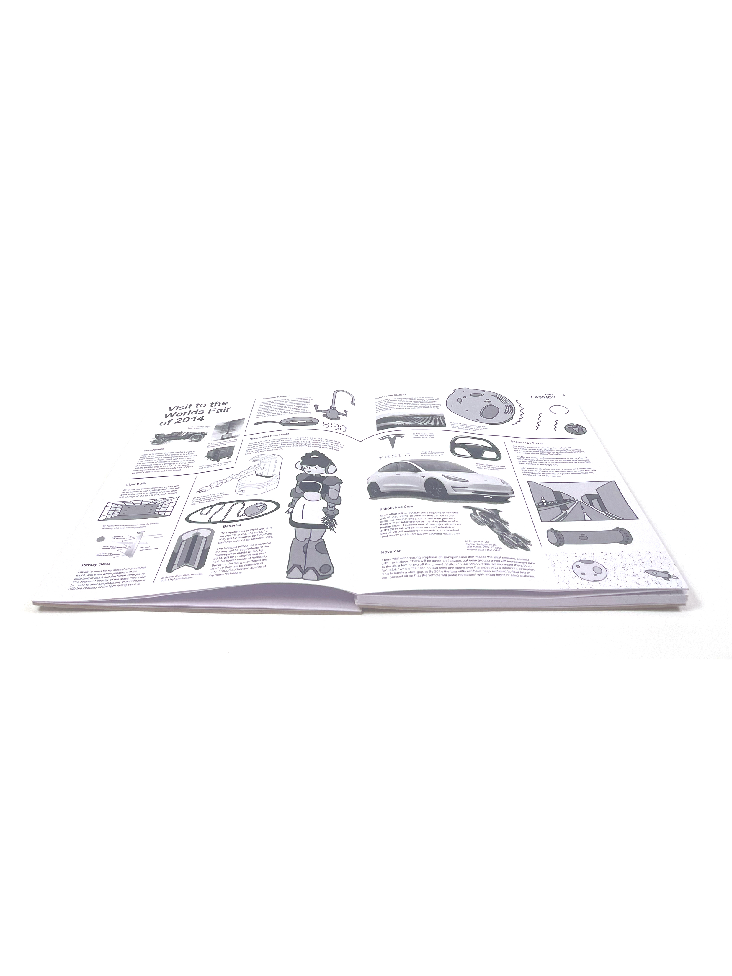
I chose to use the magazine as a starting point for my design as it mirrors the same predictive style as my readings do because ‘The Whole Earth Catalogue’ was looking forward to the then-utopian promise of technology on the horizon in the 1960-70s. I also loved how it incorporated diagrams, images, references and sectioned pieces, as I knew that would be my strength in this project as I hadn’t yet tried to layout a long form text piece. I also thought images and drawings would make the predictions more eye-catching and would help you to understand a false prediction as some were quite confusing.
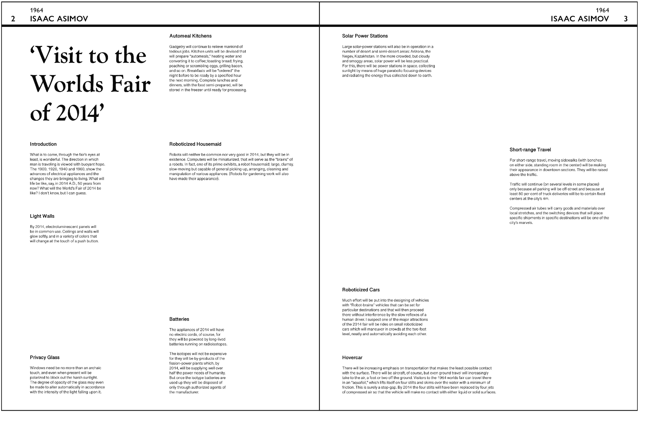
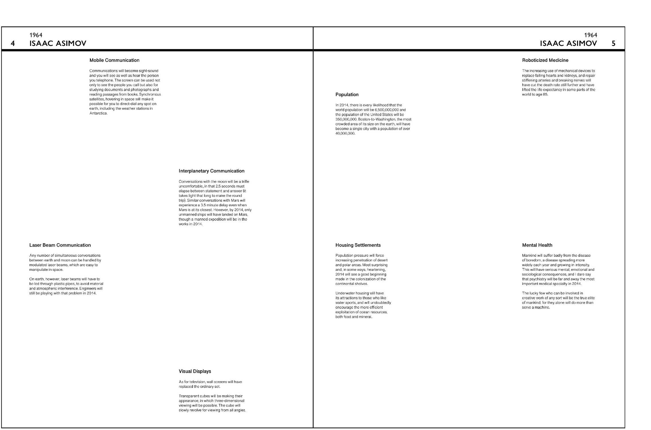
I then started to work on the layout of my printed document. I used Adobe
InDesign to design my pages. I began by getting the, what I like to call,
scaffolding of the page completed, meaning the page numbers, titles and
lines basically any constant throughout. I used the paragraph structure
from The Whole Earth Catalogue and remembered to leave space for
images and drawings. At this stage I decided I didn’t want to add the ‘true’
or ‘false’ statement to the predictions because I thought it would make the book more childish; the demographic for the book was for 20 and above.
The format for the document as a whole was set to take you through time;
you would start with the predictions from 1964 looking 50 years into the
future, 2014, next would be the 1983 predictions on 2019 and finally the
alternative guess’ for 2019. I chose this layout option as I wanted the
format to reflect a narrative style of reading, like you were traveling through
time whilst reading the document.
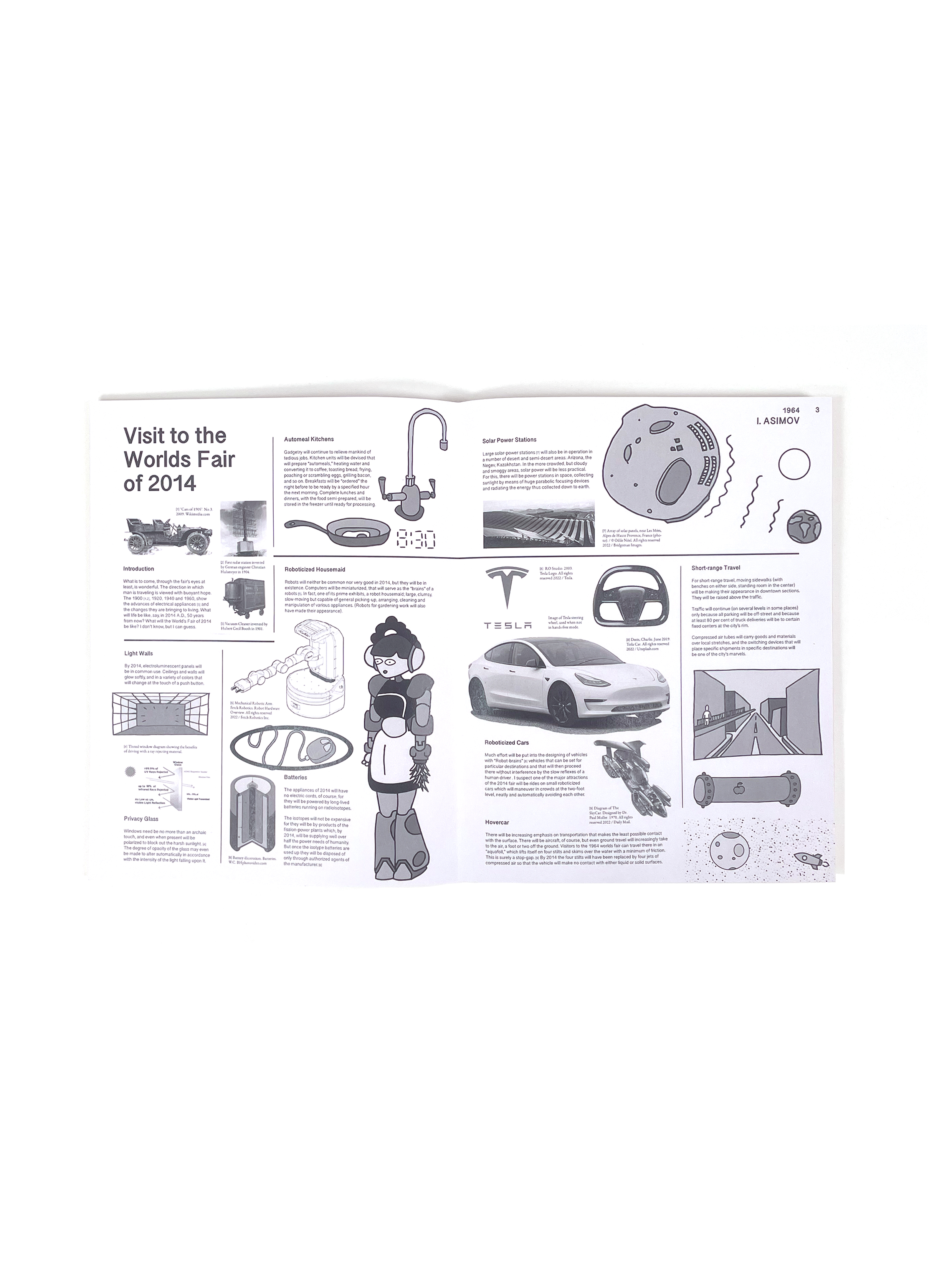
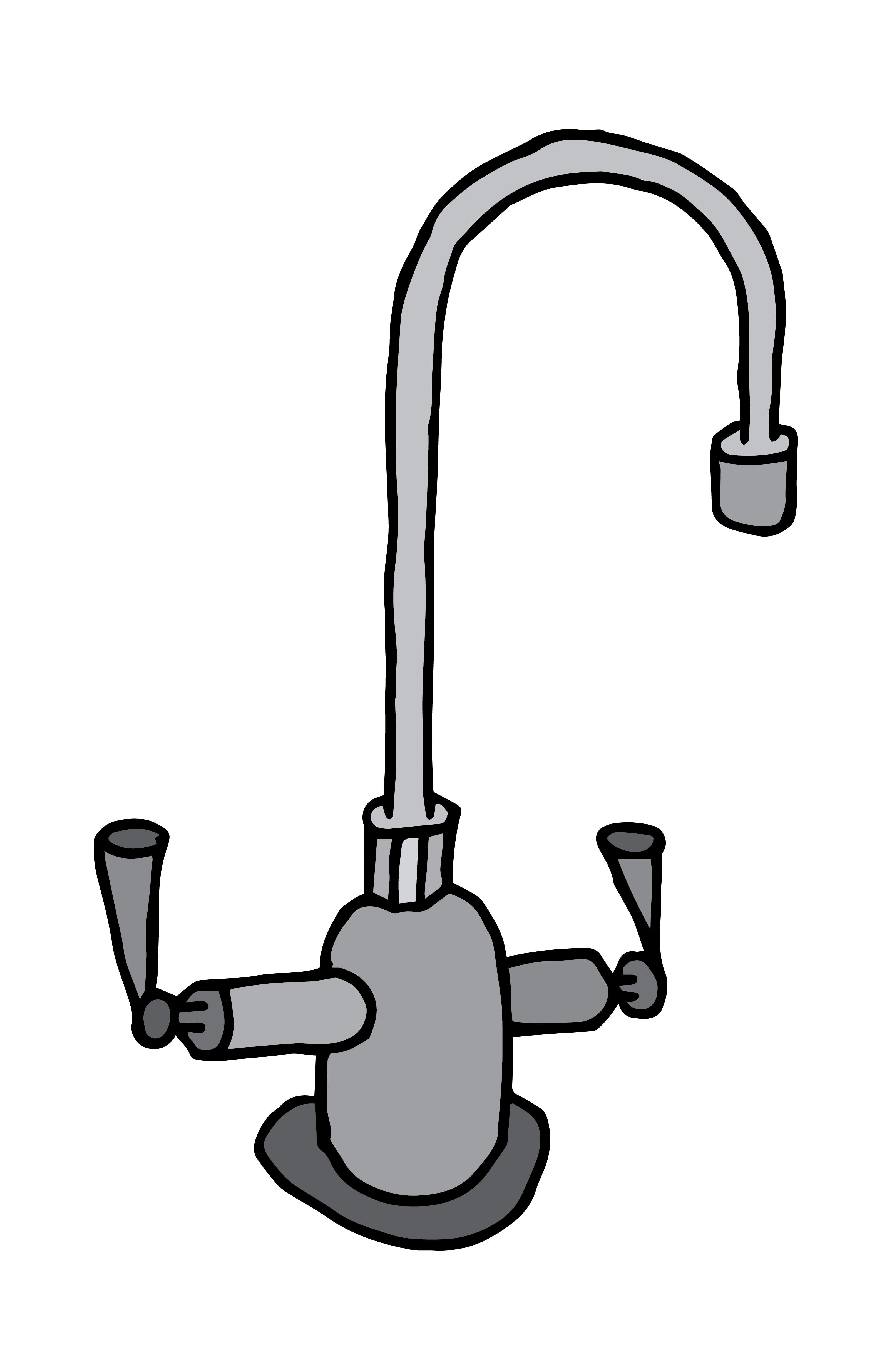
After the layout of the text I sketched out the drawings and image boundaries that I wanted to insert around the text. By setting out all parts, I was then able to draw lines sectioning different parts of the page. This took quite a lot of time yet when It came to compile all components together it allowed me to work quickly.




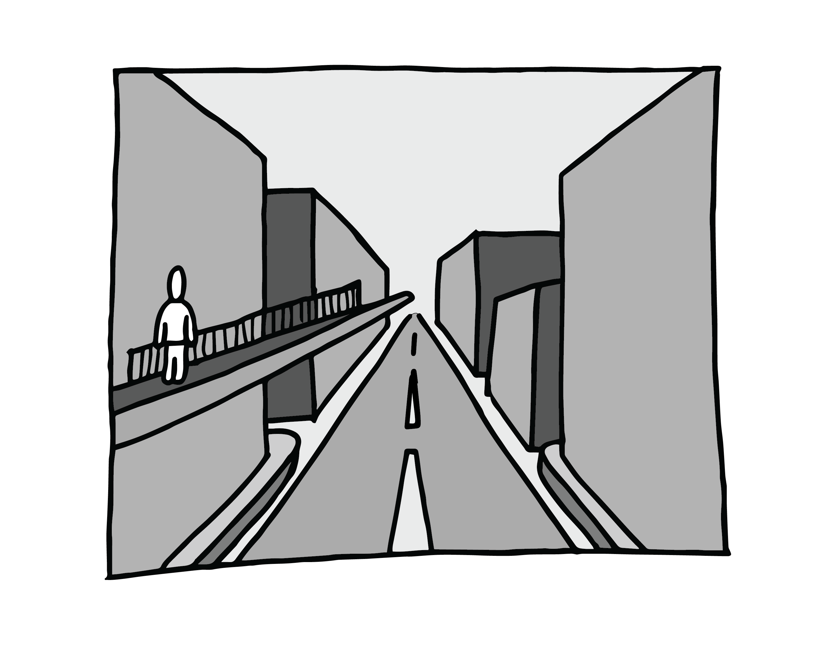
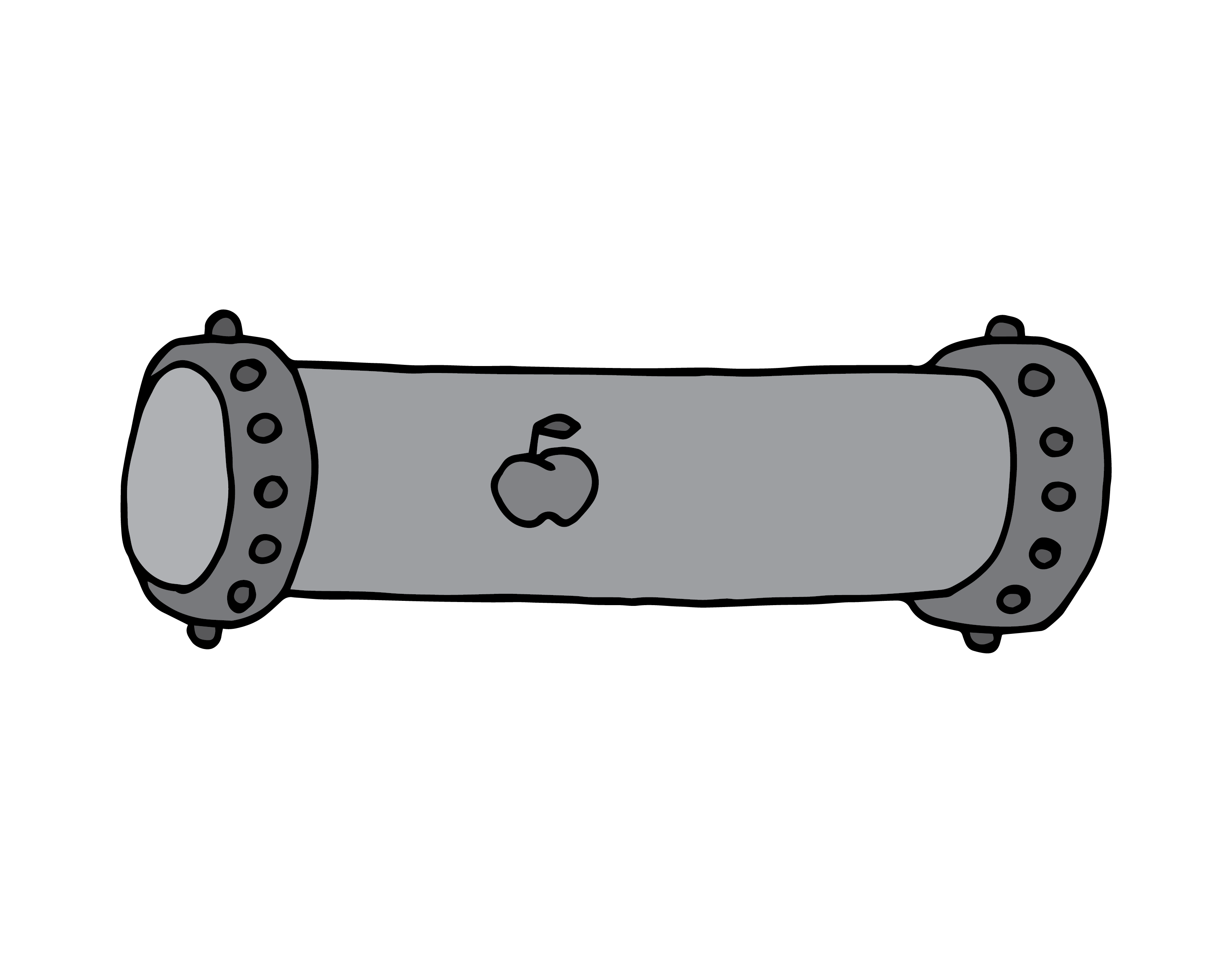
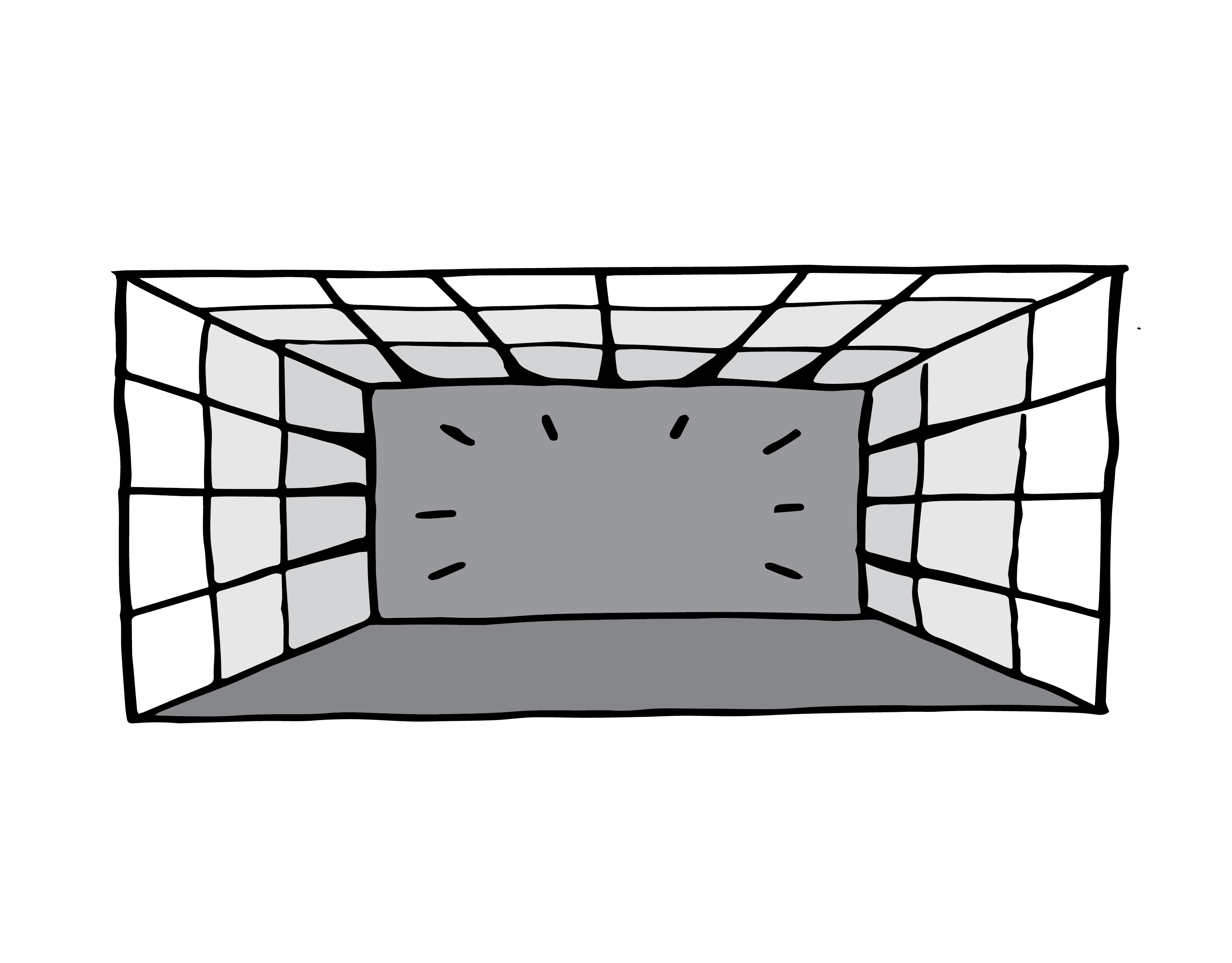
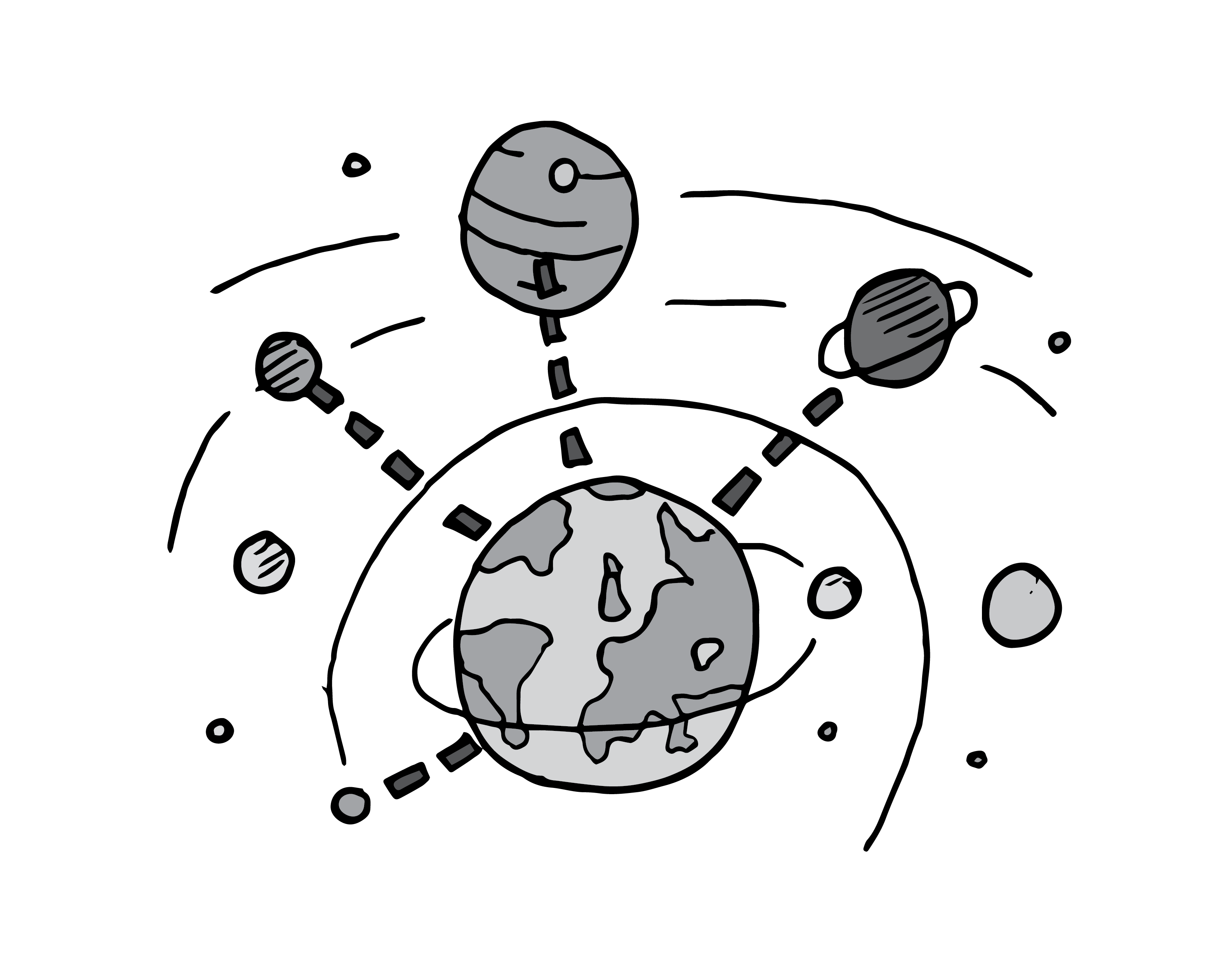






Laying out the first page meant that the
first round of printing and amends had
begun. I printed the page out two sizes,
A3, on 140gsm cartridge, and A4, 90gsm
matte, to see what kind of size was more
readable. At this stage the difference in
paper type was just to experiment with
different stocks. I found that the cartridge
colour was more successful as it made
the grey-scale images bolder, yet I liked
the thinner, 90gsm, paper more. I ended
up deciding on somewhere in between
for the next print; the A3 had too much
space between images and the A4 left
no space for eye-rests. I went over the
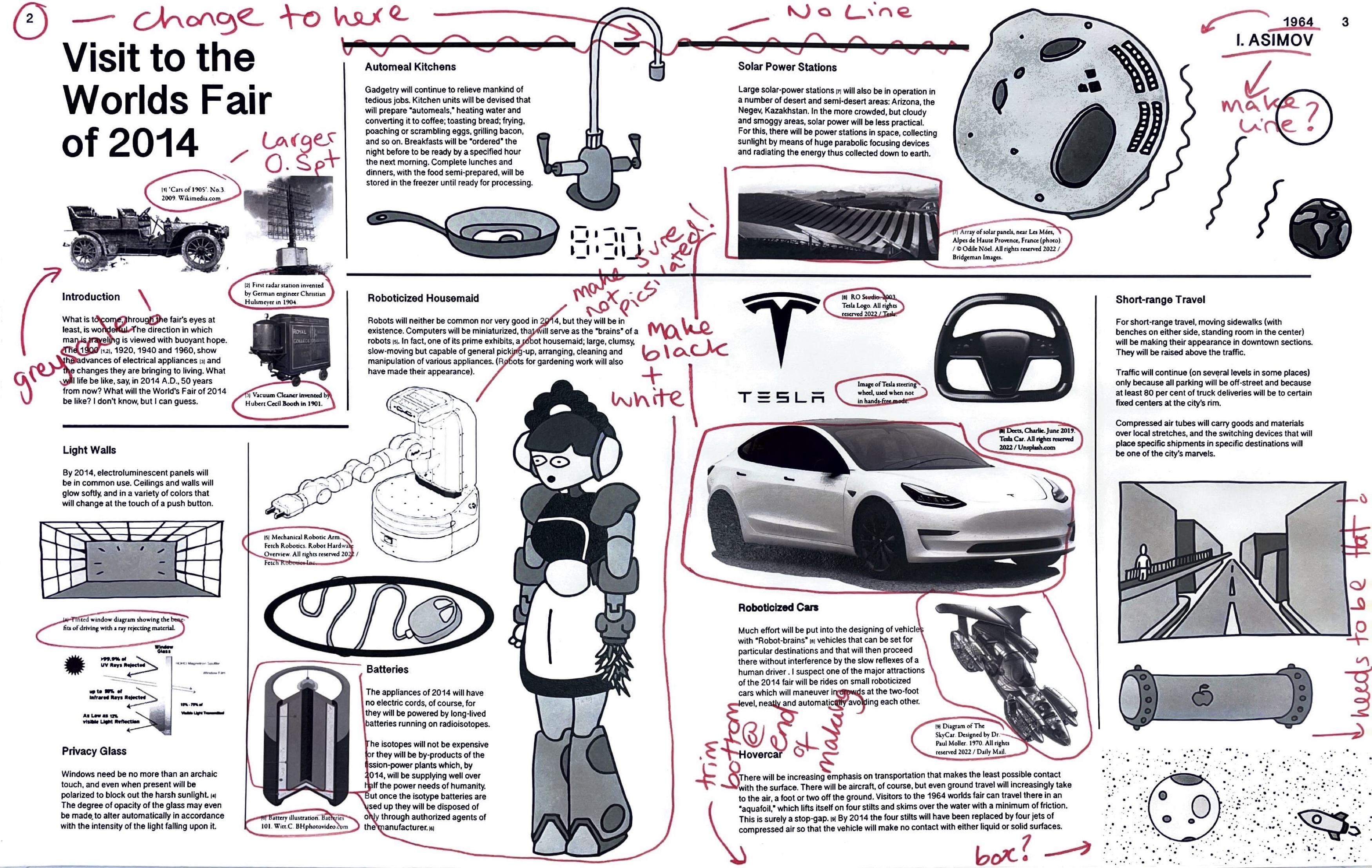
page with a pen to mark where and what needed to change. I needed to
change the title font in the top left corner
as the serif font looked too out of place
surrounded by a sans-serif font. I also
needed to make the lines a lot thinner
and not connect them as my eyes were
drawn to them due to the large stroke.
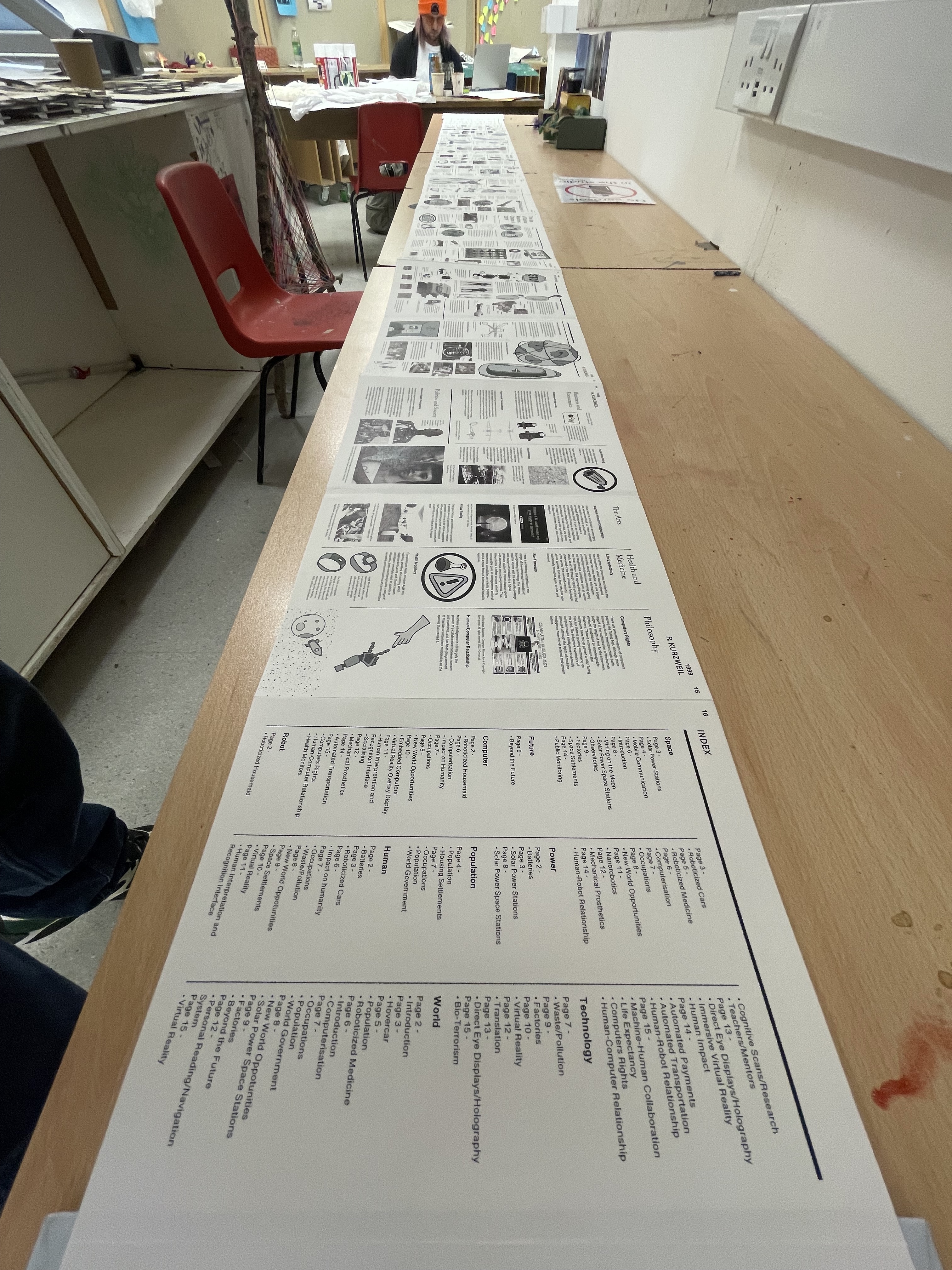
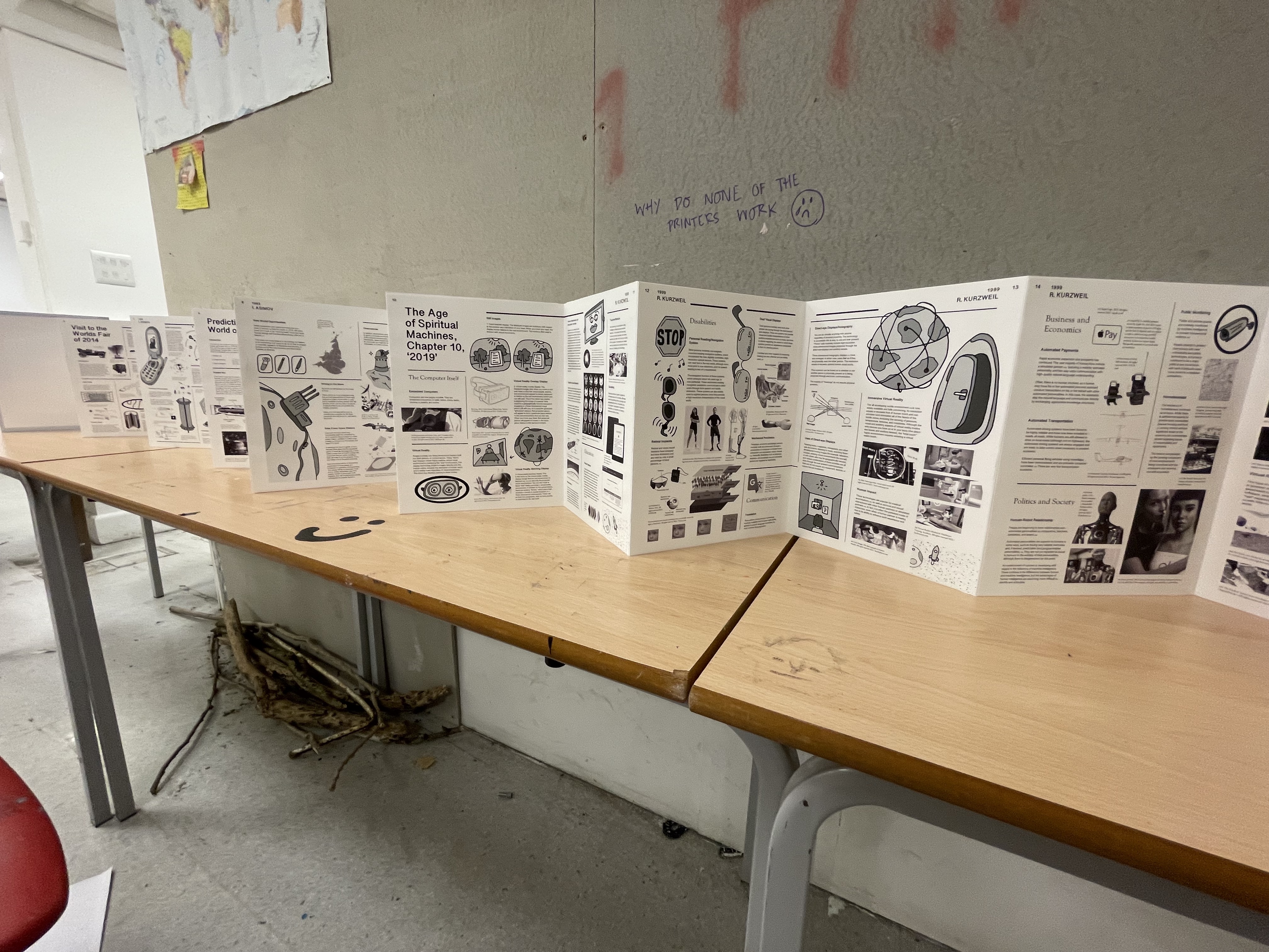
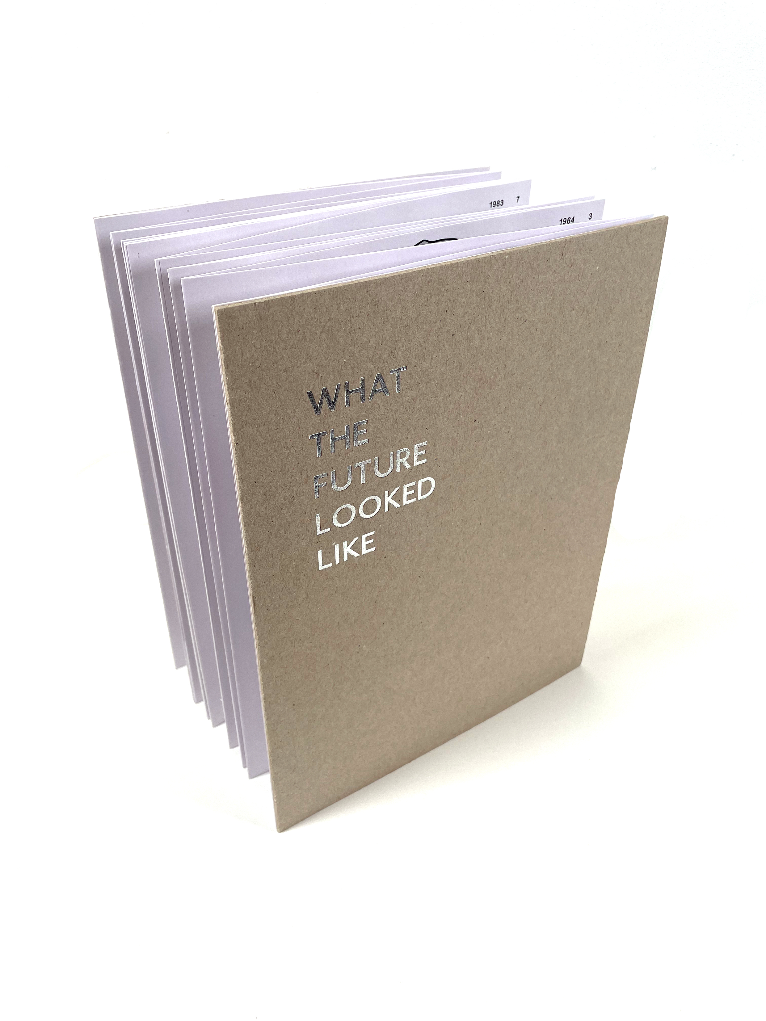
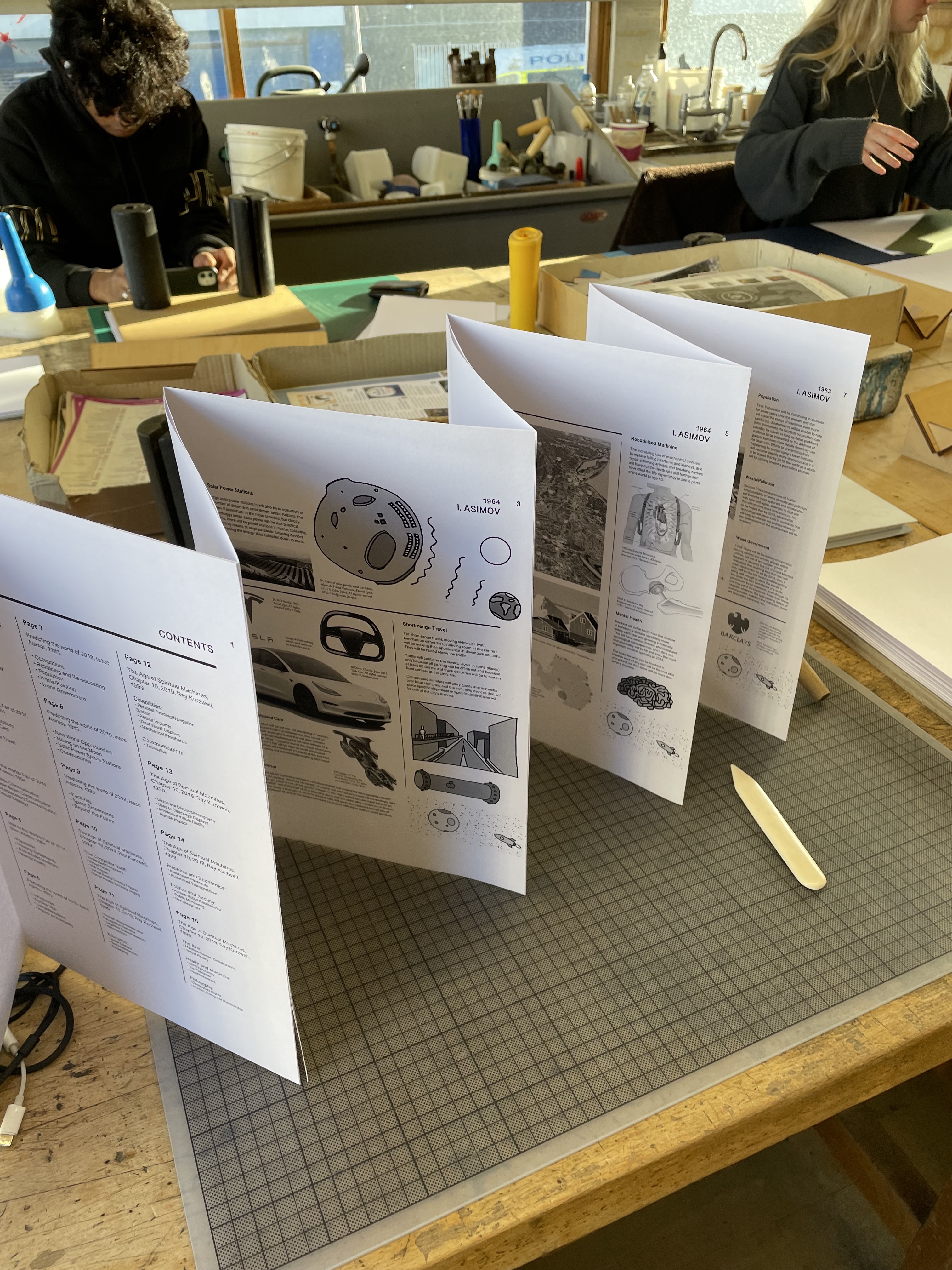
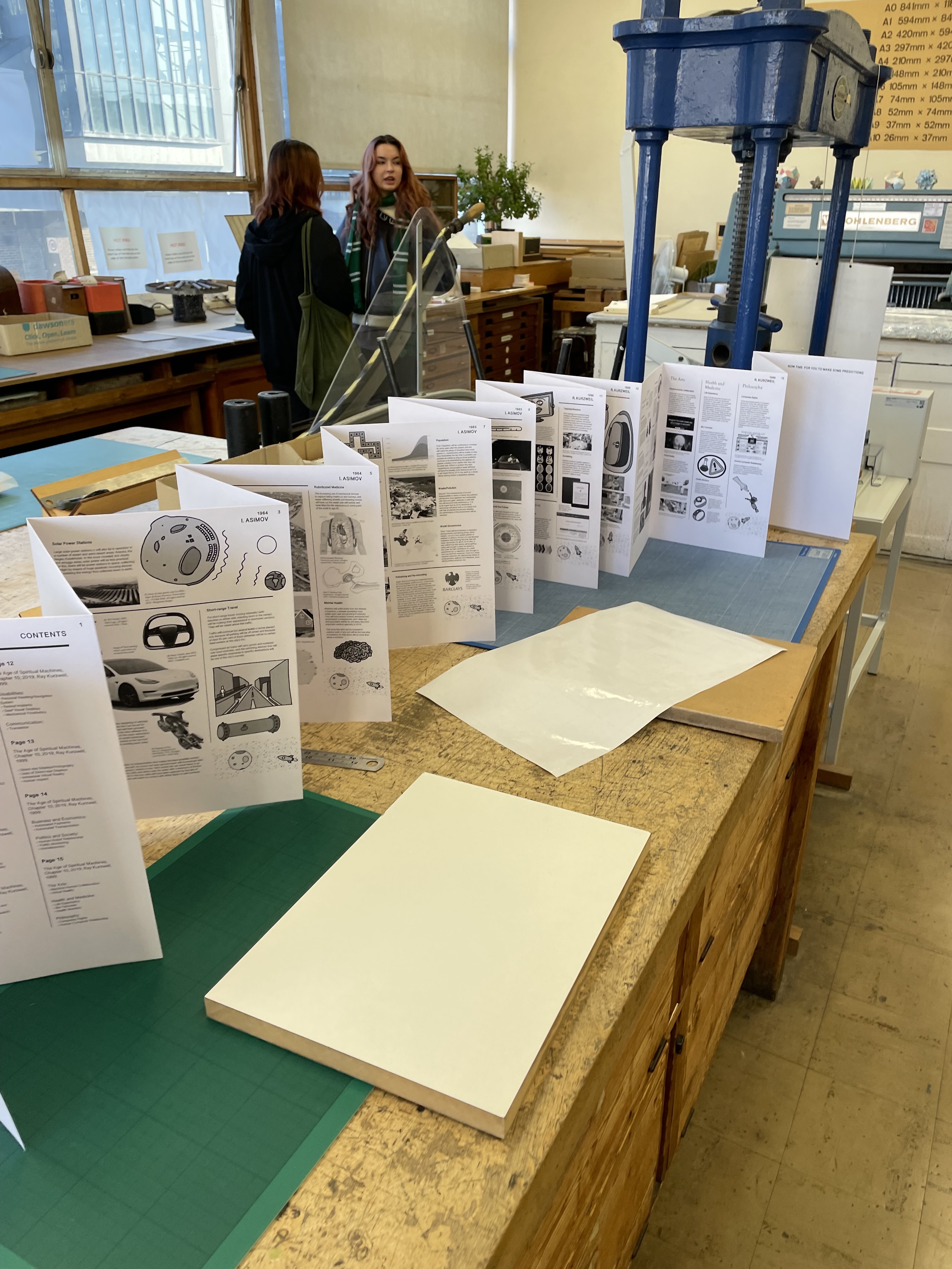
I next assembled a test copy of the book. It was made as a concertina book as I wanted to again reflect the journey through time whilst reading along a sort of time line. After we had a group review, I had a lot of
notes to go through - amends part
two. There were lots of things that had to change. I am going to highlight the larger points; covers need to be designed, all captions should be 0.5pt larger - too small on the
40x26cm pages, page numbers
when book is opened are next to
each other bad for user navigation,
images not printed grey-scale and
delete large bar running along tops
of pages. After I started making the
changes that needed to be made I
took note of the successful parts of
this crit; I knew the paper I wanted to
use, the binding method, document
size and spacing between images,
captions and body text was balanced
well, with occasional eye-rests. Below are the final pages with all of the edits from the crit.
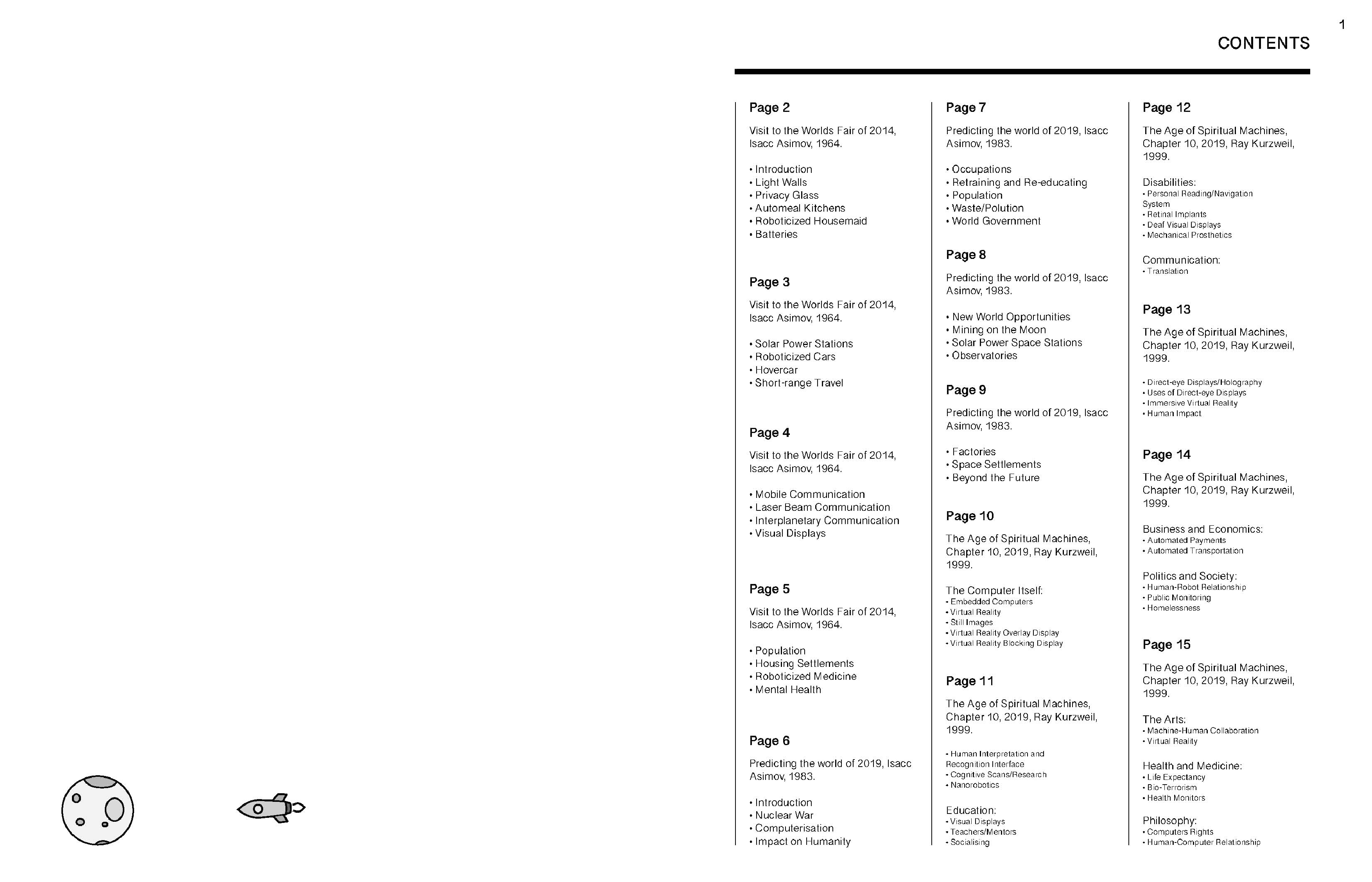
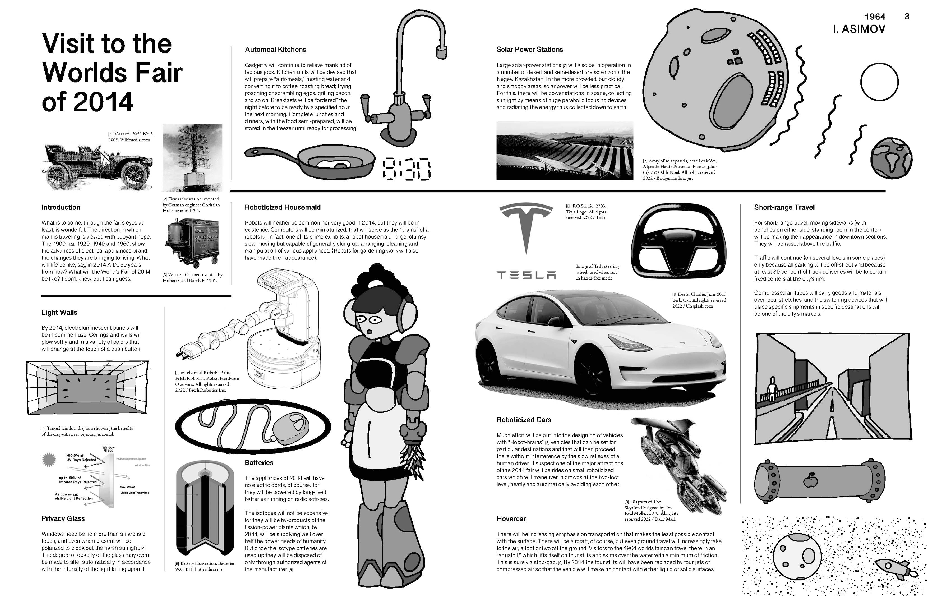
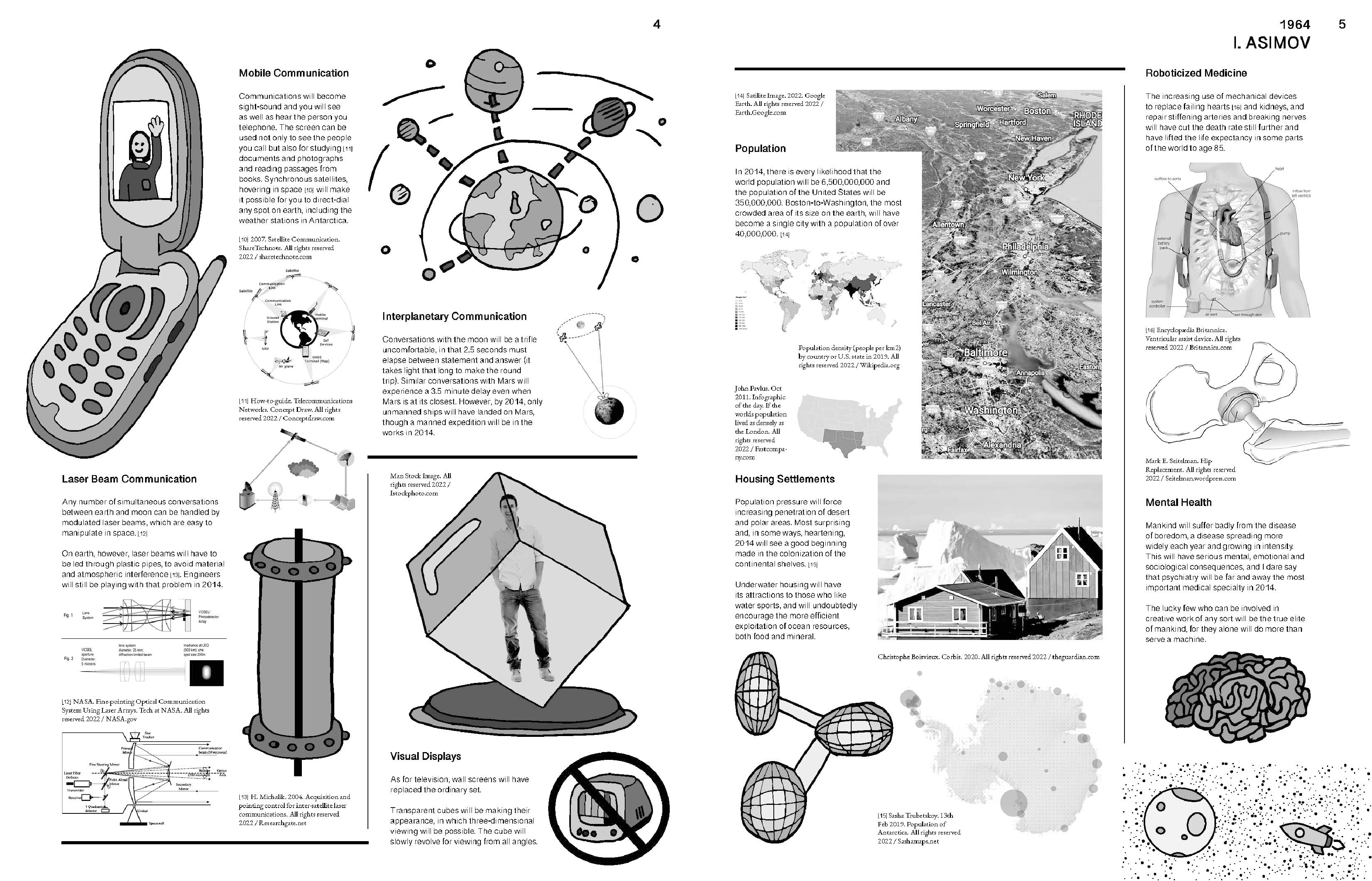
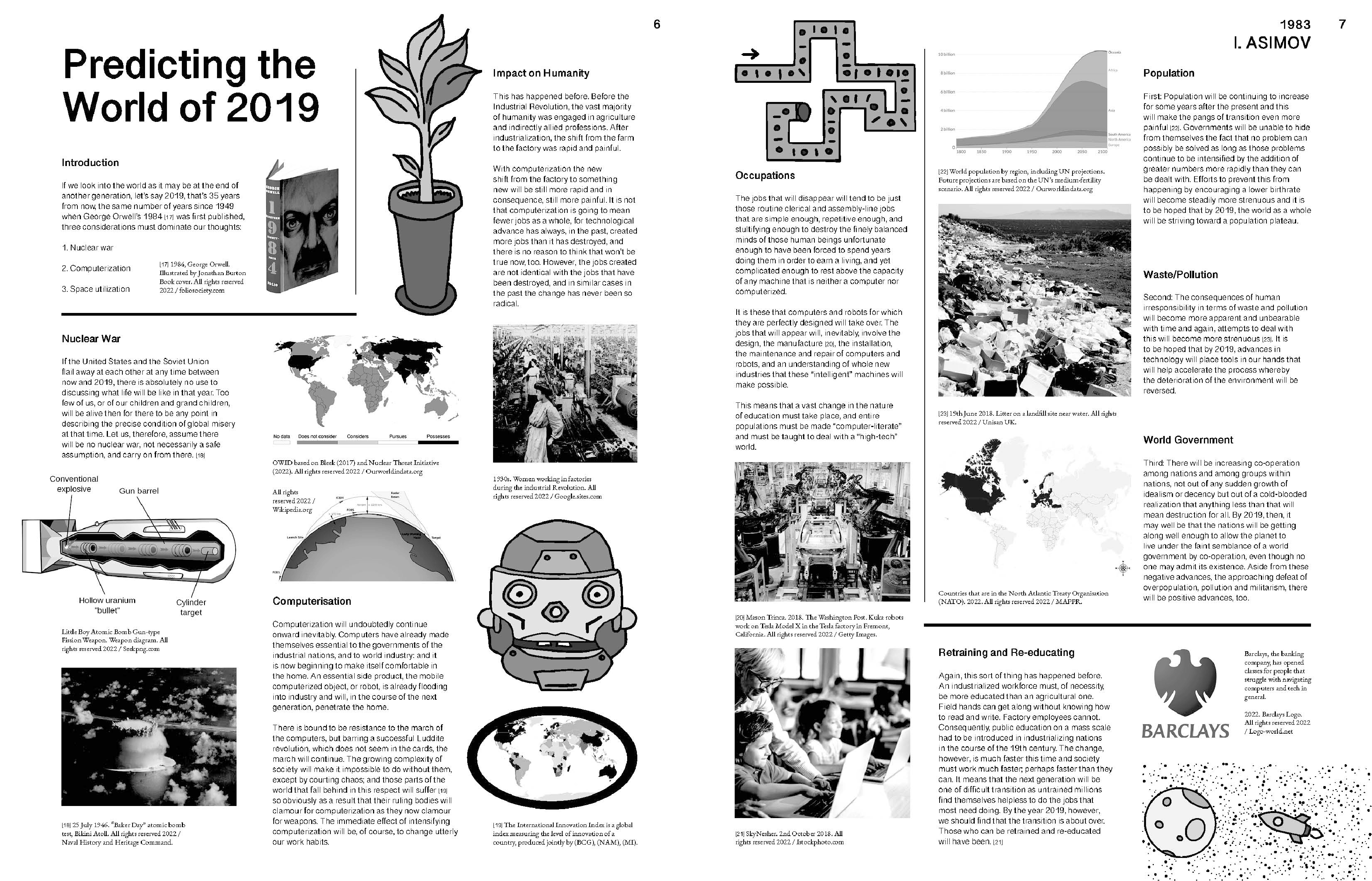
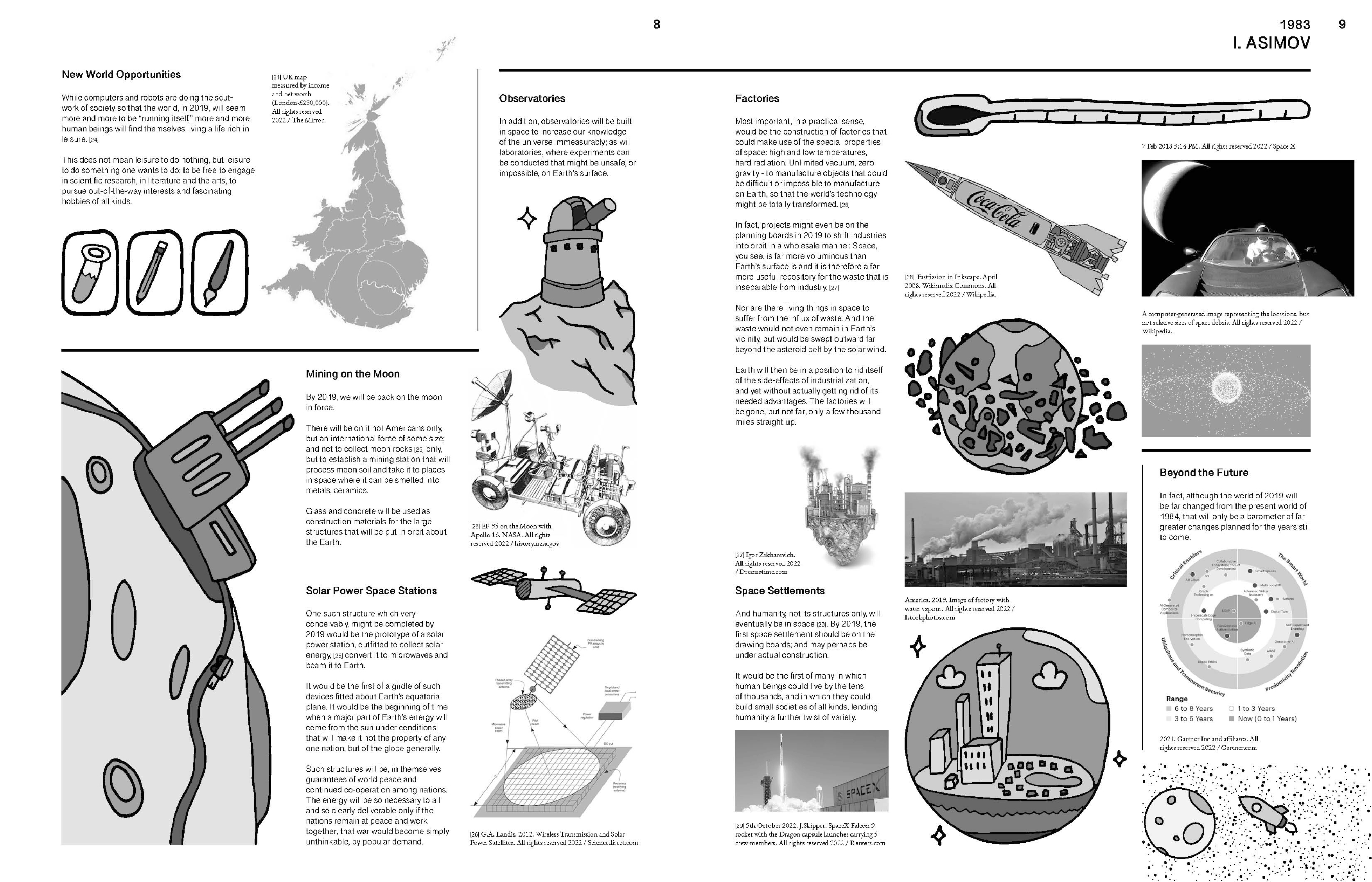
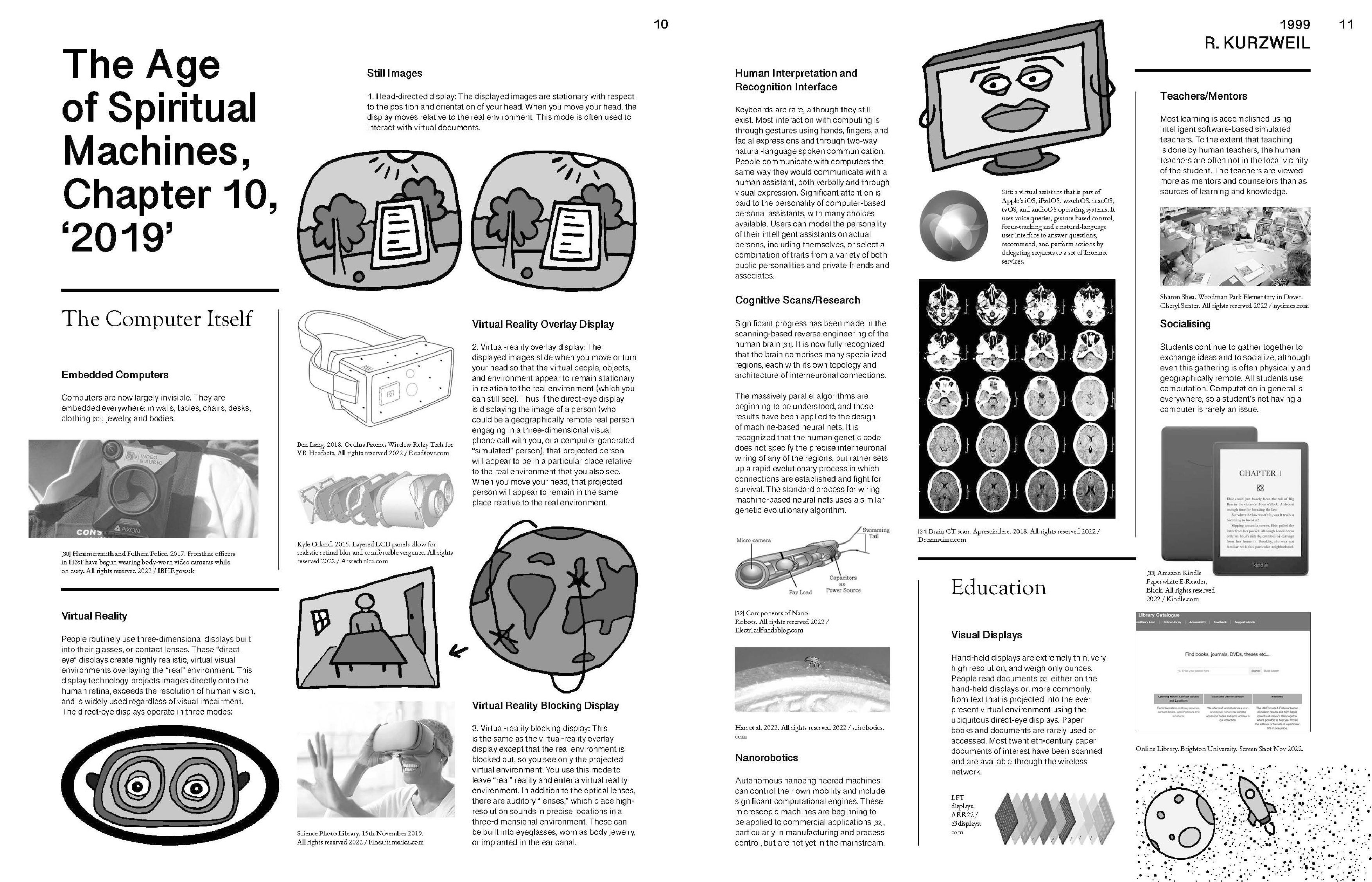
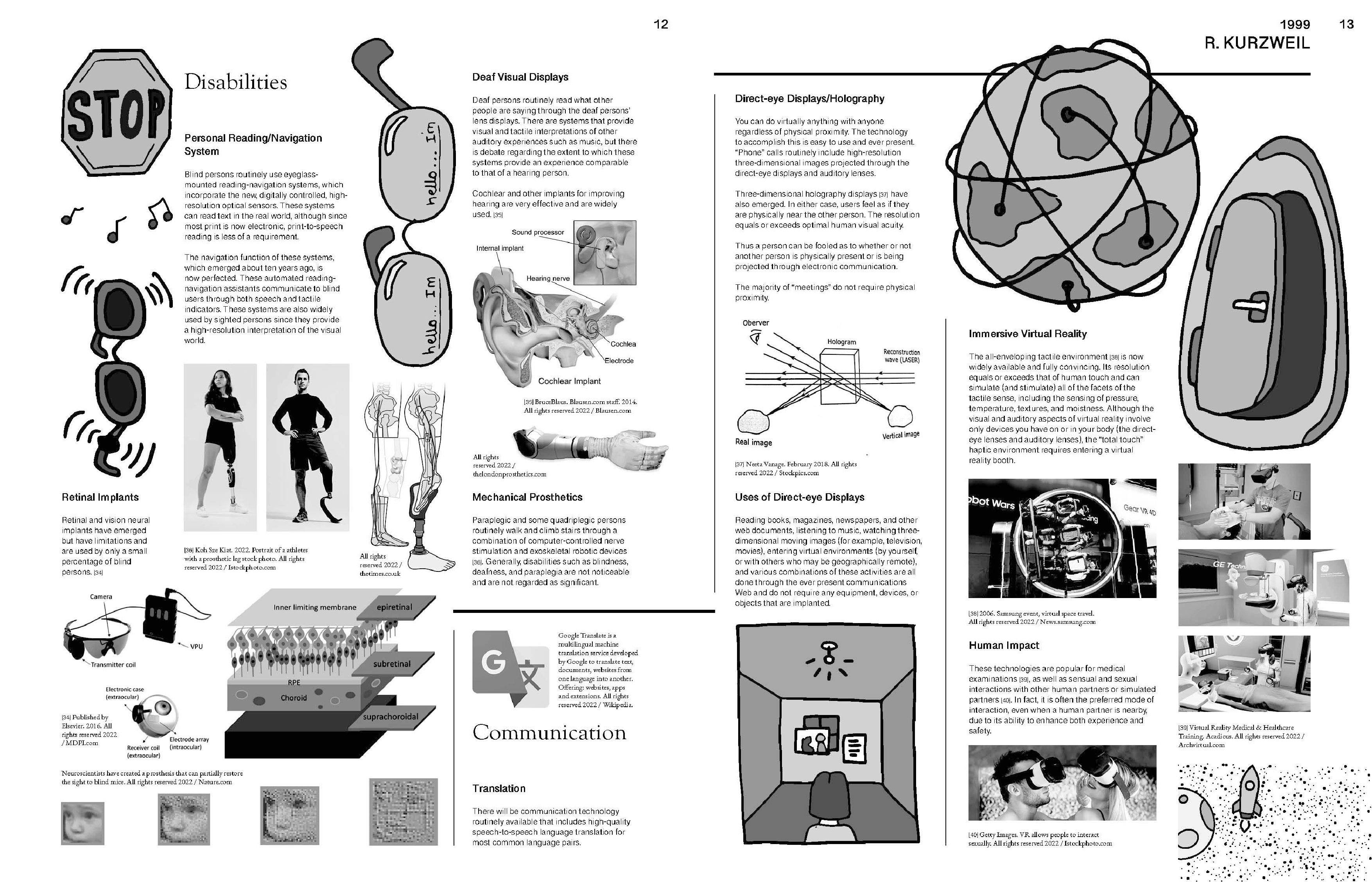
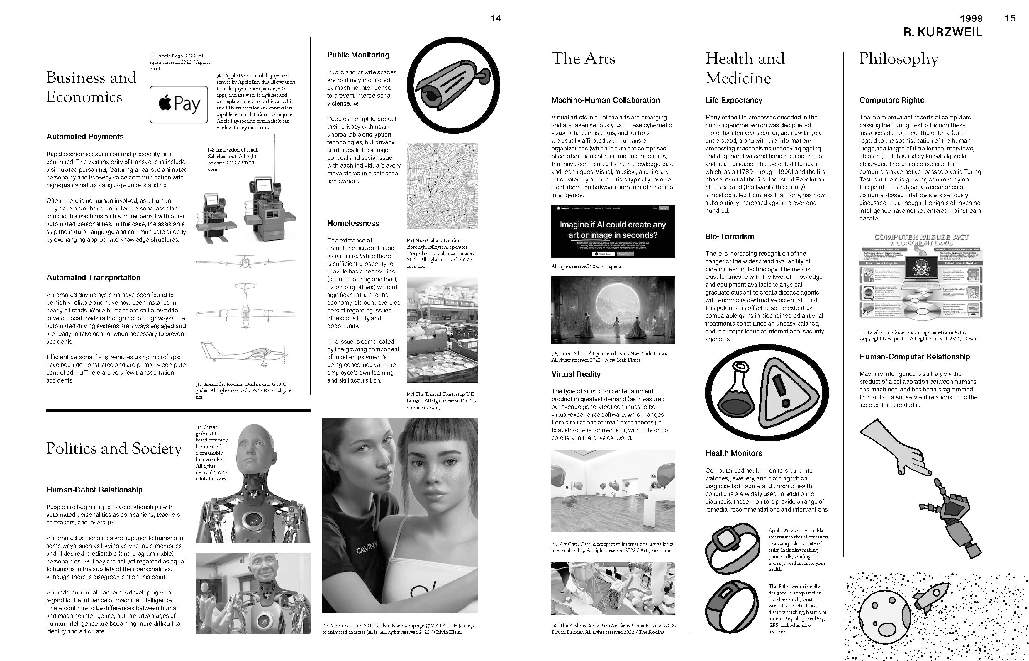
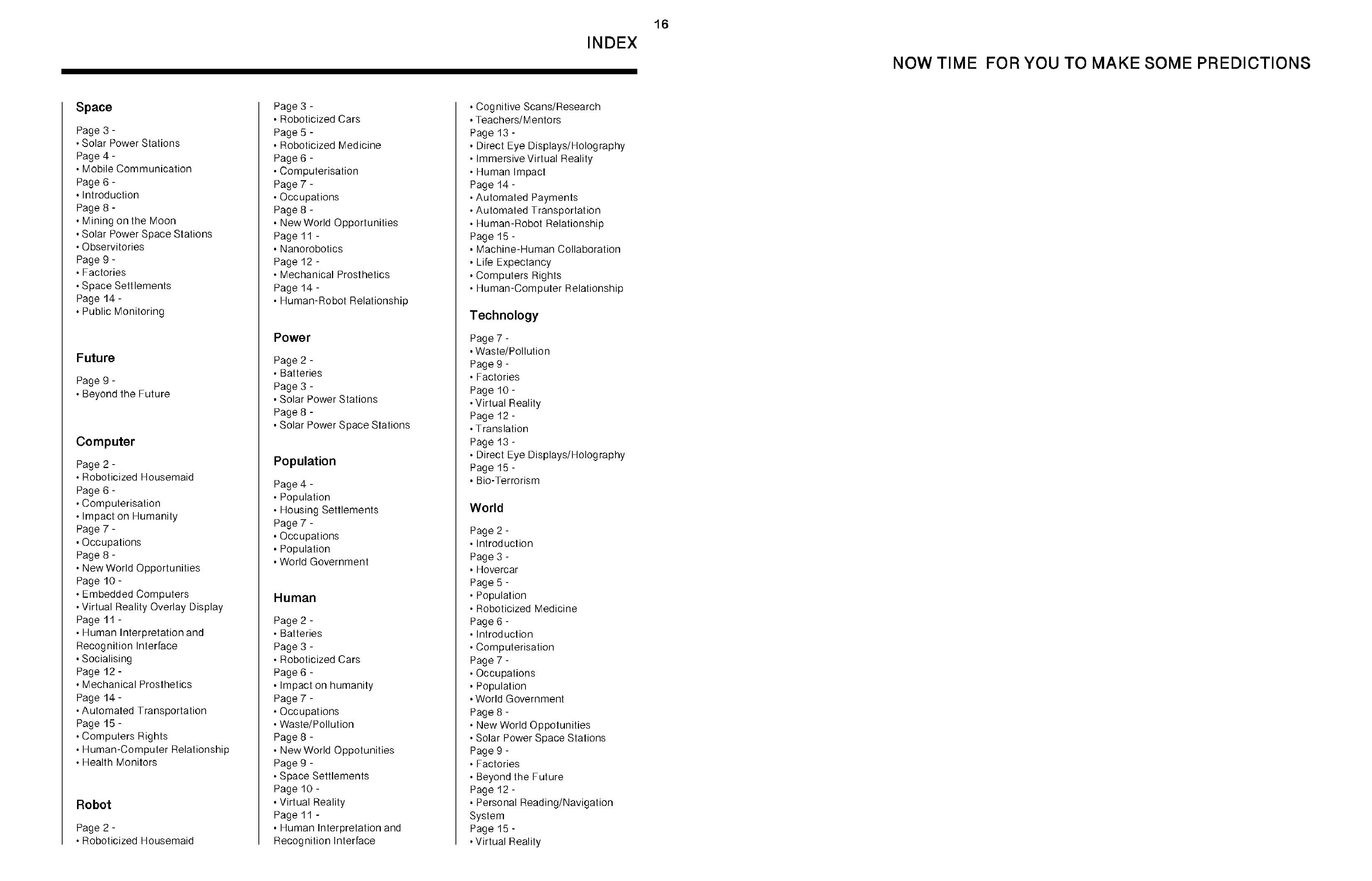
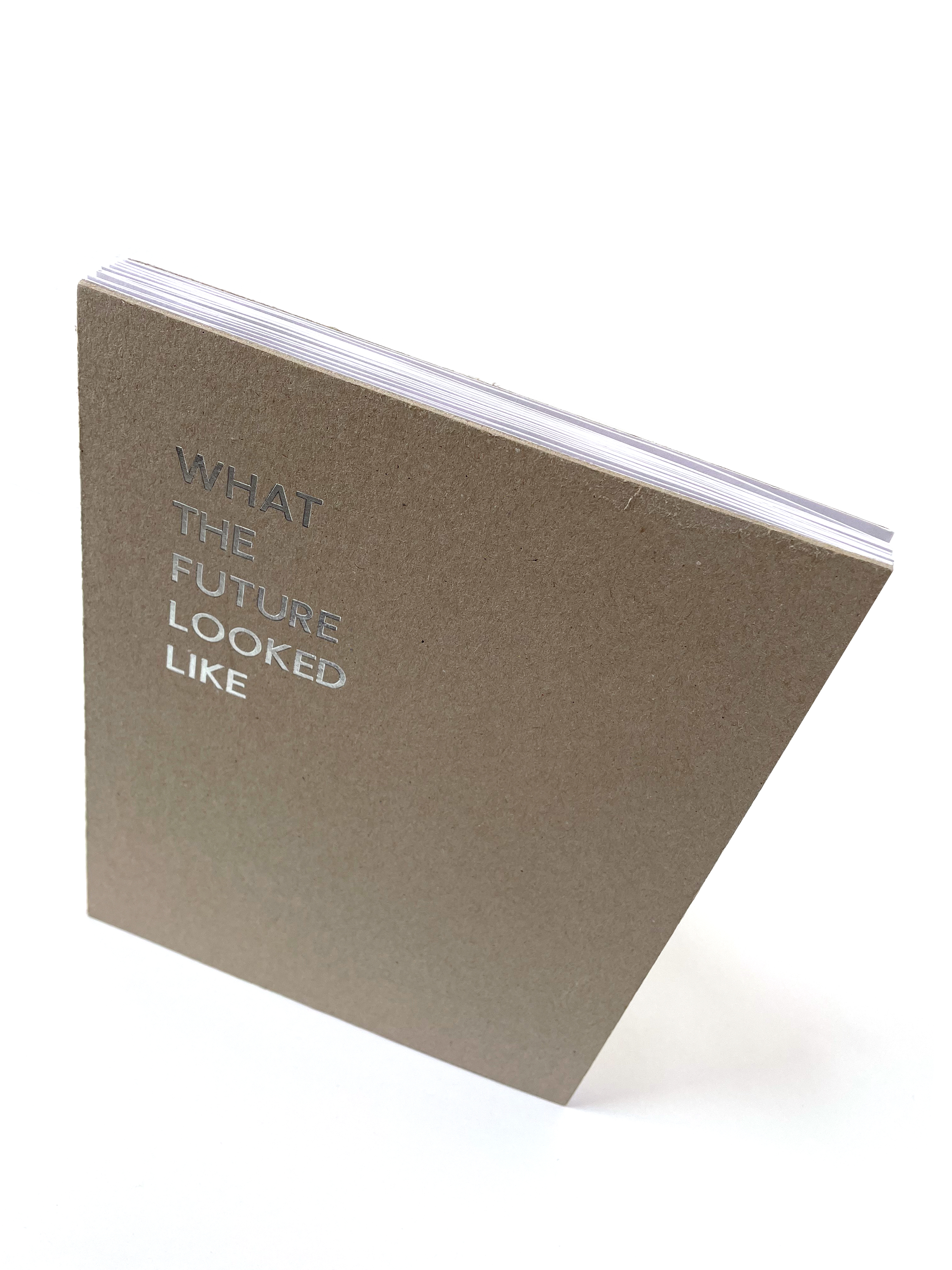
Once I had made the necessary changes to the inside of the book,
it was time to start thinking about the cover, I knew I wanted to use
a plain coloured cover, in keeping with the grey-scale images and
text inside, but also just a plain design so that it balanced with the
maximalist design inside. My first thought was to use grey board,
yet I wanted to try two different types, classic grey mount board and
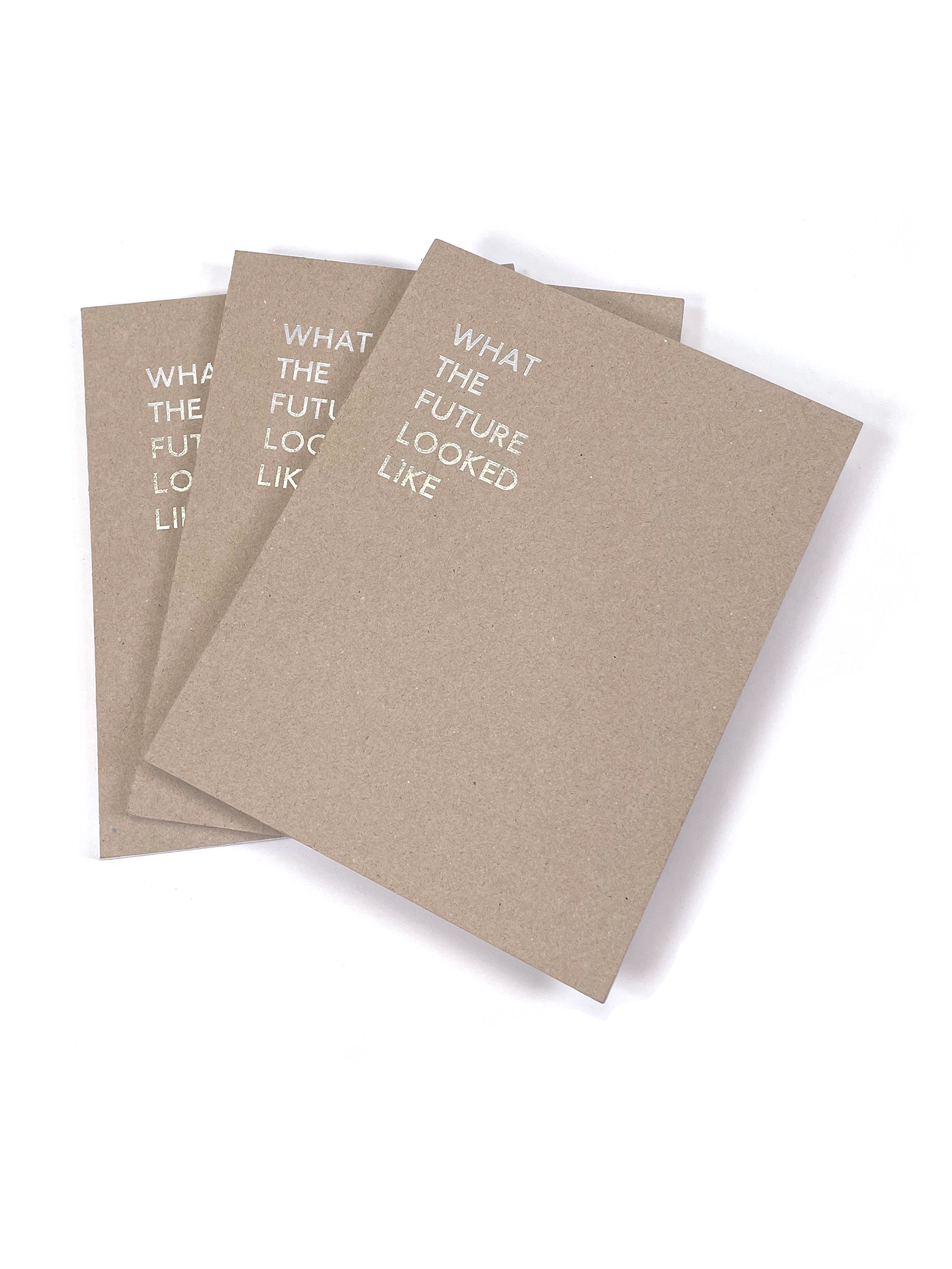
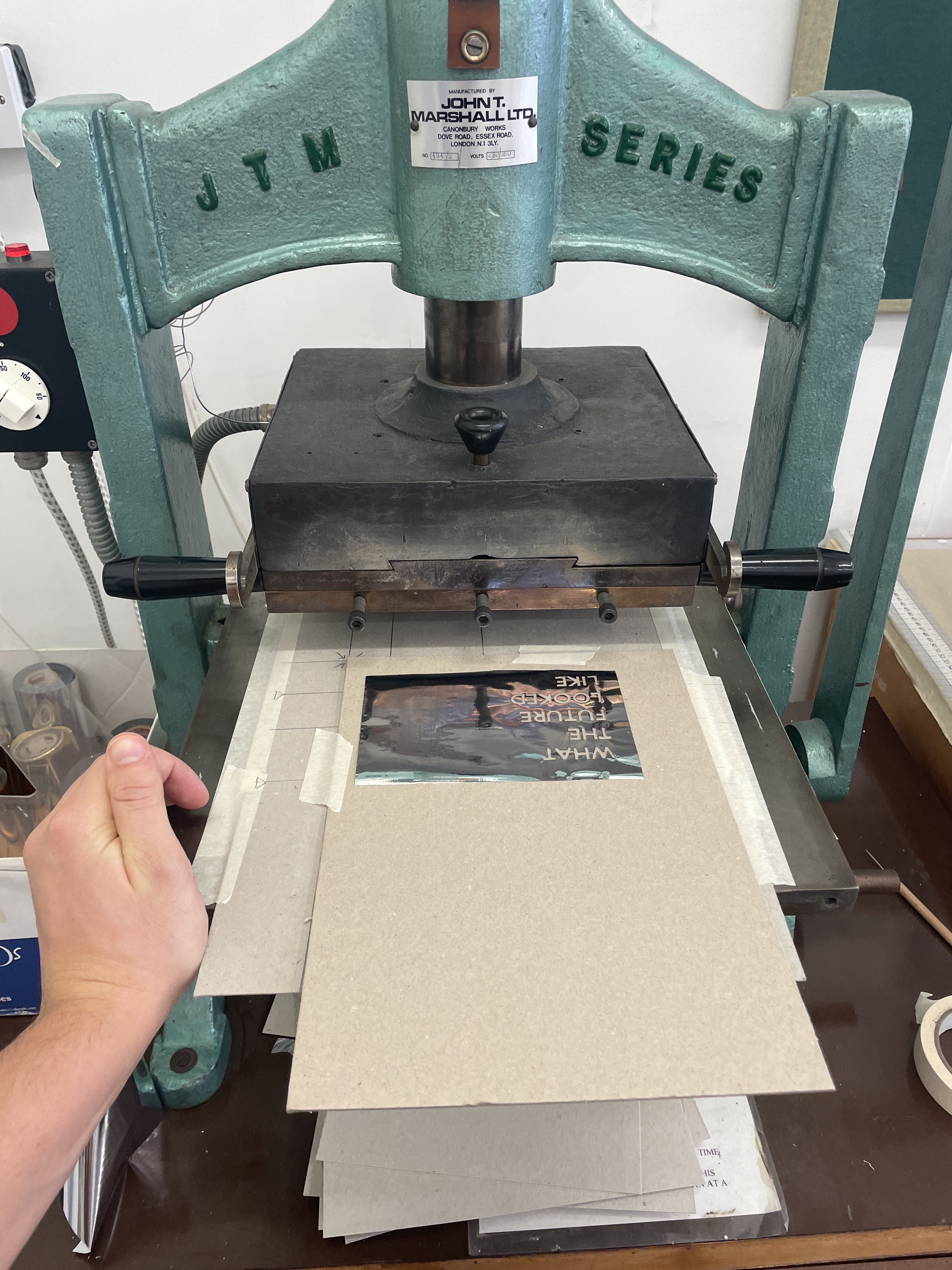
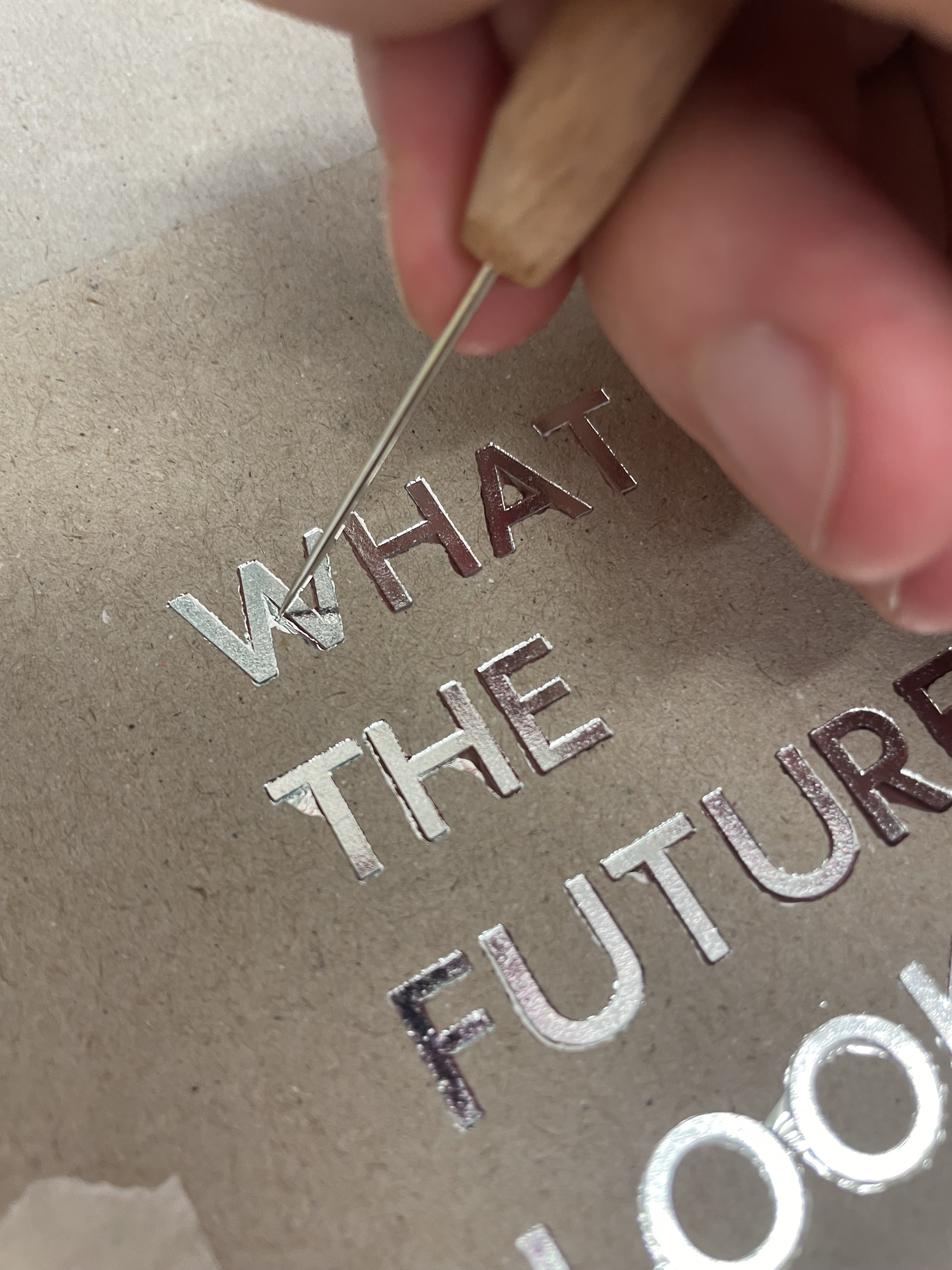
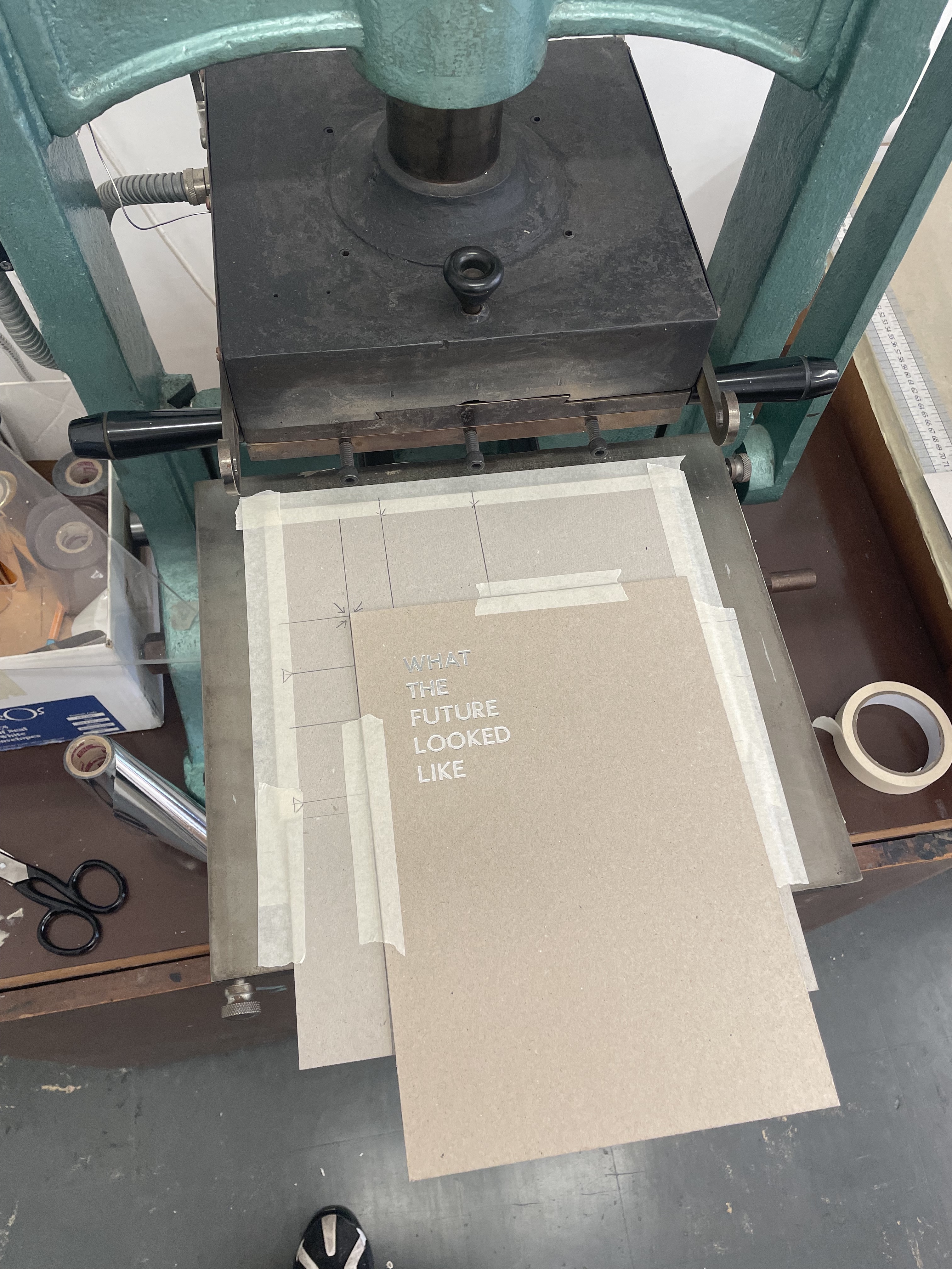
300gsm board. I also wanted to foil, in the same location and font
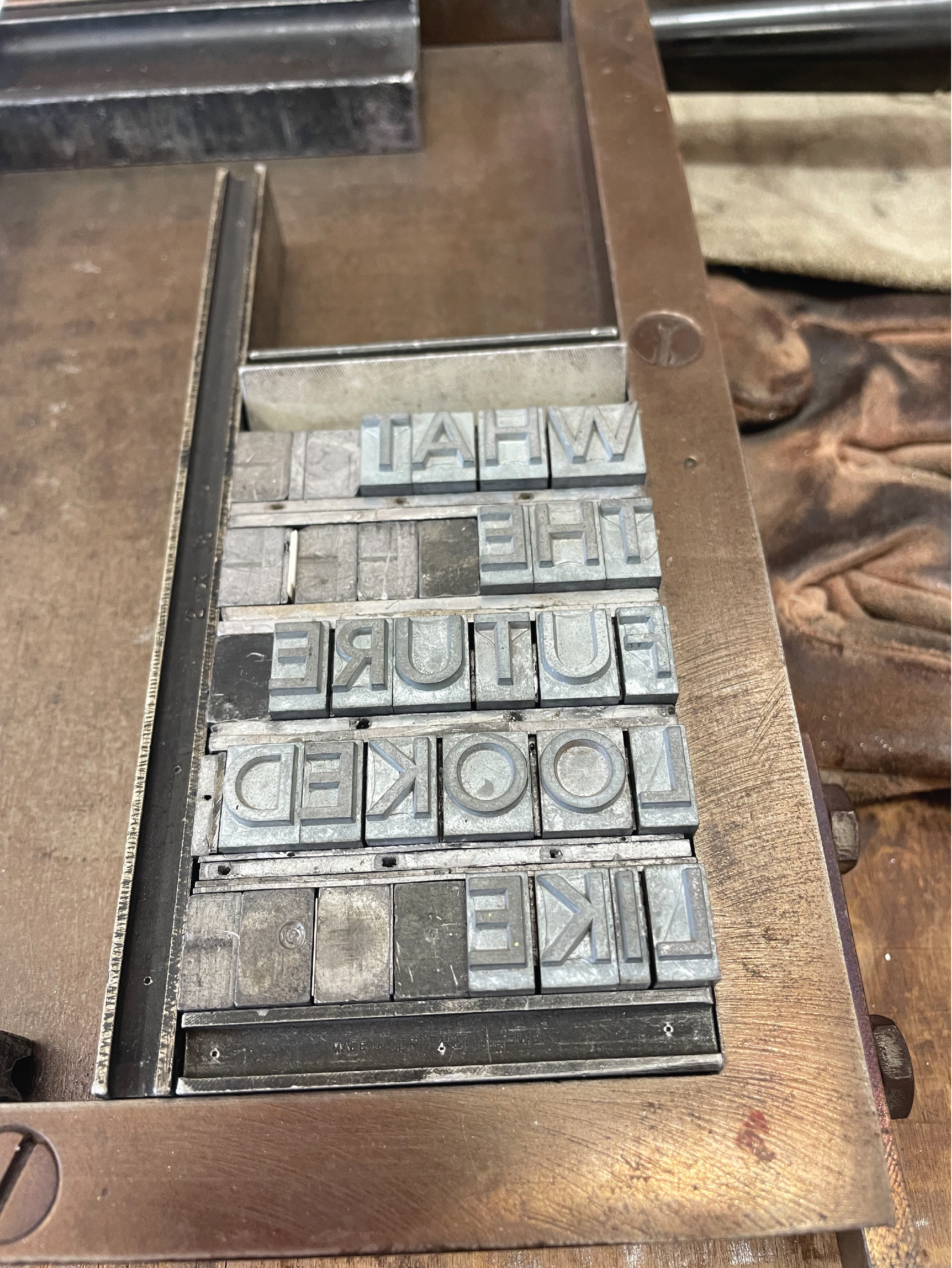
as the titles inside, the book name on the front cover. I tried out
some different iterations of the text, and chose to have each word
on a separate line, as this format was most readable. I used the
granby 36pt letters in the press, as this font was most alike the title
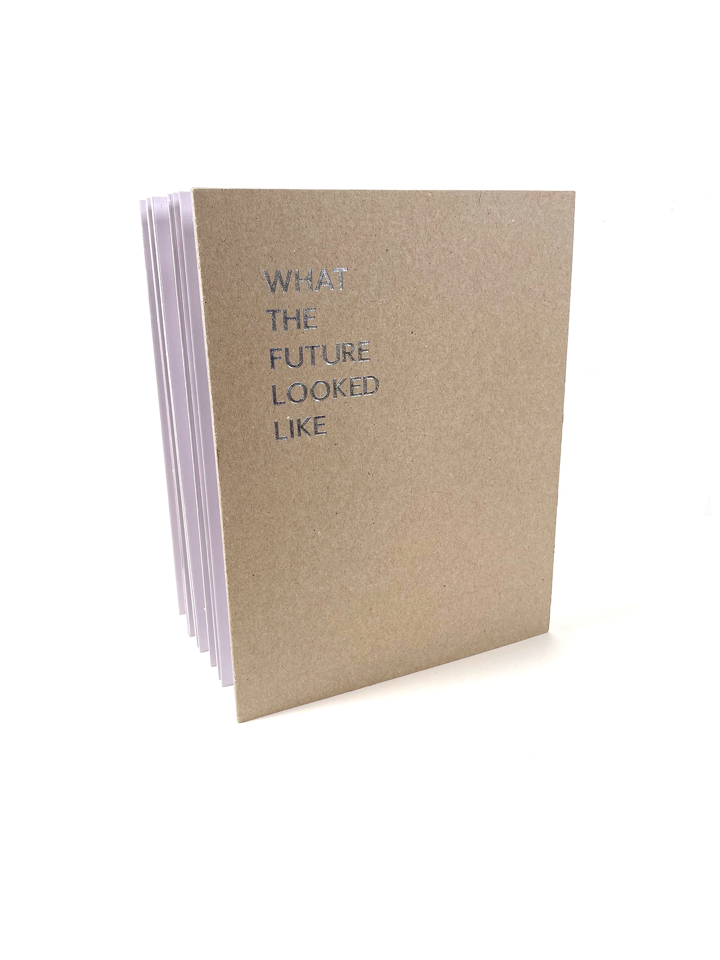
font. I want to try using chrome coloured foil, as it links to themes of space, technology and the future in general.
The making of the final three books went almost perfectly other than a few set backs with pages either needing less glue or more. The paper I chose to use for the final book was 140gsm, cartridge and uncoated this was the perfect thickness so that the book would stand on its own.
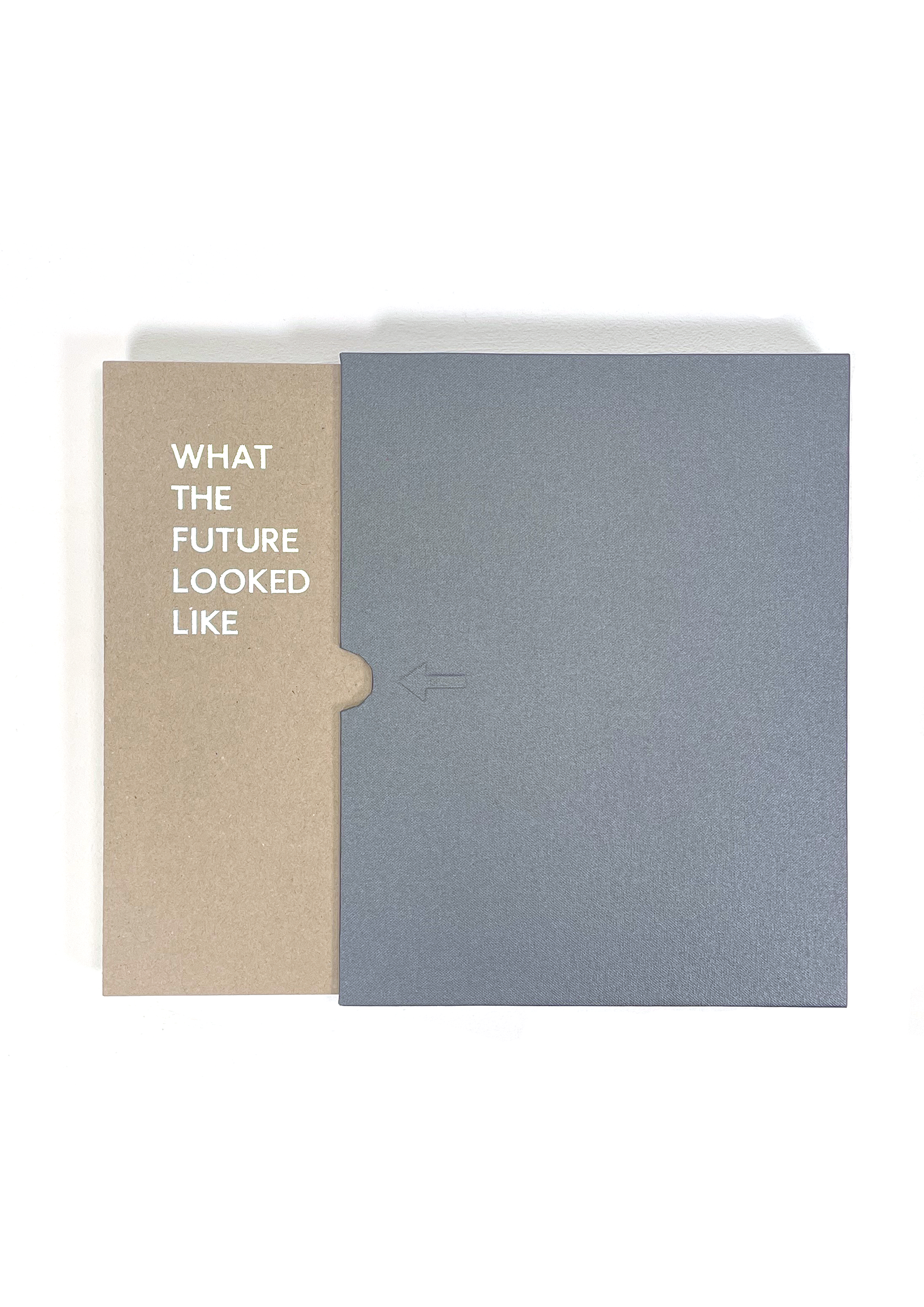
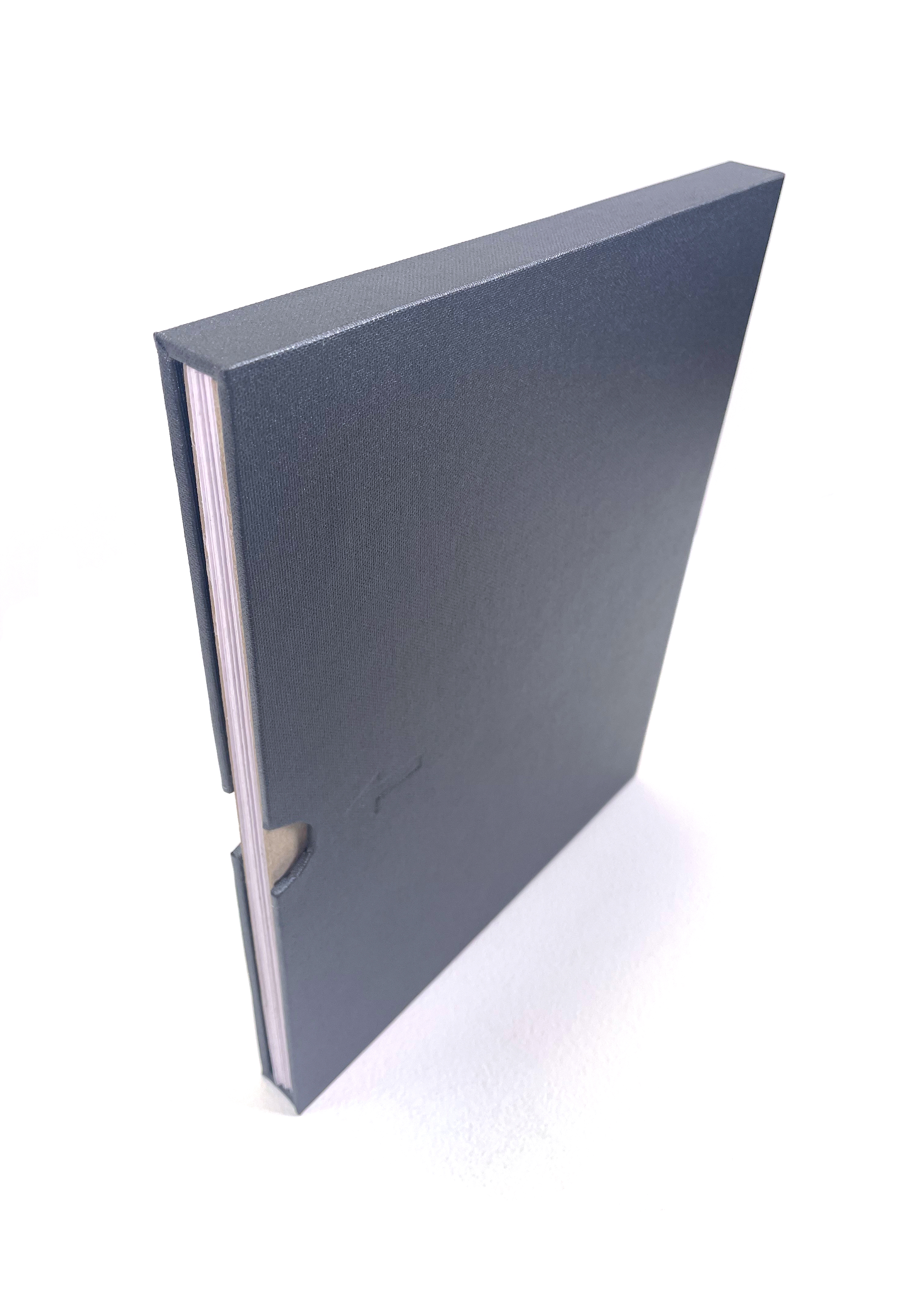
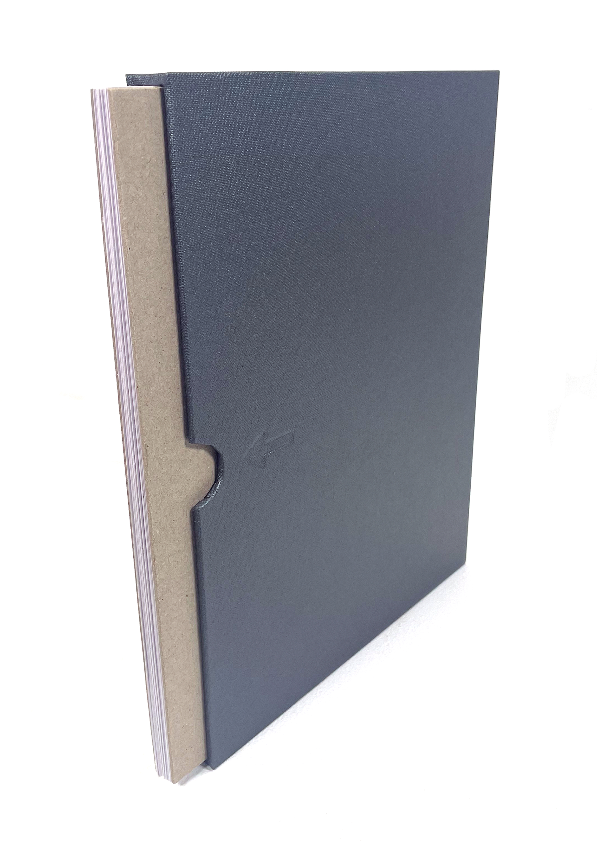
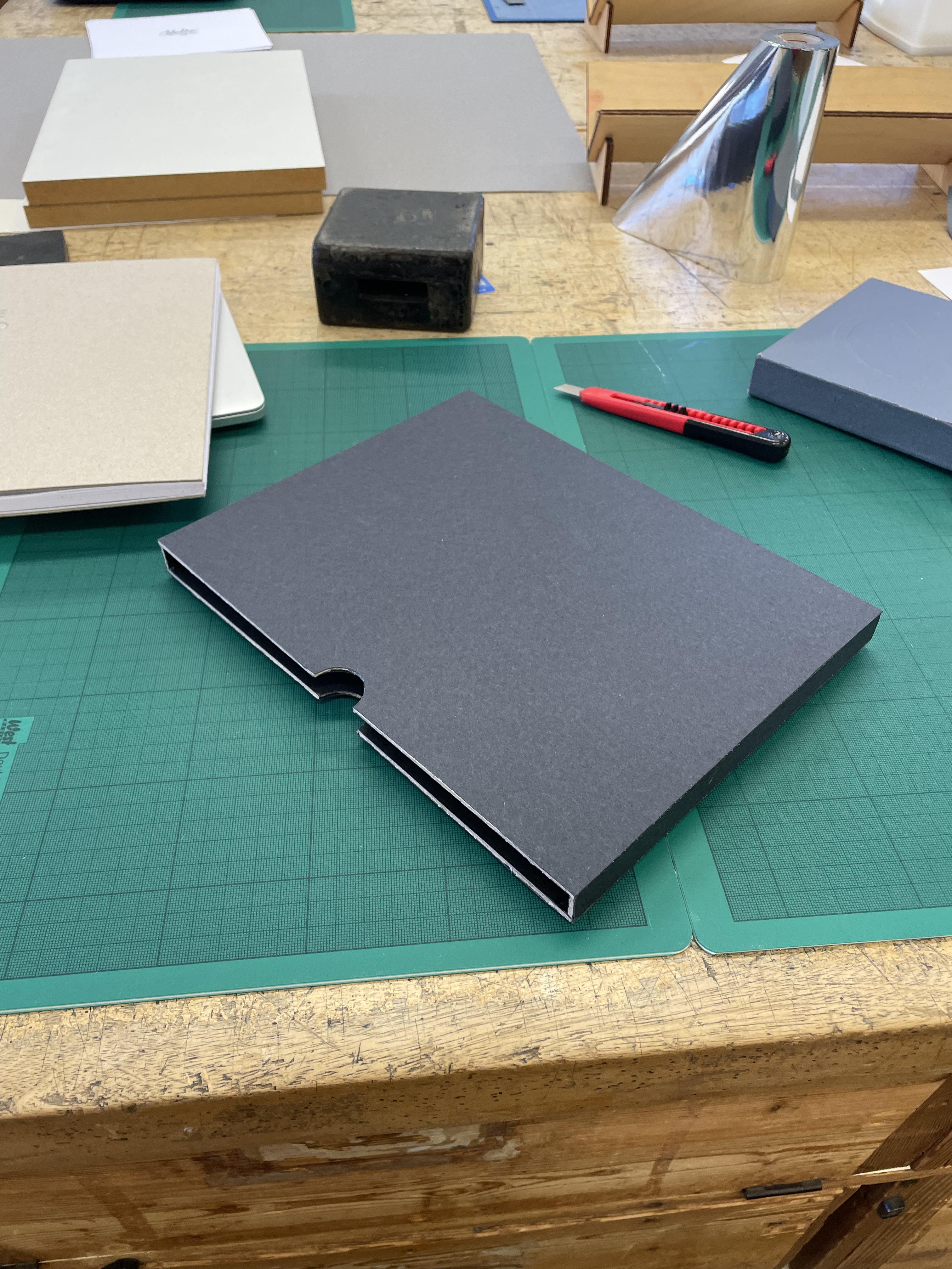
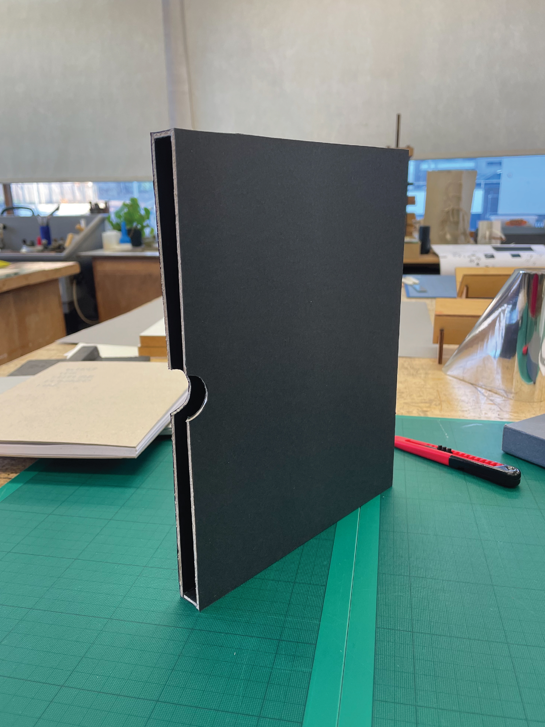
Once I had made the three copies, I realised that I want the book to be able to stand upright, but this would only be possible if the pages were slightly open, in the zig-zag formation, so I chose to make a box for the concertina. The toughest part of this process is the measurements, just a millimetre out and the book either can’t get out or falls out. I wanted the reader to be encouraged to slide the book out so I added a small arrow and finger grips to the front side of the box. I tried different versions of this with a chrome sticker and an embossing method. I chose to use the embossed arrow as it looked more sleek and professional. I chose the shiny dark grey, canvas type, material because it matched the grey-scale drawings inside perfectly whilst giving a hint to the shine of the books cover title.
Concluding this project, I first thought that I would struggle with a brief where the main focus is compiling readings and text setting and layout design, due to my dyslexia, yet I found that it is something I enjoy and can design successfully. A major fault in this project was how I started. Like I have done in the past, I was looking at the project as a whole, which, thankfully, didn’t last long and I was then able to move on and be taken in different directions due to research and the creative process.
Although it took a long time to find readings that all related to one another, I think that finding the correct collection was imperative, the excerpts became a catalyst for idea generation which I think is how you know the readings are strong and would be interesting when compiled for the reader.
Final Outcome:
